First Print Test
this is the first print test for this brief, the main thing i want to test are
-does the text on the cover fit in the circle
-get it proof read to check for any mistakes
-if text text and imagery look the same on the matt 120 gsm paper as they do on screen
-if there is any issues with printing so much back ink on the pages will this mean that the other side of the black pages is unreadable as the ink is seen through
-if the matt stock is suitable
-the if size (17cm) fits in the cover
-if the binding (saddle stitch) is thin enough to it allows the book to fit in the case
-if the paper size is thin enough for all the pages to fit in the sleeve
-is it better to cut down using a hand scapula like the other book was
-get feedback
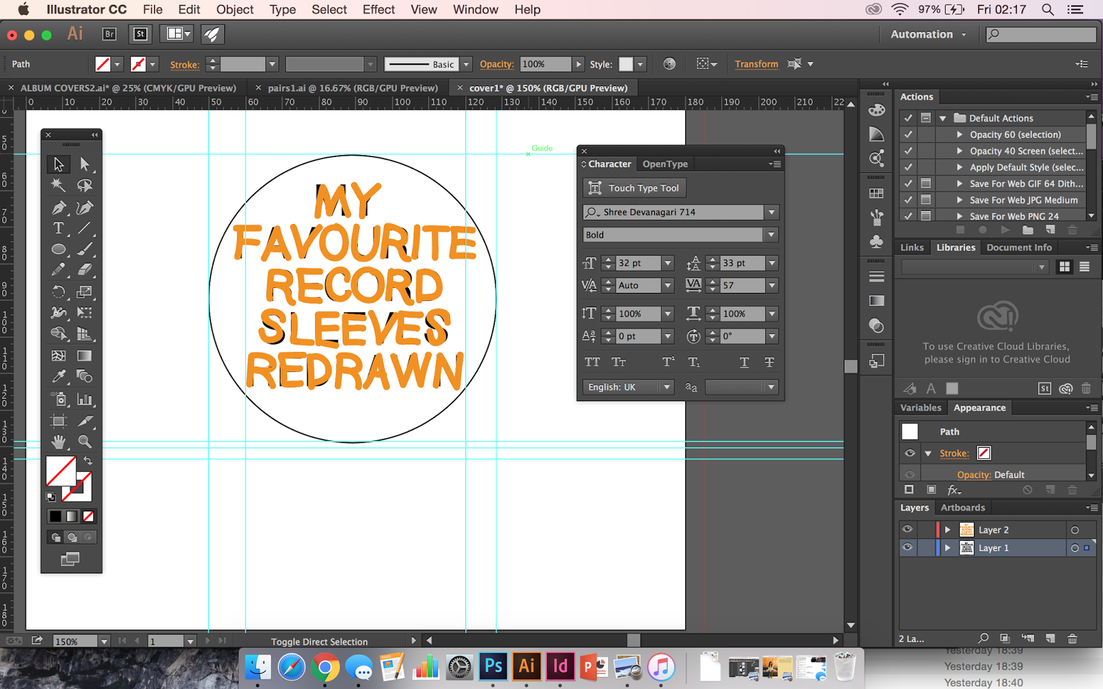
does the text on the cover fit in the circle?
After changing the alinement slightly of the text son the cover print test this now mean the text is situated correctly in the middle of the circle of the cover, all the letter can be read and seen thought the cover hole which was an issues i wanted to test in this print as it would show it with the book background, rather than just a separate piece of paper.
The text fits perfectly in the middle of the circle record sleeve cause, therefore there needs to be no changes to this page or layout.
the if size (17cm) fits in the cover/if the binding is thin enough to it allows the book to fit in the case
The record sleeve cover of this book is 18.5 cm when the case is flat, but as i found out when i tested adding 24 sheets of paper in the case if all the pages are this size they don't fit because the thickness of the amount of pages causes the case to bend slightly reducing the length of the case. Because of this i reduced the size of my designs in my mock up to 17cm, this would give room for the case to bend changing the length, changing the sizes designs was done just before the print as this is an issues i only discover the night before the print but printing at the difference size as seen above allow the pages to fit in the case without being cut down, I didn't want to cut down the book after it was printed as some of text and imagery runs close to the edge and would therefore be lost. Conducting this print test allowed me to check that the size would fit and that with the binding it would slide in and out of the case easily, make it easily accessible. There need to be not changes to the binding or the size of the pages as they fit in the case perfectly and can be removed fast. The only issues with the print is that when bound together the pages don't have a solid end line and the end sticks of the covers, this can be daily cut down for the next print. Cut down the pages after the next print so they fit together.
is it better to cut down using a hand scapula like the other book was
Since i had so many issues using a guillotine cutting out my last book and realised after the 2 print that it was easily and more efficient to cut out using a hand scapula and metal rule as it allowed me to line up against the crop marks more accurately for each page which made them fit together more equally that i used this way of cutting for this book. It again worked better than a guillotine as it cut down the lines accurately and made sure that all the pages matched, this is defiantly the cutting method i will use in the future now and for the next print of my book. I was very nervous about using this type of first as i haven't done it before this module and felt that a machine would be more accurate but it turns out it the opposite therefore this method will be used from now on.
get it proof read to check for any mistakes
After showing my book to a few of the student in the print room and around my class the mistake that was pointed out was the spelling in this page, joy division is spelt wrong, therefor on the next print i will make sure that is changed.
Also on this page the white from the other page ran over as the black background didn't cover the page correctly, to see if i could cove this up i have drawn over it in sharpie which has made it less noticeable but even from this scan the difference is still noticeable, on the next print i will make sure that all the pages background are correct and too the middle. This happen on a few pages and even thought once bound it not noticeable as much i would like the final print to be perfect so will change it.
if text text and imagery look the same on the matt 120 gsm paper as they do on screen
Since this print only uses 2 colours and when i set the document up i used CMYK setting, this print colour were exact as they are on screen so this aspect of the print worked. This print also allowed me to see if the imagery was too big in person on a physical book but since the quietly of the drawings is high and there is no pixilation the images work at this size, they grab attention as they are the main focus of the layout but also all the detail from the covers can be seen due to their size. The text was worked out to the half the size of the images and when printing this showed a clear grid system, which fits with the ideas of minimalism and modernist design principles. The text used also fits with the imagery as its very neutral which allows the images to be the main focus, all the pages aligned the type correctly when printing so there was no layout issues with this print.

if there is any issues with printing so much back ink on the pages will this mean that the other side of the black pages is unreadable as the ink is seen through
This was a major issues that i wanted to check when i printed the book, if i could print anyway i wanted i would have printed the black pages on black stock but as white digitally print ink doesn't exist i couldn't do this therefore i had to fill in the background of the pages in which black ink instead but i thought this might have an effect on the other side of the pages is the ink is too dark and the gsm too thin it would leak thought and the pages wouldn't be readable but i picked a 120 gsm, i only also the print man if he thought it would be ok on 80 gsm but he said as it was quite thin it would be seen thought the other sides therefore tested it on 120 and it worked perfectly.
As i couldn't use black stock for this digitally print, this paper made sure it didn't obstruct the readability of the other side and made sure that all the pages where readable .
if the matt stock is suitable/if the paper size is thin enough for all the pages to fit in the sleeve
Since this is a very simple minimalist book with a selection of pages that needed to fit in a very thin record sleeve cover i decided to use Matt stock for the book, this is as it will be thiner and easier to bind thiner to make it fit in the cover. Also the cover has a glossy finish so if all the pages having a matt finish not he cover and back would make the cut out circle on the cover stand out more highlighting the uses of a record sleeve cover which is one of the main feature of this book therefore something that needs to be drawn attention to. If the whole book used glossy finish the over all look would be very flashily and over the top which i don't feel would fit with the ideas/concept of this book therefore i selected matt, it will also help it fold easier and be thinner for the case.
I have placed this book bound using saddle sketch binding (the thinest binding method that give full vision to the pages) into the record case using the 120 gsm matt paper
The book needed to be thin so that it could fit in the cover which could only bend slightly without ripping therefore the book needed to be thin but also thick enough that it didn't let the ink run though or look like a leaflet, after looking at the different stock int he print room the one that bent the easiest but would also work for the solid black ink is 120gsm matt. This test was conducted to test if when the 24 pages where then bound together using the 120 stock would they fit in the case, it worked really well as the book quality is still kept as the paper is thicker than normal paper but thin enough to fit easily int the case, the record sleeve case can be roomed easily without much friction so this is the correct weight of paper, binding method and finish that should be used in the final print.
issues i didn't think of -
When the pages of solid page are folded the ink on the edges rips, this causes the edges of the pages to seem scruffy and unprofessional. The ink around the edges isn't as solid as it is when its in the middle of the page, using a case will hopefully protect the book from any more damage but there is noting that can be done about the black ink as i can't use black stock (explained earlier). For this print i have tried to colour in the missing ink placing with black sharpie as i felt this was the most permeant ink i could use over the top which does cover most of the parts but this doesn't work under close examination.If i was getting this book professional printing i would find a way to print on to black stock in white but at uni this isn't available therefore there is nothing i can do about this but carry on to cover the small marks with sharpie on my next print. cover ink mistakes with black sharpie
FEEDBACK
'change the spelling mistake on joy diversion'
'try a black cover for the book? it might make it stand out more again the white sleeve cover'
'its a good concept but make sure the sleeve cover doesn't get ink on it'
'the pages are slightly misalined in the middle change that'
' the type works really well for with the complicated images because over very minimal and balances it out but maybe try Helvetica light? its really similar but it more modern and is associated with more 'cool' brands like american appear which seems to be the theme of this book to'
'i didn't get the idea when you tried to explain it but i do now i can see it physically'
'the white space works with the images well'
'the black thread for the binding works for the inside pages as it hides the line errors but it looks kinda of strange on the front, it contras with the white to much and drawn attention to an unimportant part'
'the colour scheme is very dramatic but since the theme of the book is more casual it seems to balance out'
the hand written text on the front matches with the image style inside and works well to add a more lighthearted personal touch,keep it but maybe do change invert the colours'
'the content pages has a black line on it that seems unprofessional and distracting from the text'
'simple layout works for a busy imagery'
Cover Change Experiment
Feedback from the book suggested that i changed the cover of tube book, invert the colour scheme to make it stand out more in the circle due to the contrasting colours, this is text i have conducted to change it .
in the case
After changing the colour scheme i think it does look better, i can't alter the colour of the case due to its glossy finish that doesn't absorb ink but this allows the cover to have a contrast which fits with the style of the other pages inside the book that all contrast against the next. I will use this version for the next print, i might need to change the pages inside so that they still match up.