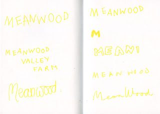
LIKED SECOND ONE IN THIS
FEEDBACK-
make it more textured
make it thicker
doesn't like the first one at all, too much dairy of a wimpy kid
try a digital type face? if you want it to look more mature of the audience
more research -
This is is the first brief were i'm designing type to fit with another designer illurstaions, as the type need to work with that element it should be tested against that element.
DIGITAL VERISONS-
feedback for collab partner-
LIKE THE BOLD CAPITALS
IS MEANWOOD VALLEY URBAN FARM
TAKE THIS DESIGN FURTHER
DEVELOPMENTS MADE TOGETHER-
final logo-
both agreed this works best
-as it can work on the a range of backgrounds/ different colours
-goat isn't distracting
-works at different scales
-shows the whole brand name
-relax tone of voice
-reflects non perfect nature/messy


No comments:
Post a Comment