Friday, 4 May 2018

Fine Art Logo, Other Outcomes

-square just logo
-square logo with info
-fb banner just logo
-fb banner like poster
-logo on different backgrounds 

size research -


-square just logo

-square logo with info


-logo on different backgrounds 


FIRST ISN'T VERY READABLE AGAINST THE BACKGROUNDS, GIVE THC LEINT AND LET THEM DECIDE


-fb banner just logo


-fb banner like poster


too busy for a page??
try the logo with pattern and simple background


PERSONALLY I FEEL THIS COMBINATION WILL WORK BEST, I WILL SUGGEST THIS TO THE CLIENT BUT IT'S THEIR CHOICE

Thursday, 3 May 2018

P&P LUA Art Work - FINAL EVALUATION

For this brief I got to work on one of my specialist areas, it was a typographical based project. I really like this aspect of the brief, as I got to experiment with more functional, purposeful type work and newer more modern style. I also got to make a connection with a design studio, due to the brief being set by Peter and Paul. This was useful as I got to experience what it’s like working with a professional design studio, and also because if they liked my work or remember me it could lead to future opportunities. Another positive of this brief was that it’s a piece that will be used in the LUA new building, displaying my work to a range of creatives as well as being around for a long time and being able to see my work actually used/made. This will also be a good portfolio piece, as shows my ability to work with a studio and also my type skills.
 
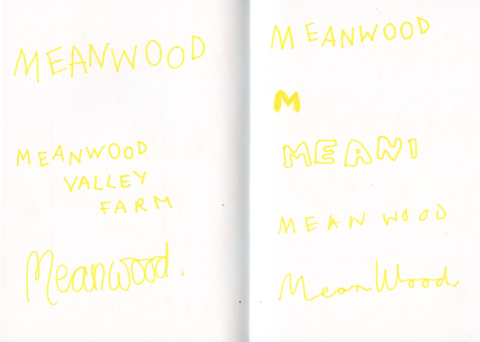
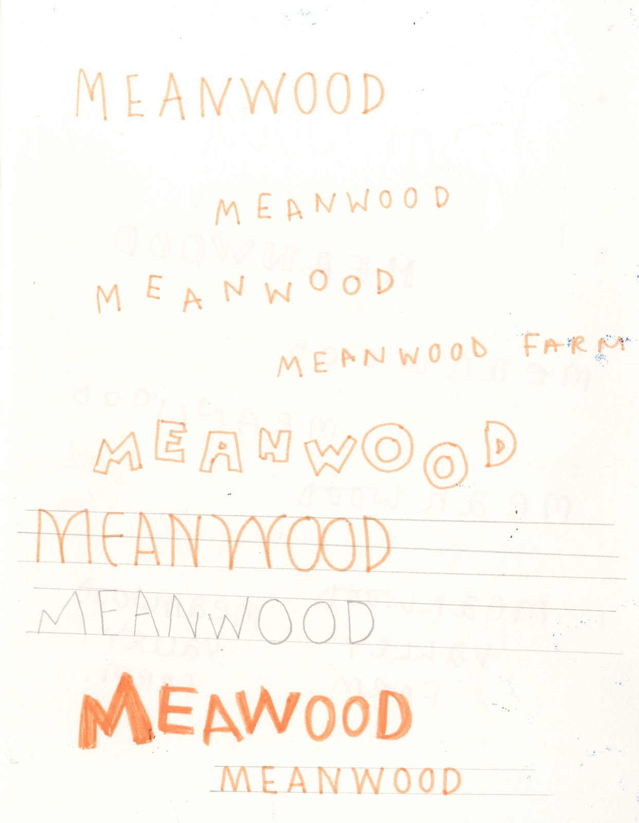
The major issue with this brief is the difference in my personal design preferences and the clients. The overall outcome is not the style I would have picked or want to be used but they are happy with this outcome. This is just due to personal style differences, but I managed to create a piece the client was finally happy with due to mass feedback and informed development. At the start of the brief I developed idea too much and places too much time into a style before asking for feedback, this was an issue as the designs focused on the digital type and the client wanted hand drawn. This massive effective the time planning as I had to redo the brief from the start, but this time I learnt from the past issue and sent over sketches before developing the idea. This is also something I should learn from in the future, design clients can work with sketches as they can visualise the ideas but this is not the same for non-creative clients they need to see outcome/digital version. There was a wide range of changes made by the client, I feel this would have been reduced if the feedback was done in person. A few stages where added as the changes were not communicated or understood fully.

As mentioned time planning for this brief was drawn out, this was due to the changed the client wanted and the total redesign. I expected one of the first designs to be picked, maybe with a few changes but this was not done therefore added an extra week for the new work. The work was completed for the deadline with another set of changes, but again more changes were sent back the day of the deadline at 5 o’clock which meant it had to be extended.  The feedback from the client in this brief took quite a lot of time, this all dragged out the brief as I was waiting days for feedback.

The final design was created by hand then drawn over using illustrator, this is due to the brief specifications so the client could edit the design is needed. Also, this media was used so the final outcome was a vector, keeping it high quality at any size and also easily resizable without pixelation.

The quote ‘Freedom of Speaking Art through Heart’ was not very visible in the final outcome, which personally seems unfunctional. The client specified this is a chance to ‘really let yourself go’ in the brief which implied they were looking for abstract creative pieces outcome does work for this, but not legibility which was also mentioned.  The set sizing and specifications were kept to throughout the brief.

603 EP - Petting Zoo Brief, Collab, type

type 

In this collaboration, i'm doing the type aspect of the poster. Nanami is designing the posters, i'll add the type then together we will make any other changes.

nanami's work-


changes -
added social handle on all pages
changed font colour


G CHANGED TO BE MORE READABLE FOR YOUNGER AUDIENCE/MORE OBVIOUS


O FILLED, D's NOT SO CAN BE TOLD APART
P FILLED AND R NOT SO CAN BE TOLD APART
-done for younger audience 

FINAL FILES -


Fine Art Logo, Poster Development FINAL CHANGES

FINAL CHANGES


FINAL OUTCOME, SAVED AT A1 SO CAN BE USED FOR BIG POSTERS


FEEDBACK-


VERY FINAL CHANGES -


Tuesday, 1 May 2018

603 EP - Petting Zoo Brief, Collab, Stickers

When we visited the farm we were given a sticker as to show the workers that we'd paid. This current tell the audience to wash their hands after feeding the animals but could be used as a form of advertising. This is as the sticker will probably be worn after the visit, or left on clothes as we were, then promoting the farm to the audience peers.

The stickers need to be visible, but also include the logo/branding as to promote. As the final logo has been finalised decided the stickers now need to be produced.

colour scheme -

sticker designs -
using background map colour
USES LOGO
USES BRANDING
STICKS TO COLOUR SCHEME
LOGO IS LARGE ENOUGH TO BE READABLE
-does the colour need to be worked on?
-is it bright enough to be seen from afar? functional?

the colour scheme for brief try other colours?
ask for collab feedback?
DO NOT FEEL THESE COLOUR SCHEME WORK AS TO DISTRACTING FROM THE LOGO/OVER POWERFUL

FEEDBACK-
also prefers the cream colour, as simpler and easier to read, easier on the eyes


mock ups-


There was an issue with the print of the final stickers, a print slot was booked 10 days before the deadline to print but unfortunately, the person that runs the studio was off sick for the slot and not back till after the deadline. Stickers where printed, but not on the matt white stock needed, instead they are see-through. This makes the colours largely paler and less visible. This was an unforeseen issue, and if the funding for the brief was set the stickers would have been produced using Awesome merchandise or Moo printing, but this was not finically viable.

Thursday, 26 April 2018

603 EP - Petting Zoo Brief, Collab, Type Experiments

Type Experiments 


 LIKED SECOND ONE IN THIS


FEEDBACK-
make it more textured
make it thicker
doesn't like the first one at all, too much dairy of a wimpy kid
try a digital type face? if you want it to look more mature of the audience

 more research -


This is is the first brief were i'm designing type to fit with another designer illurstaions, as the type need to work with that element it should be tested against that element.


DIGITAL VERISONS-


feedback for collab partner-
LIKE THE BOLD CAPITALS
IS MEANWOOD VALLEY URBAN FARM


TAKE THIS DESIGN FURTHER

DEVELOPMENTS MADE TOGETHER-


 final logo-


both agreed this works best
-as it can work on the a range of backgrounds/ different colours 
-goat isn't distracting
-works at different scales
-shows the whole brand name
-relax tone of voice
-reflects non perfect nature/messy