Module Submission 504
For this brief everything need to be justified, everything need to have a reason and cannot but intuitively. Make sure everything has a reason, why.
PRINT DESIGN BOARDS OFF IN BLACK AND WHITE, A4, just incase
5 design boards per brief
PDF all blog posts, 5mb only
name - Bethany_Fitton_260368_OUGD504
make sure .pdf isn't deleted
just acrobat to combine all the pdfs
has to be done via estudio, upload at 12
both studio briefs need 500 word evaluation
SUBMIT VIA ESTUDIO
http://estudio.leeds-art.ac.uk/mod/page/view.php?id=7404
http://estudio.leeds-art.ac.uk/mod/page/view.php?id=6373
Showing posts with label OUGD504. Show all posts
Showing posts with label OUGD504. Show all posts
Tuesday, 10 January 2017
Sunday, 8 January 2017
504 - Design Production, Design For Screen, Time frames Final
Time Frames Final
For the second brief in this module a time frame was set at the start of the work but this ended up going slightly wrong, this was due to way the the development of the site was a lot harder than planned, this stage took longer than planned but has meant that the final solution is more suitable.
The development taking longer has meant that some aspect of the project wont be as high as i wanted to at the start but i did manage to animate the site which was a major issue i didn't think i wold have time for. But the animation was done quite quick just to show how the user interacts with the site, if the development of the site hadn't taken as long work into the advertisement the placement of the site would have been done but the finish the brief for the deadline this was not.
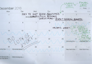
SO MUCH WORK TO DO, this is for he final project but it was very very useful near deadline time that the first brief for this module was done and the design board and blogging had been finished as it allowed the stress at the end of the module to be focused on the final brief.
The overall time planning of this module has help with the outcomes as it allowed the project to be finished with time for extra work but has allowed less stress near the brief submission so it's been worth it. It gave me a plan of my time so i knew what i should be doing so i knew when i was behind so i could use this to catch up.


For the second brief in this module a time frame was set at the start of the work but this ended up going slightly wrong, this was due to way the the development of the site was a lot harder than planned, this stage took longer than planned but has meant that the final solution is more suitable.
The development taking longer has meant that some aspect of the project wont be as high as i wanted to at the start but i did manage to animate the site which was a major issue i didn't think i wold have time for. But the animation was done quite quick just to show how the user interacts with the site, if the development of the site hadn't taken as long work into the advertisement the placement of the site would have been done but the finish the brief for the deadline this was not.
SO MUCH WORK TO DO, this is for he final project but it was very very useful near deadline time that the first brief for this module was done and the design board and blogging had been finished as it allowed the stress at the end of the module to be focused on the final brief.
The overall time planning of this module has help with the outcomes as it allowed the project to be finished with time for extra work but has allowed less stress near the brief submission so it's been worth it. It gave me a plan of my time so i knew what i should be doing so i knew when i was behind so i could use this to catch up.


Friday, 6 January 2017
504 - Design Production, Design For Screen, Nagivation Video
To show how the site navigates this is a simple animation done on after effects, it shows the way the user would interact with the site, how the buttons work and the stages of the site. This shows mostly how the welcome page, drop down menus work, and the hoover over labels for the item products. Its a very simple animation with a few issues but it shows the basics of how the site will work.
link is animation isn't working -
https://youtu.be/9Y06SzY4aqY
504 - Design Production, Design For Screen, Final Website
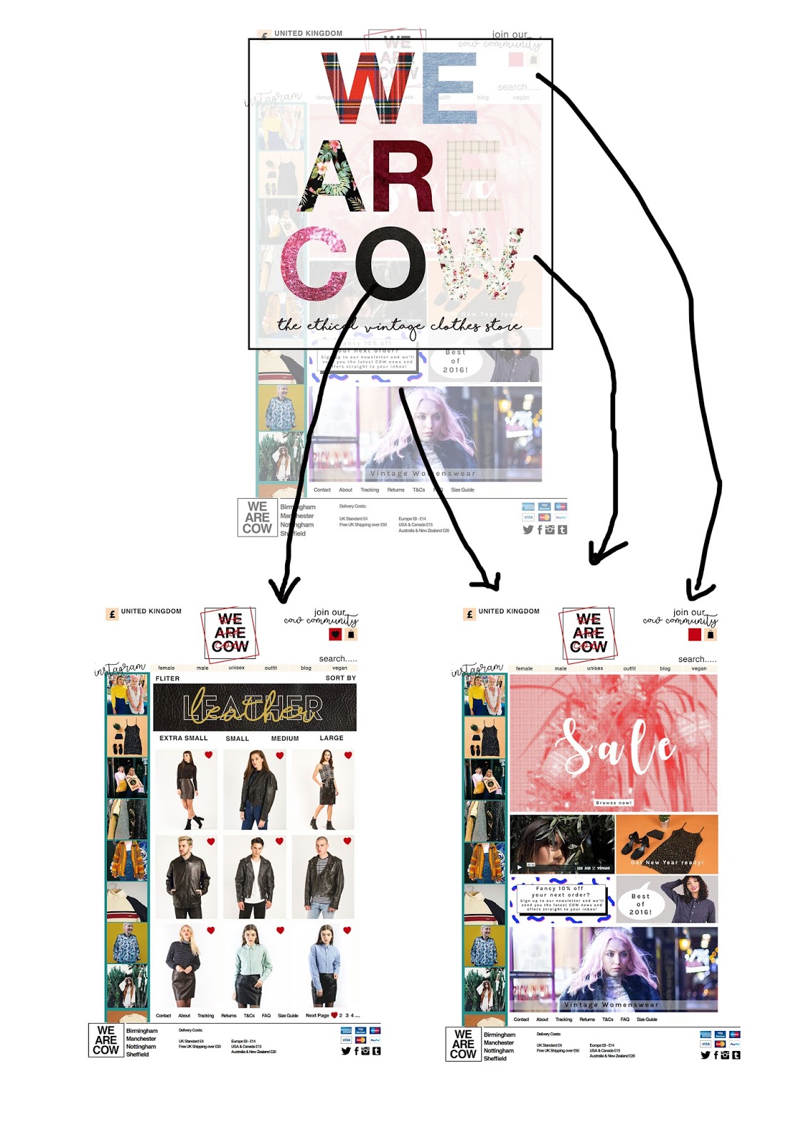
Final Website
welcome -
The first page the user interacts with on the site is a pop up page that comes up for 3 seconds once the user open the site, its a collective view of the website logo as a greeting to the site that gives links via the different letter form of the logo the selected textured search pages of the online store. The text has simple letter form cut out of fabric as a visual representation of a sign for the store in scrapbook form but is given a functional purpose via the links to the textured pages.
This is the first page the user interacts with on the site therefore set the tone for the rest of the site, an aim of this brief is to digitally express the visual atheistic of the brand online therefore this mix matched collection of texture fabric aims to portray the nature. The page reflects the contrasting, mixing, bright nature of vintage shopping straight away to the audience to engage them more, it shows the benefits of vintage shopping via the uniqueness of the fabric. The strap line for the store is placed underneath in hand drawn typeface, to express the shop brand ideas to new user whilst serving as a visual link to the style of signs in the store, handrawn to appear more personal, welcoming, kind and less digital as possible for a website. This page attracts the users in the same way the shops interior but using the same typeface from the brand but applying textures to the letter forms, this creates a similar visual asetheical style does whilst having a purpose/useful function the user can interact with.

Home Page
The next step in the user journey is the home page, this is the page used to showcase current promotions, offer or any information the site whats to communicate with the user. This page is the simplest of the pages as it doesn't direct have a purpose but to show offers and allow the user to search the site via the different methods
-via gender
-via search bar
This page is the basic for the other pages as it involves all the main features without the products on, it set the house style design for the user so they can see all the needed features clearly.
The original logo has be used the top of the pages on the site as this is branding of the store, used on all their signs ect but due to the harsh nature of the black and white hard contrast, solid terminals and capital letters used in the original logo this contradicts the atmosphere in their physical store. The aim of the new website is to match the online site with the stores in way that communicates this atmosphere digitally, therefore to express the more a softer, kinda, vintage nature of the site an overlapping version of the logo has been added in a lighter hand drawn font. Handcreated font has a natural association with softer, less commercial brand due being used more by stores like handcrafted items, or small stores, using this font for this brand over the top of the logo conveys the message of a more kinder store. Handcreated text is used heavy in the actual store therefore this need to be present online, adding it to the logo will ensure its added to every, reinforcing this value and link the user.
-handcreated text seems kinder which will appeal the target audience
- handcreated text link the way the brand uses this style in their stores
-over the top of the other logo to allow the user to recongise the original logo but with more vintage twist rather than re banding the store.

female page
The women's page is the representational page design for the section pages, this is basic design that would be applied to wth different content to the Male, Unisex,Vegan and Texture pages. The basic layout overall works for the site as it take aspect of the vintage shopping experience that appeal to the target audience then combines these with usability features and and aesthetic that reflect the intended style. The bright nature of the site create a welcoming tone of voice that aims to reflect that of the physical store. The header on the pages will be an animated gif.


welcome -
The first page the user interacts with on the site is a pop up page that comes up for 3 seconds once the user open the site, its a collective view of the website logo as a greeting to the site that gives links via the different letter form of the logo the selected textured search pages of the online store. The text has simple letter form cut out of fabric as a visual representation of a sign for the store in scrapbook form but is given a functional purpose via the links to the textured pages.
This is the first page the user interacts with on the site therefore set the tone for the rest of the site, an aim of this brief is to digitally express the visual atheistic of the brand online therefore this mix matched collection of texture fabric aims to portray the nature. The page reflects the contrasting, mixing, bright nature of vintage shopping straight away to the audience to engage them more, it shows the benefits of vintage shopping via the uniqueness of the fabric. The strap line for the store is placed underneath in hand drawn typeface, to express the shop brand ideas to new user whilst serving as a visual link to the style of signs in the store, handrawn to appear more personal, welcoming, kind and less digital as possible for a website. This page attracts the users in the same way the shops interior but using the same typeface from the brand but applying textures to the letter forms, this creates a similar visual asetheical style does whilst having a purpose/useful function the user can interact with.
 |
| clicking on the letter takes the user to the selected selection page, eg O is leather so it takes the user to the leather page |

The next step in the user journey is the home page, this is the page used to showcase current promotions, offer or any information the site whats to communicate with the user. This page is the simplest of the pages as it doesn't direct have a purpose but to show offers and allow the user to search the site via the different methods
-via gender
-via search bar
This page is the basic for the other pages as it involves all the main features without the products on, it set the house style design for the user so they can see all the needed features clearly.
The original logo has be used the top of the pages on the site as this is branding of the store, used on all their signs ect but due to the harsh nature of the black and white hard contrast, solid terminals and capital letters used in the original logo this contradicts the atmosphere in their physical store. The aim of the new website is to match the online site with the stores in way that communicates this atmosphere digitally, therefore to express the more a softer, kinda, vintage nature of the site an overlapping version of the logo has been added in a lighter hand drawn font. Handcreated font has a natural association with softer, less commercial brand due being used more by stores like handcrafted items, or small stores, using this font for this brand over the top of the logo conveys the message of a more kinder store. Handcreated text is used heavy in the actual store therefore this need to be present online, adding it to the logo will ensure its added to every, reinforcing this value and link the user.
-handcreated text seems kinder which will appeal the target audience
- handcreated text link the way the brand uses this style in their stores
-over the top of the other logo to allow the user to recongise the original logo but with more vintage twist rather than re banding the store.

female page
The women's page is the representational page design for the section pages, this is basic design that would be applied to wth different content to the Male, Unisex,Vegan and Texture pages. The basic layout overall works for the site as it take aspect of the vintage shopping experience that appeal to the target audience then combines these with usability features and and aesthetic that reflect the intended style. The bright nature of the site create a welcoming tone of voice that aims to reflect that of the physical store. The header on the pages will be an animated gif.


Outfit Shop


An issue with the final solution for this brief that although it fits this brief the site would have to be edited to work on a phone screen due to the nature the smeller type wouldn't be readable at the scale. The site would need to have site changes to work on a phone screen. The main design features could be kept the same but the layout would need to be changed to allow for the smaller screen size.
Tuesday, 3 January 2017


Sunday, 1 January 2017
504 - Design Production, Design For Screen, Gif Experiments
Gif Experiments
Feedback from a recent crit was that a that a GIF could be used to show the mass of style individual without being overly decorative and distract from the site features. The header idea currently is used to reflect the style on the site, these is a range of different time frames, trends and style portray by these therefore using these in a gif might allow the the site to reflect all these style in combination.
GIF HEADER TO REFLECT RANGE OF STYLE IN ONCE FEATURE
A GIF feature for the site would also taken advantage of the on screen design media being used to create this site, it would be a feature that could only be applied to the site via this medium.
This would enhance the engagement of the user with the site as it would create a constantly change feature on the page that would keep their attention whilst reflect the aesthetic of the brand.
headers used -
https://www.youtube.com/watch?v=Z3egWZWKtHc


After effect has been used to create this mock up gif, the headers last for 1 second each this is o the audience can read the text to make the header functional whilst seeing the style reflected.
Headers Applied to Site -
https://www.youtube.com/watch?v=_S3kn3z58cM
This gift shows how the header would look on the website for the band, how they would change and where they would be places, this allowed feedback to be collected for this idea.
feeedback -
'the header GIF make the site more interesting
reflect the style well, the design is on point
GIF time frame works well as the can still be read
make it quicker maybe? the first one seem to be there ages so i might not see it if i was quickly look at the site
personally its too much with the design of the site, its too busy
its more interesting so causes me to look at the site for longer.
good idea
i like the GIF part
Since the overall feedback for this element of the design as positive the GIF style headers will be applied to the final site on all the main pages, female, male, vegan , unisex and outfit as the headers for the pages.As the pages where designed to all have different headers the pages will have different GIF set, these will use unique design style and trends for the pages.
Feedback from a recent crit was that a that a GIF could be used to show the mass of style individual without being overly decorative and distract from the site features. The header idea currently is used to reflect the style on the site, these is a range of different time frames, trends and style portray by these therefore using these in a gif might allow the the site to reflect all these style in combination.
GIF HEADER TO REFLECT RANGE OF STYLE IN ONCE FEATURE
A GIF feature for the site would also taken advantage of the on screen design media being used to create this site, it would be a feature that could only be applied to the site via this medium.
This would enhance the engagement of the user with the site as it would create a constantly change feature on the page that would keep their attention whilst reflect the aesthetic of the brand.
headers used -
After effect has been used to create this mock up gif, the headers last for 1 second each this is o the audience can read the text to make the header functional whilst seeing the style reflected.
Headers Applied to Site -
https://www.youtube.com/watch?v=_S3kn3z58cM
This gift shows how the header would look on the website for the band, how they would change and where they would be places, this allowed feedback to be collected for this idea.
feeedback -
'the header GIF make the site more interesting
reflect the style well, the design is on point
GIF time frame works well as the can still be read
make it quicker maybe? the first one seem to be there ages so i might not see it if i was quickly look at the site
personally its too much with the design of the site, its too busy
its more interesting so causes me to look at the site for longer.
good idea
i like the GIF part
Since the overall feedback for this element of the design as positive the GIF style headers will be applied to the final site on all the main pages, female, male, vegan , unisex and outfit as the headers for the pages.As the pages where designed to all have different headers the pages will have different GIF set, these will use unique design style and trends for the pages.
Saturday, 31 December 2016
504 - Design Production, Design For Screen, Page Development
Page Development
Over this project it has been very hard to portray the over all atheistic of the shops brand interior, this is at the shop inside heavily relay on textures to give of the rustic, vintage, older vibe. Since the texture it's self could be used a due to the limitation of digital on screen production and the way site works off pixel, a photo would have to be substituted which this often appeared tacky or over powering on the mock up, due to the way its distract from the important need navigation tools on the page. Using textures online is commonly associated with more lower class, cheaper brand who don't have the fund to imply a graphic designer and is often over used by these brand therefore this gives the online version of textured fabric a tacky association.
Due to the nature the interior style need to be portrayed via a non-textured screen development into how to do this for the web page has been done, the aim is find a balance between the house style of the brand (very minimal harsh type) with detailed imagery to create a site that is also clear and easily usable for the user whilst portraying the brands style and benefits whilst appealing to the target audience. HARD TO GIVE VINTAGE FEEL DIGITAL WITHOUT TEXTURE.
research -
how to make a digital site appear vintage


As digital design and website are new medias website are automatic associated with modern design styles, this contrast the brands aesthetics as it is of this media limitation as it very hard to change this prospective. Over this design process it has become aware it very difficult to get digital design to appear vintage to the point of the 1960 ect which is how the store brands itself as computers screen didn't exist then. Also the store aim to appear handmade as this style fits with the eco, personal ideoagys but as computers are very un-eco friendly and mass produced so creating a website that reflects is contradictory, trying to recreate this has been very difficult, mediums that have been tried -


this idea has had retro vintage 70's colour scheme applied to the site in attempt to reflect this time frame as many of the styles in the primary research showed it was use in the interior of the store to create the vintage feel. The colour scheme was added to balance out the harshness of the current design style/branding to give more retro touch to the high contrast back and white basic design currently used without distracting or adding any un-needed detail which would make it overly busy (crit said keep it simple for user ease)
-colour scheme works but overpowering why applied to all the site
-reduce the use of colour, colour only needs to be added to the buttons sections that need to stand out
-darker colours make it hard to see the black text/imagery, don't use dark green
-paler browns work best for the buttons as it shows the outlines but the text is more legible
-orange stands out clearly, use for features that needs to be a focus

-paler colour scheme for the buttons give off a less busy, easier on the eyes layout
-the paler colour boxes match the imagery more, the orange clashed with some of the items
- neutral colour scheme for the button means any banner can be added to the page as it will not clash
-the greeny/blue for the Instagram scroll make the bar stand out against the rest of the paler website
- greeny/blue bar matches the colours used in the imagery therefore enhance the pictures
-is the site too plain/minimal for the brand?
- seems very modern due to text font and colours, how can this be balanced out
- doesn't portray any vintage themes/trends
-OVERLAPPING THE HANDDRAWN TEXT OVER THE LOGO BALANCES OUT THE HARSH MINIMAL MODERN NATURE OF THE LOGO WITH SOFTER MORE PERSONAL TOUCH
-not as busy as the stores interior
IDEA - apply a pattern taken from the wall decoration in physical stores, match the digital site via background design with the stores interior the fit with the aim of reflect the aesthetic.


-makes the site fit the theme
-the background is overpowerinly heavy for the user
-too much going on the page, user doesn't know where to focus
-background contrasts with the headers, headers are needed more on the site to express the different genre of styles/separte the pages
-with the header there are too many contrasting design styles and patterns on the page
-might work without header?
-colour scheme works well together
-does match the store interior
-OVERALL TO BUSY TO USE
How do they do it on Instagram?
Since the Instagram page for the site manages to sell the products as it reflect the sites aesthetic digitally more research into how this site manages to do achieve the aim need to be done. Whats does the Instagram page do that the site can apply to make it achieve the same? Difference in the Instagram and the site design?


Features
-uses little/no text on the page
-uses hoover over caption for infromation to reduce text
-visually heavy
-simile layout that give allows the picture to express the content.
After looking at the Instagram website for the site it was made clear that is site expresses the aesthetic via creating a very visually heavy website that reduces the amount of text seen at once as much as possible. This then allows the imagery to set the tone for the site, as the imagery reflect the stores interior as it shows the store and the items which has been analysed as a strong point for the brand social site. The store is very visually heavy, there was not much text ect around the store as the focus was mostly on the items this is also seen on the social sites, therefore as the brief is reflect the store as well as link the soical sites more this should be done on the online store.
-REDUCE THE TEXT
-MAKE THE SITE VISUALLY HEAVY
-MAKE THE IMAGERY THE FOCUS

Here the refined search bar, and the item information has been removed to allow the site to be more image heavy rather than text heavy. Removing the block Helvetica text bar and product details from the main page gives allows the site to appear less serious as now the focus is the imagery content rather then the commercial text. Imagery is the main selling point of the site therefore this layout change creates a site that is more a visual shopping experience for the linking to the way that vintage shopping is done in real life.
MORE VISUALLY INTERESTING SHOPPING EXPERIENCE, LESS INFORMATION HEAVY
Information -
But the information will need to be included for the user to navigate the site, this can be done via the same way instagram and other fashion sites seen in research do this via a hoover over pop up. When the user hoovers the mouse over the imagery the name, price, and size of the product will appear direct over the corresponding image. This feature can be applied to the site as it will show the needed information in smaller burst, as the user has to hoover over the image it means the user will only be able to see one product information at once which make sure the user is not overloaded with information at once keeping the experience as visually image heavy as possible.
USE HOOVER OVER CAPTIONS FOR THE PRODUCTS TO GIVE NEEDED INFORMATION.

Filter / Sort By Search -
The filter search bar and sort by search has been removed from the main page to give more room for the imagery but this information still need to be included on the site, on other fashion website this is down via drop down menus. This allows the user to apply the features but doesn't need a filter search bar or sort by bar on the page. The bar will drop down when the user need its then remove when the have used it again this is reducing the amount of text on the pages as much as possible to make the site a more visual experience. The drop down menus make the features assailable but not constant or distracting from the imagery.
DROP DOWN MENUS USED SO THE FEATURES ARE AVAILABLE WHEN THE USER NEEDS THEM BUT NOT CONSTANTLY ON THE PAGE SO THE IMAGERY IS MADE THE MAIN FOCUS.

feedback -
To see how people feel about using drop down menus rather than the still there option peoples personal opinions on which they felt looked better and which was more useful. mixed feedback was received as someone felt it would be useful to see what they defined their search by constantly but overall out the people asked it was made clear that that the aesthetical value of not having these text take up the sapce on the page made it a lot more visually heavy therefore seem more like vintage shopping than before. The removable of the text feedback stated that it did make the site appear less serious and more friends s the text was a very bold block boring type style therefore without this the site fit the aim of the brief more.
final style applied to the rest of the site pages -

this is the final page top for all the site pages, this will be applied to the whole site design.
outfit shop page with the style appiled


How will the pop up link and description look?


Final Outfit Page PopUps-


FEEDBACK -
Subscribe to:
Posts (Atom)