Showing posts with label in cold blood. Show all posts
Showing posts with label in cold blood. Show all posts
Thursday, 27 April 2017
Tuesday, 7 March 2017

Wednesday, 15 February 2017
503 Studio brief 1 - Responsive, In Cold Blood, Final Feedback
Final product feedback for the outcome of the brief is to see if the final design fill the aim set by the client, fits with the tone of the book, expresses the intended theme, whilst appeal to the selected audience.
Final Feedback-
type reflect sinister nature establishing the tone expressed in the brief
serve designs style reflect the harsh nature of the crime, colour contrast works well to present his
the final cover has a dramatic look
good use of imagery of the criminal rather than the victims
the imagery that is very bold and strong reflect the them
eye being covered is impactful, adds sense of mystery and creates a scarier more scary
ransom type yet no theme of ransom in the book, is this misleading
looks personal, like a older book handed down
colour filter ages the ads of the book
retro type work with the time frame
spine stands out do to contrasting and font style.
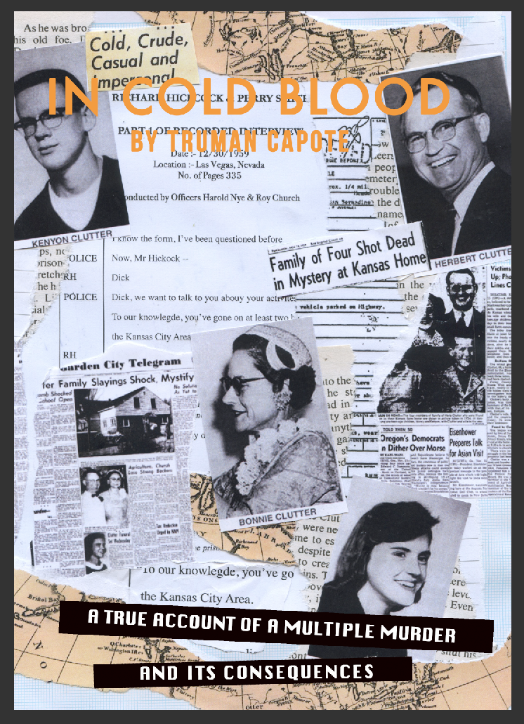
Due to this feedback the overall on the book cover design is felt that the design fits the intended themes, to expresses the genre, content and audience of the book in a way that creates mystery to intrigue new readership. The college design concept was inspired by the work and the large body of research the author undertook to compile the book contents, the book is the result of in-depth studies of articles, interviews and media coverage of the crime which is a defining aspect to the books success therefore representing this collection of different source via different lettering forms taken from the relating articles fits with the content of the book.
The imagery of the criminals are photography taken whilst in prison for the crime, the faces of the criminals have been covered as to darken the tone, the subject where seen as happy/smiling in the photo therefore removing this aspect changes the tone of photos. This idea also links to the idea the eyes are the 'gateway tot he soul' and how the author felt this crime was committed without any care or human nature, this dehumanizes the subject rather then celebrates them.
The harsh contrast between the imager/lettering and the white background sets a serve serious tone of the book referencing the genre as well as the tone of voice. The brown filter has been added over the original design as to add age to the novel, this is famous classical crime committed in the 1960's and the book design aims to portray the decade/time frame of the novel.
Final Feedback-
type reflect sinister nature establishing the tone expressed in the brief
serve designs style reflect the harsh nature of the crime, colour contrast works well to present his
the final cover has a dramatic look
good use of imagery of the criminal rather than the victims
the imagery that is very bold and strong reflect the them
eye being covered is impactful, adds sense of mystery and creates a scarier more scary
ransom type yet no theme of ransom in the book, is this misleading
looks personal, like a older book handed down
colour filter ages the ads of the book
retro type work with the time frame
spine stands out do to contrasting and font style.
Due to this feedback the overall on the book cover design is felt that the design fits the intended themes, to expresses the genre, content and audience of the book in a way that creates mystery to intrigue new readership. The college design concept was inspired by the work and the large body of research the author undertook to compile the book contents, the book is the result of in-depth studies of articles, interviews and media coverage of the crime which is a defining aspect to the books success therefore representing this collection of different source via different lettering forms taken from the relating articles fits with the content of the book.
The imagery of the criminals are photography taken whilst in prison for the crime, the faces of the criminals have been covered as to darken the tone, the subject where seen as happy/smiling in the photo therefore removing this aspect changes the tone of photos. This idea also links to the idea the eyes are the 'gateway tot he soul' and how the author felt this crime was committed without any care or human nature, this dehumanizes the subject rather then celebrates them.
The harsh contrast between the imager/lettering and the white background sets a serve serious tone of the book referencing the genre as well as the tone of voice. The brown filter has been added over the original design as to add age to the novel, this is famous classical crime committed in the 1960's and the book design aims to portray the decade/time frame of the novel.
Sunday, 5 February 2017
503 Studio brief 1 - Responsive, In Cold Blood, Back and Spine Design
As feedback from earlier on in the brief was to find a way to include the concept of the interview in the final outcome a way this has been included is in the back of the final cover. The interview was seen as too overly formal and not aesthetically pleasing/attractive enough for the front cover as it wouldn't attract the correct attention, as well as the tone was being slightly too informative. The concept can still be included using it as the back cover allowed it to be functional, it can be used in this style in a formal setting.
The spine style was taken from the same 60's inspired typography used on the cover, this is to tie the book together as a whole by linking the different sides but also as this typeface is slightly decrotive as to intrigued the audience on a shelves as this is the only part they will seen without effecting legibility of the type.

including the interview concept as the back of the cover as the design is clear and readable yet also the style also is directly associates with interview material and copy expressing a serious factual nature to the overall cover expressing the tone of the content.
 |
| aged effect added due to feedback |
The whitespace heavy back also link to to the front as it makes the front the major focal point whilst having it's own decorative details.

Saturday, 4 February 2017
503 Studio brief 1 - Responsive, In Cold Blood, Final Changes
After this design was selected as the piece to be taken forward for this brief final development of the colour was experimented with. This is as the book is a classic in the true crime field and was published in the 1960's, the book should aim to reflect this decade and time frame as to set the tone for the story line.
Final Changes -


503 Studio brief 1 - Responsive, In Cold Blood, Mock Up Feedback
After 5 main ideas where mocked up feedback was asked for, this was to get feedback on which idea and visual the audeince felt fitted the tone of voice, concept, genre and the target market penguin aimed for.
Interview - One of the idea for this brief was to visual reflect the accuracy nature of the publications information, the book is seen as the more true well researched crime book and in a effort to break away from common true crime book cover style.The cover is a interview style document expressing the turning point in the content when the criminal has been caught. This style informs the audeince of slight parts of the book without giving away to much detail of the crime to the reasoning in a intrigue the audeince.
Vintage Style -Research into book covers from this genre showed how the book covers can he heavily influenced by the imagery of the criminals.This idea takes imagery of the murders and depicts their death at the end of the publication. Both the criminals get hung therefore this visually shows this via digital college style but this was done in a way that didn't directly reflect the gruesome of the hanging, but showed it via the use of broken neck photography and a illustrative rope. This is aim interesting the audeince as they be intrigue by the reason for the hanging.
3 Layer of Type - The writing style is a heavy focus of the clients aim for the book cover, a feature of the book that makes it the content clear and engaging for the readers is the use of a range of points of view. The book follows the points of view and storylines of the victims friends, the police/media and the criminals. This is one of the only true crime book that explores the subject area to this degree, consequently this is one of the reasons for the books success. This cover would reflect the 3 stories give by the different accounts of the story by visually expressing the title in 3 different type styles.
College Ideas - These cover designs is based around the in-depth research the style of writing style, and in-depth research conducted. Truman collected a wide range different media, police files and interviews to achieve the books famous accuracy, which became one of the major seeing point and reasons the book is celebrated. These cover ideas are inspired by this process, celebrating the combination of the different research mediums via a college style outcome using similar or the documents Truman would have studied. Images from the victims, criminals, maps of the destination, newspaper articles, crime reports, interviews have all be collected and manually college together than scanned in for this design. The cover of the book aims to visually represent the writing style and show how the combination of source material complied the more interesting cover outcome.
Feedback on the range of ideas as a whole allowed the crit to analyse with outcome was more suitable for the brief, having mocked up the ideas allowed the audience to visually see the ideas in the style they would be presented to the client. this also so the client the idea process.
One of the feedback areas was focused around if the other market agreed with my ethical stance on not using the victim imagery but using the criminal imagery. This was done as the imagery it's self is very bold and representative of the criminals personalities. Including imagery from the crime it's self, photography directly ties to the book to the non fiction field as it expresses the genre of the book to the audience via showing the relevance to real life and in the inclusion of the actual criminals.
Feedback on all these set of ideas explore the visual benefits of all them but focused around the positive feedback around the college type and photo idea 4. This it was felt by the audience that due to the use of the criminal imagery which only is powerful and then the removable of the eyes this had the most dramatic effect on the audience. This is design that should be taken forward as it expressed the tone of the book the most accurately whist representing the writing style in a modern trend way that relates fundamentally with the audience to crime.
Saturday, 21 January 2017
503 Studio brief 1 - Responsive, In Cold Blood, College Mock Ups
One of the main idea and point this brief aims to explore about the book is the writing style as this is mentioned in the brief, the book is made up of a variety of different sources information which the author pieced together to create a overview of the crime in the detail that made it famous. The author spent 6 years analysing documents, articles and crime report and any information of the crime available. This in-depth research is one of the reasons the book was so popular, this has informed this design idea which is to create the cover from a range of crime information college together. this shows the research the author when to, the style of writing and also the factual nature of the publication.
Images from the victims, criminals, maps of the destination. newspaper articles, crime reports, interviews have all be collected and manually college together than scanned in for this design idea. The cover of the book aims to represent the writing style by creating a cover from a range of sources the same way the content was taken.
scans -


idea 1)

Eye are seen as the human aspect of people, these are seen as the windows to the soul and the personal identifier as they are different for everyone. A common theme in the book is the lack of human emotion the crime showed, removing this facial aspect of the criminals takes away the human nature of the criminals visually.


The scans where digitally recreated in the same style due to the quailty of the scan image being too low to use for the cover.
idea 2)


idea 3)


feedback on these idea favoured the top design, this is as the audeince felt this dehumanises the criminal the way the book portrayed the subject. Also visually this design was seen to express the dark tones of the novel to the audience were as the other ideas we;re felt to be too busy. The dramatic effect of the imagery was lost as there is so much imagery combined, there not focal point on the other design which causes the audience to be intimated by the cover. The first idea is clear due to the use of whitespace which allowed the dramatic imagery to talk for it's self, the photos are very power therefore this layout enhances this.
As a personal point of view the imagery of the victims should not be used in the final cover, this is as see this as commercializing their picture for the gain of the client and the author, this is a personal view due to my ethical stand i wouldn't be personally happy if i was used in this situation therefore will refrain for any final idea that use victim images. The imagery on the criminal on the other hand can be used on the cover as they deserved to be related and to the crime without any ethical issues.
Thursday, 19 January 2017
503 Studio brief 1 - Responsive, In Cold Blood, Tumblr Research
A wide range of site were searched as sources for imagery relating to the crime mention n the novel, for example - crime case files, letter ect, any part of data or account that could have be used as pieces of information that Truman Capote to compile the book. This was done for part of a college idea for the cover where the cover would depict a range of the data joined together to compost the cover to reflect the range of sources, and information samples the author used. After many different site where searched for this type of data the more diverse source of the type of imagery that could be used for this idea, it displied a range of unique items that could only be found on this site.
https://www.tumblr.com/search/richard-hickock


not from Richard Hickok to the prison warden
“Sir: Perry Smith is without funds for Christmas and has no family to send him any. Would it be possible to transfer ten dollars from my cash account to his.
Thank you
Richard Hickock”


Richard Hickock interviewed at the Kansas State Penitentiary.
I am not guilty of murder. I didn’t kill any of those people.

The use of the unique imagery and exclusive data found on this site would gives an advantage in this brief as it will give the final design output a more specialized attention to the content, a unqiue look at the book compared to the other entries making the cover standout due to attention to detail. Exploring the use of files from the crime, details from the crime scene combined with the personal notes from the criminals detail have be used in this cover design as a visual way of representing the literal style of the book as this is how the Author collected data for the novel, this will fulfill an is a aim set by the client set in the brief ' reflecting both its literary merit and its chilling content'. The Novel content is created based off a range of different source that Truman examined, these source gave the books it's unique insight into the crime therefore the covers use of the exclusive particular details represent the books literally content as well as the writing process.
Research highlight how the book was made famous and successful due to the excessive detailed research Truman collected, the book review via amazon states that the feature that make the book stand out are 'remarkable synthesis of journalistic skill and powerfully evocative narrative' and 'Truman Capote's comprehensive study of the killings and subsequent investigation explores the circumstances surrounding this terrible crime and the effect it had on those involved' The cover aims to visually represent this via the combining materials he could/would have used to gain this knowledge and compose the content.
Saturday, 14 January 2017
503 Studio brief 1 - Responsive, In Cold Blood, Typography Idea
From the first mock up feedback it stated that this idea of portraying the 3 different influences to the book could be a successful unique way to shows the in-depth research the author conducted but the design needed more development as seemed to formal and un-dramatic so compared to other book in genre this book would get over shadowed.
The feedback was that the 3 main voice needed to be made more obvious, in the last design the typeface were similar which didn't fit the idea of visual reflecting the different influences.


rather than over lapped text as this could effect the legibility of the cover title with penguin won't use this ideas represent the voices as singular text styled line. The cover is more leigabile but looks unprofessional and unfinished , it seem as if there is as aspect missing therefore more work will be done.


this idea reflect the media as the ransom style type, police and the serif font and the family as the background text


One of the first idea that received great feedback for the concept but not for the design has been experimented with here, this is to find a way to include the concept. The overlapping of this many different styles of text is confusing for the audeince, it makes it hard to read or to focus on any of the type.


As the current idea seemed to over powering due to the amount of type, this has been striped back to one of the font style, the style is inspired by randoms notes with have no link to this story line but have very strong association with the genre and the intended tone. The type style here also reflects the way the author pieced togetehr the story from a range of different medium as the type is pieced together in this style.
final idea -

The whole design comes together to reflect themes of the age of the book via the vintage colour schemes, the genre via the random style type but also the emotive aspects of the storyline via the hand type. This cover visually representative the aspect of the book to communicate the title to the audience in an eye-catching style.
Subscribe to:
Posts (Atom)