Showing posts with label Penguin. Show all posts
Showing posts with label Penguin. Show all posts
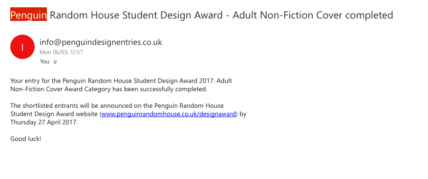
Thursday, 27 April 2017
Tuesday, 7 March 2017
Sunday, 5 February 2017


Thursday, 26 January 2017
503 Studio brief 1 - Responsive, Grave Stone Idea Development
Feedback on the grave stone idea was very positive as it highlight that this is the more unique abstract idea in the set, this idea is the idea feedback felt was what the client was looking for due to the connection tot he passing of harper lee this year. But his has to be done in respectful way, make sure the final cover is not to clique.
First style test -


feedback/stylechange -
too child like
too flat
not detailed enough
inspiration -


full layout experiments -


503 Studio brief 1 - Responsive, Type Mock Up
After feedback
sketches -
After feedback form the last crit on the children book idea the feedback was to work on the type aspect of the design more, to make this the defining feature of the cover in a decorative manner similar to the books research to do this first drawn sketches were completed then digital versions mocked up so the idea could be applied to the design.
-make it the main focus,
-make it more expressive
-make it decorative


DIGITAL COVER -


full layout experiments -


Friday, 25 November 2016
503 Studio brief 1 - Responsive, First Mock Ups
First Mock Ups


crit feedback -
the idea of the chid drawn style book cover was seen as the most successful cover from this set, this was due to nature the idea 1 seems to formal and idea 3 has no relation to the story line.
-try actually dropping blood on the cover
-make the type more legible for penguin need to be very clear
Tuesday, 22 November 2016
503 Studio brief 1 - Responsive, To Kill a Mockingbird Ambiguous
Ambiguous Themes/Ideas
For this brief Penguin describes the wanted outcome as
'the trick here will be to come at it from a fresh perspective and to avoid repeating the obvious iconography from the many previous editions in print.'

These means that Penguin want a book that doesn't reflect the current design or common themes in the book, the aim is to design a fresh idea/concept for the book they haven't seen before. Research was conducted earlier into common themes on the covers of other edition of the book so that the most used idea can be highlighted then ignored, so the concept for the idea hasnt been seen before by the company. The themes seen on the common covers where-
-birds (due to title)
-trees (due to link to the book)
-swings (due to link in the book)
-houses
-children (due to narrative)
-leaves
IGNORE THESE
As these have been ignored for the book cover design the concept can come from another idea/them or fact about the book that havent been over used, these are the current ideas that could create a ambiguous book cover design -
-taught heavily in the american education system
-harper lees death last year (remembrance)
-Scout is goes as ham to the party when she attacked
-at the fire Boo put the blanket on her shoulders
-Scout vs the mob
-links to black lives matter (would this cant non timeless, give away decade made)
-items found in the tree
-scout vs feminine ways
-type only cover
-quote cover
-paper aeroplane
-racism
-gravestones/death/everyone is equal in death
-trail/court
-40 languages with over 30 million copies in circulation


40 languages with over 30 million copies in circulation
idea-
sketch-
mock ups-


sketch-
mock ups-


feedback -
For this brief Penguin describes the wanted outcome as
'the trick here will be to come at it from a fresh perspective and to avoid repeating the obvious iconography from the many previous editions in print.'

These means that Penguin want a book that doesn't reflect the current design or common themes in the book, the aim is to design a fresh idea/concept for the book they haven't seen before. Research was conducted earlier into common themes on the covers of other edition of the book so that the most used idea can be highlighted then ignored, so the concept for the idea hasnt been seen before by the company. The themes seen on the common covers where-
-birds (due to title)
-trees (due to link to the book)
-swings (due to link in the book)
-houses
-children (due to narrative)
-leaves
IGNORE THESE
As these have been ignored for the book cover design the concept can come from another idea/them or fact about the book that havent been over used, these are the current ideas that could create a ambiguous book cover design -
-taught heavily in the american education system
-harper lees death last year (remembrance)
-Scout is goes as ham to the party when she attacked
-at the fire Boo put the blanket on her shoulders
-Scout vs the mob
-links to black lives matter (would this cant non timeless, give away decade made)
-items found in the tree
-scout vs feminine ways
-type only cover
-quote cover
-paper aeroplane
-racism
-gravestones/death/everyone is equal in death
-trail/court
-40 languages with over 30 million copies in circulation


40 languages with over 30 million copies in circulation
idea-
sketch-
mock ups-


gravestones/death/everyone is equal in death
idea-sketch-
mock ups-


feedback -
Subscribe to:
Posts (Atom)