Showing posts with label STUDY TASK 1. Show all posts

Monday, 1 February 2016

406 Studio Brief 1 - Secret Seven, Study Task 1


406 // SUBUMISSON 29/4/15

Real world work, that has purpose ect, self directed approach. 
AIM - self determined approach, function context and audience with a critically explanation. 

STUDIO BRIEF 1- live/ competition  
STUDIO BRIEF 2- design problem 
STUDIO BRIEF 3- group project
STUDIO BRIEF 4- first year problem brief 

STUDIO BRIEF 1- SECERT SEVEN


Seven tracks that are designed the sleeve for, these are unknown till the buyer pays.

‘Secret 7” takes 7 tracks from 7 of the best-known musicians around and presses each one 100 times to 7” vinyl. They then invite creatives from around the world to interpret the tracks in their own style for every 7”. 700 sleeves are exhibited and then sold for £50 apiece. They buyers don’t know who created the sleeve, or even which song it’s for, until you have parted with your cash - the secret lies within.’

features of this brief -

NO NAME, NO TITLE
184mm x184mm, must include 3mm bleed, CMYK, tiff/JPEG/PDF, 300dpi
2ND OF MARCH
don’t tell anyone 
140 characters explanation, twitter can check this not word, keep it simple 

Songs 2016 -
S729 / Chvrches - Clearest Blue
S730 / Etta James - At Last
S731 / Jack Garratt - Worry
S732 / The Jam - Art School
S733 / John Lennon - Imagine
S734 / Max Richter - Dream 3
S735 / Tame Impala - The Less I Know The Better

Research Sources -
Peter Savile

STUDY TASK 01
straight forward//random for last year titles —

The Maccabees - Go


The Rolling Stones - Dead Flowers


Diana Ross & The Supremes - Reflections 


Underworld - Born Slippy 


The Chemical Brothers - Let Forever Be


St. Vincent - Digital Witness


Peter Gabriel - Sledgehammer


UNDERWORLD - BORN SLIPPY (taken from trainspotting film)

Drive boy, dog boy, dirty, numb angel boy
In the doorway boy, she was a lipstick boy
She was a beautiful boy and tears boy
And all in your inner space boy

You had chemicals boy and steel boy
You had chemicals boy, I've grown so close to you
Boy and you just groan boy
She said, "Come over, come over", she smiled at you boy 

Let your feelings lift, boy, but never your mask boy
Random blonde boy, high density
Random blonde boy, blonde country
Blonde high density

You are my drug boy, you're real boy
Speak to me and boy, dog dirty numb cracking boy
You get wet boy, big, big time boy, acid bear boy
And babes and babes and babes and babes and babes

And remembering nothing boy, when you like my tin horn boy
And get wet like an angel, derail

You got a velvet mouth, you're so succulent
And beautiful shimmering and dirty wonderful
And hot times on your telephone line
You got to never land on your telephone and in walks an angel

And look at me, your mum squatting pissed in a tube hole
At Tottenham Court Road
I just come out of The Ship
Talking to the most blonde I ever met

Shouting, "Lager, lager, lager, lager"
Shouting, "Lager, lager, lager"

Shouting "Mega, mega white thing, mega, mega
White thing, mega, mega white thing, mega, mega"
Shouting, "Lager, lager, lager, lager
Mega, mega white thing, mega, mega white thing"

So many things to see and do in the tube hole true blonde
Going back to Romford, mega, mega, mega
Going back to Romford, hi mum, are you having fun?

And now are you on your way to a new tension and headache?

Album Cover Experiments 

Abstract - 


Overuse of the word 'boy' so boy is created in the amount of time its spoken in the song, there a large focus on this word as the major lyrics of the song, therefore the cover reflect this. The use of colour reflect the songs theme of gender fluidity, how it says she and boy combined to create a multi gender persona. Each 'boy' then on the cover has a blue version which represents the male but also the pink to show female. The glic effect also relates to the style of the song which is very rave/techno.

Obvious -


As the song is best know for its part in trainspotting the film which has a heavy theme of drug uses and addiction the cover for the record is just simply a dilated pupil, this is a side effect of drug use therefore the relates film. Also this happen in raves ect where the song will be played and associated with this scene, mostly unground illegal raves along with drug use. 


final photos


Tuesday, 24 November 2015

Wayfinding & Signage Brief Introduction, Studio Brief 1


For this brief we have to create a wayfinding and signage system for a chosen environment, this can be any area we chose and we can create it in any media we like. As i haven't actually heard of/designed a wayfinding system before my first idea was to google this and research into what i will be creating.

WAYFINDING

Wayfinding can be defined as spatial problem solving. It is knowing where you are in a building or an environment, knowing where your desired location is, and knowing how to get there from your present location. Wayfinding systems are created to inform peopler about the surrounding in a different environment they may not be familiar with, they show all the important information at the points they need to be shown to guide people.

effective wayfinding systems factors ;
don't make they audience think
are simple
don't cause any confusion
clear and consistent visual communication systems
convoy a important message/direction
remove excessive information/ only show whats needed
remove unnecessary elements to create understandable path way
create an identity at each location, different from all others
use landmarks to provide orientation cues and memorable location
create well-structured paths
create regions of differing visual character
don't give the user too many choices in navigation
provide signs at decision points to help wayfinding decisions
safely return back to the starting point

sources:
http://designworkplan.com/wayfinding/introduction.htm
http://www.ai.mit.edu/projects/infoarch/publications/mfoltz-thesis/node8.html


SIGNAGE
Signage systems are visually oriented information systems, consisting of signs, maps, arrows, color-codings systems, pictograms and different typographic elements. They are typically used to guide people's passage through the physical world; road signs on a highway, station identification signs in a– subway and overhead signs in an airport are all common examples of signage systems. The act of following a signage system is known as wayfinding, waysigning or signposting.
SIGNAGE IS THE IMAGER/TEXT, WAYFINDING IS FOLLOWING THIS SYSTEM
"where to locate signs, what they should say, and how they should say it”
This is quote talking about how to design a wayfinding system, its put is simplify and explains how the designer should go to the environment and think about the main key aspects of the design theory; where, what and how. these are the elements i need to take into consideration when creating my signs, i also have to think about how suitable they are for the audience, will the audience have a level of understanding or do they need to explain anything? what is the visual literacy of my audience? will there be able disable users? how will the audience seen the work?  the more research i do into the signage design and how the systems work its clear that they are based completely around the audience and what will work best, the audience is the most important part because it has to be designed to work for them, not just look nice its created for a purpose to guide. Wayfinidng systems need to be simple to understand and quick to notice and read, they need to grab the attention of the view quickly then inform at a glance as they are walking past. They need to bring the complicated down so its simple and easy to understand, clarify the direction at the needed points not before or after.

secondary research examples 


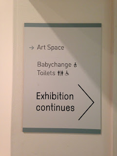
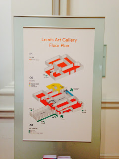
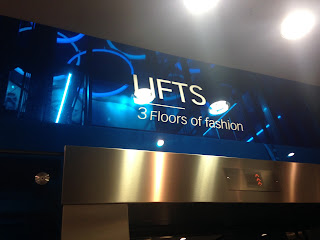
After my initial researching into way finding systems i can see that the designers can be creative with this simple concepts but this has to still include and be based around the main important information. The main focus always is the direction or the place, giving the audience a sense of guidance. All the different systems here use different medias and concepts but all work as they all inform the audience with the need information at the needed time, not before but when the decision about which direction to take is present. The design  of all these unique systems is based around this idea that they interact with the view as they communicate a way with them, in all the main direction are seen clearly from afar, they are clear and mostly simple using symbols internationally recognized.

main features seen:
-bright colours used to catch attention
-bold clear fonts used to be clearly readable from a distance
-obvious from a glance what they all mean (clearly cognitive)
-less important information seen smaller
-use a constance house style on all floors, so it clear when on different floors where the direction are and the systems look the same throughout the environment
-not over complicated
-situated in places people look
-stand out

examples


This example is a clever way of creating a simple wayfinding system that uses the layout form of the rooms on each floor as a base for the floor number type. this look give a standing out appearance because it takes a clear and simple design but adds interest as well as content. Its aesthetically pleasing but also functional because the viewer can see where they are stood from a bird eye view, making the directions more relevant and giving them a sense of direction by basically giving them a map in a more simple form. the audience can clearly see which floor they are on as the designer has used a simple black type that is readable for almost any audience or any level, this  is then contrasted as all the other elements which are white or brown, colours that clash with the main type body causing it to be the main focus.The floor number/current space should always be clear and obvious as this is the first part of information they need to know.  The number is readable because of its larger bold text, its not overcomplicated or detailed which means it can be read from a distance which will also works for someone looking at a glance (as they past by) . Then the artist has created the layout of the rooms on the individual floor as the background, this raises the number slightly off the wall this emerged more attracting more attention  to the wayfinding systems as its brought forward. Way finding systems always need to be recognizable because people will look for the same design every time they need a direction, the current house style here is kept all the same for each floor which means the audience will be able to recognise the direction from far and can clearly see they are the directions,  a lost person cant get more lost looking for for a sign. 
primary research examples

HENRY MOORE INSTITUTE


LEEDS ART GALLERY


BRITISH ART SHOW 8


TRINITY SHOOPING CENTER