Showing posts with label WAYFINDING. Show all posts

Monday, 7 March 2016

406 Studio Brief 3 - Group Wayfinding

Studio Brief 3

This is a chance to get work out of the studio and with pave the way for next year and the future course.

Working as a group we will create a promotional, identity and engaging, campaign for the exhibition, licensed to print money-
what is unique
content (redesigned bank notes) , location (bank house), exhibitors (LCA students) will inform design treatment 
target audience
what do they need to know
how will it engage?

considerations -
location
times
content
exhibitors
social media
contact details
format
signage
wayfinding
opening night invites

There will be a launch event organized

restrictions -
reproduction costs
must be reproducible

mandatory requirements
evidence of time management as a group, planning, dissemination, independent and collaborative practise work, organisation, presentation.

have to come up with a reflect unique identity that is based around a theme/concept that relates to the brief and is adaptable, also must keep in mind production aspects.

RESEARCH
die neue sammlung 


because of audience can be more playful with the design
more creative
almost as if its created with no link to work
interesting design

unplugged exhibition 


As it different work it need a strong branding to pull it all together, to make it seem like a collective group other than separate, make it seem like a group.

all work should be informed by
content
context
location

BY FRIDAY
we need to create a group contract
-emails
-group name
-times i can work

independent and group research
tentative concepts
considerations of group roles

The brief notes that me must consider a number of things with our design process as we work with the group.
These Are:

Location
Times
Content

Target AudienceExhibitors
Social media, links, hashtags etc
Contact Details
Format
Signage/Wayfinding
Opening night Invites


Saturday, 2 January 2016

Wayfinding Systems - Overview, Evaluation


OVERVIEW

final symbols used -


Typeface used over store -
FS ALBERT PRO, this is because the is the font used in the current branding, symbols where designed to fit with this style, curved edges, same weight, same colour scheme, same basic form with a hit of humanity

Environment - 


colour scheme -
Pantone 11-0601 TCX bright white


Pantone Black C


Evaluation. Wayfinding

For this project the brief was o create a wayfinding system for a chosen environment, the environment could be anywhere for this I picked waterstones for the subject this is as I always get lost into the store over time this was clear this was the first mistake I made as I didn’t research into how many different genres there was for waterstone properly. There are over 40 subgenres, having this many and such a wide range of different subgenres meant that I should have created a sign for each different one but as I didn’t have time I had to group the together into the main fields. This means that they wayfinding systems wasn’t as overall effectively useful as if the audience was looking for a specific subgenre that would have to think about which categorises it would come under, this causes the audience to think which goes against the principles of god wayfinding sign theory I research. If I was to do this project again I would pick somewhere like Leeds art gallery tat has a smaller amount of signs but I could creatively design I system for.
Having to create the different signs for each different genre took up most of the time in this project because of the amount I had to do even though I did try and simplify it , I wanted to make sure each symbol has a few different options and create a survey to see which reflect each genre the best. This gave me an overall representative symbol as a results but took a lot of time to mock up all the different symbols and think of the different ideas, for the next brief I will make sure I research the area first before selecting to do so this doesn’t happen again.  The research into good wayfinding systems and the primary research into uses them allowed me to see issues that acre throughout the design process and this informed my decisions as I then knew what to avoid (small type, no paths, overly text heavy). 
The range of design ideas I created for this brief made allowed me to experiment with different types of wayfinding and graphic design, my aim was to do something I wasn’t uses to or create a system that was very different therefore I created 4 unique ideas. Focusing on create 4 different ideas rather than just one then really developing it first worked better as the feedback from my crit gave me new views into ideas I personally didn’t like or think would work. This focused me to think about wayfinding as principle along with what needed to be done as the more the ideas need to be full explained for my crit so the audience could understand them, i created mock ups and design sketches for mot of my ideas that showed me how they would look then allowed me to compare the results.  Using a sketchbook worked better for me as this allowed me to jot down my ideas faster, I struggle to produce work digitally at first so I will also create work via sketches first then make them digital after i have a clearly idea what I want to create as otherwise I feel over phased. Having a wide range of design in-depth made sure that the wayfinding I created was the apt for the environment as it had be developed in detail.
Symbols design, this was the major part of my wayfinding so this was the most worked on part as I needed to make sure the symbols where readable, legible, representative yet also aesthetically pleasing. For the first part I asked group of people what they associated with each genre then create simple sketches of these, then I got feedback on which worked best, then I created them digital, got feedback on which worked best, create a set of the most popular then edited them to correspond together more. The constant feedback informed my design decisions which mean the design where constantly changed to fit everyone views rather than just my personal preferences making them more effective. As I spent so much time on the symbol work I was rushed to experiment with colour ect  if I was to do this again I would leave more time for development of the symbol set.
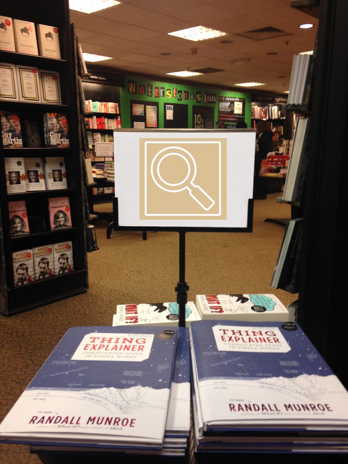
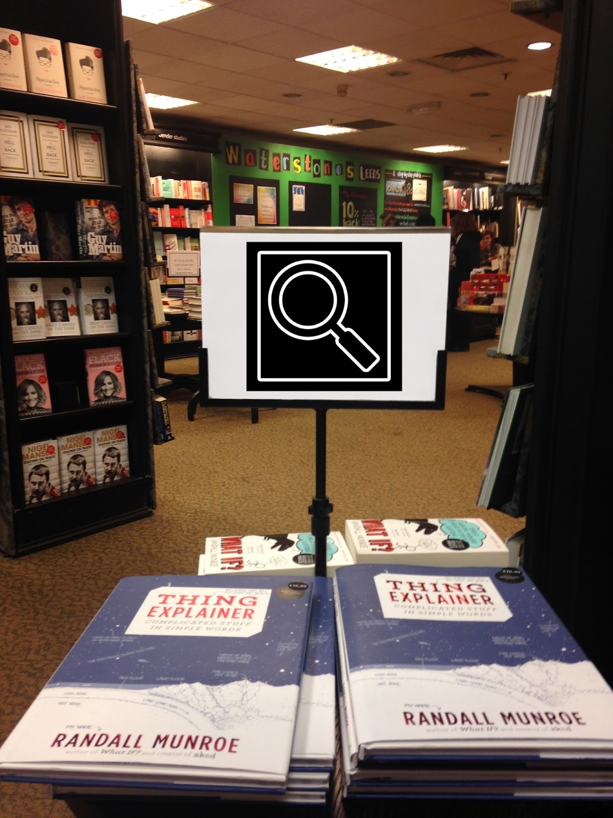
To create symbols that match the signage and branding of the shop I had to study and research the typeface that waterstones uses, this showed me how the company wanted to be represented as a whole and the impression they want to give. To make sure the font and symbols matched I used the same curved terminals, weight and style to apply this.

Production,  I should have experimented more with different materials how I could apply the wayfinding to the environment rather than just using the same system that waterstones already does for the rest of the wayfinding but I keep it the same to keep a constantly house style and brand throughout the shop.


Wayfinding Systems - Final Photographs

IMAGES


COMBINED IDEA - feedback from crit try combined styles


Friday, 1 January 2016

Wayfinding Systems - Arrows


Arrow research


Make sure arrows match symbol style, do this by keep the same style - simple, obvious, basic as possible, thin line, lines only, curved style lines, soft shapes. these are the most suitable shaped arrows


Arrow experiments -
here the arrows that are most suitable are experiment with next to the symbols, this is so they can be compared side by side to see if the arrow matches the style whilst also still directing and having purpose.


edited arrows -
here the arrows have been changed to try and make the edges less harsh and only the header only are uses and these are the only needed part of the arrow therefor this fits with the style of the symbols (being as basic as possible but still understandable).

feedback - 
'2nd of 3rd styles fits the the other symbols better, its direct and simple too'
'i like the 4th but i think it looks more like a gameboy button?maybe not the right one for this setting'
'yeah i like 4 but its too rounded and associated with immature setting so 3 would be better'
'4 makes me think of children, i don't know why'
'i'd say 2 or 3 are better, they look mature but also professional whist sticking with the styles of the symbols because of the thickness and white space'

final arrow selection -


Wayfinding Systems - Symbol Selection

Symbol Selection

Comparison -


Feedback - 
'the first one is the clearest from a distance but that be because of the contrast between the light brown and white in the last, those too work the best'
'the first fits with the current system best, well i think it does, isn't the colour scheme black and white?'
'the white set ones are better as the border isn't standing out and looks more professional'
'i mean the varied colour ones wouldn't look bad at all really, i think with the black ones its just because of the brashness of the edges'
‘I like the full colour ones, makes things easily distinguishable’
‘black and white is more sleek’

most popular -


other environment test-


feedback -
'black and colour is always good, stand out more'
'black looks more professional and formal, i think it because it matches the current system'
'there more obvious in the middle'
'black on white fits with the current style better'
'simple is always better'
'black is more sophisticated'
'i focus on them more when they're in the middle, the top might as well just be the current style'


Thursday, 31 December 2015

Wayfinding Systems - Symbol Experiments


Experiments with symbols 

symbols compare to typeface uses (to check it matches the same style) -


black and white -

colour that relates to the genre -


inverted colour coordination -

Symbol colour changed -


Wayfinding Systems - Symbols Feedback


After collecting data associated with which symbol a group of people thought was the most effective, representative and aesthetically please symbol for each genre, this is the feedback showing the most popular symbols -


This is the over all feedback as separate symbols, but to keep a constant style which is needed as this is a less confusing for the audience, there was a few that needed changing. These are the one which don't fit the the style of line only drawn symbols, they use thicker lines or have sections coloured in, because of this these will need more development to make the symbols appear as a set -


science development-
issue is the lines are thicken then the rest therefore the weight is larger and the symbols standout as different, change this and alter circle in the middle to make them all line only symbols 


music development-
issues was with the weight of the symbol uses, this was a lot stronger than the other but after it was changed it wasn't suitable as it was too detailed to match with the other basic symbols, because of this i have decided to use the other headphone symbol as i feel this fit the style of the symbols and was the second most popular symbol. The constantly changing weight in the music note make it unsuitable to fit the style. 


food/drink development-  


computer development - 


house development -


 fantasy development -


all developments changed -