Thursday, 5 January 2017

503 Responsive Studio brief 1 -, Live Briefs, Beer Mat + Sticker Design

Beer Mat + Sticker Design

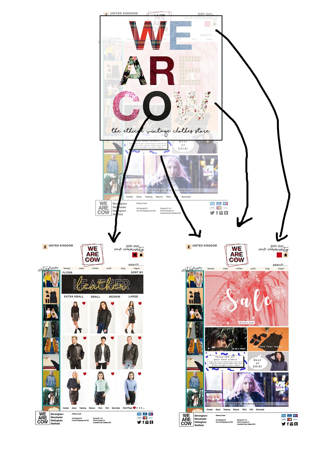
Feedback from a recent crit was that the idea need to be applied to more than just the bottle design, there needed to be range of items produces the company could release/promote or use as promotional work for this outcome. The aim to is create thing associated with drinking where the face can be added, feedback suggested beer mats so these will be designed also stickers and posters this as from primary experience of working in and visit the distribution channels (pub/bars/shops) where a new product is being promoted these are the items used therefore will be applicable for this brief and client.
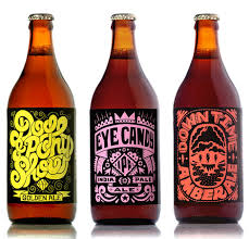

beer matt research -


common features -
two sided
circle or square
have logo on
have branding on
very simple design
no overly text heavy
basically just the logo

mock ups -

size guidelines -


feedback -
-keep it simple
-make sure the face is big enough to snapchat
-this increases product placement
-don't include the follow the pig type, to overly complicated
-direct link to the product design which is good
 -fit well with the rest pf the branding and style
-make sure they are printed on a thick stock
-pig works well here
-very directly informative, like no not needed information


print -


Wednesday, 4 January 2017

503 Responsive Studio brief 1 -, Live Briefs, More Bottle Research

More Bottle Research 

As the bottle label is becoming he main feature of this design idea as the label might be changed to fully wrap around the the bottle instead of the current design which is 2 separate stickers. As this a dramatic design change research into how other cider companies do this, if they do. Research into the layout and style of these bottle will give a basic form of how to design the label of this brief.

primary research -


secondary research 

2 sticker labels-


1 wrap around label-


It was made apparent when conducting this research that most cider brands do use two sticker, a full single label is not a common feature but this could be used a advantagetage for this brand due to way that this difference would make the bottle stand out more whilst also drawing more attention to the face element as it differ from the normal design style. Many of the cider bottle are relatively similar as most of them relay on using the same apple based or ingredient based imagery therefore using the pig imagery more would also create a more attention grabbing bottle design feature due as it would give the bottle a more defining feature stand out against the competitors.


craft beer -
as orchard pig aims to be branded as the only craft cider, research into the label design by craft beer companies as these are more available, craft beer is a lot more ready assessable as than any craft cider. There is wide range of craft beers available even in most supermarket due to the popularity therefore these labels an also be studied as the style of these craft beer and what make the craft beer differ from normal cider via brand styles.


one full label!

503 Responsive Studio brief 1 -, Live Briefs, Feedback

Crit Feedback

Today there was student organised lead crit, this was chance to receive feedback about responsive work idea and any issues currently that need a range off opinions. These was the best time to get feedback for the placement of the Pig face element being added to the bottle design, this is the main output response to the live brief for studio brief 1 therefore asking a range of peers which happen to fit the intended market will be great useful.

the first part of the crit will be used to see if the audience have an awareness of the brand, the aim of this project is to increase the brand social media presence in a way that targets 18-21 year olds. The brand aims to get noticed by the audience, to make them more aware of the brand in aim to increase sales via brand knowlegde.

Have you heard/tried orchard pig cider?
-yes but only for the briefs
-i think i've seen it a few times
-yes, but i don't like it
-no, i don't drink cider
-never heard of it, never seen it
-nope

This feedback shows the relevance of this brief, it shows that most of the target audience don't know or haven't bought the cider, there needs to be a large social presence made to increase this.

The main question asked was around the placement of the pig face as well as around the whole pig idea as a whole, this is in aim to explore how the feel about the concept and if the target market would actually engage with the product in the intended way.

Would you use it?
-yes, i think especially after a drink or in pub, it give a cool game or just something to do interactively with the bottle 
-the caption make me want to interact with it, needs the caption or else i wouldn't think of interacting with it
-i'd test it, it's be pretty cool if it worked
-yes definitely, everyone uses snapchat on nights out all the time so its the perfect setting
-yes, it'd be a cool think to test out
-i think i'd use it but i might not send it
-probably yes
- i wouldn't use it, personally, but i think others would

How do you feel about the idea?
-its a really strong concept, its a god use of an existing social site
-i can see it being used, but i think i could get boring quick
- the logo needs to be included, so when it's shared the logo is shared too otherwise it's just a random pig as the pig isn't the official logo
-good idea

Would you interact with social media a night out/pre-drinks/day drinking?
-yes definitely
-all the time
-snapchat is one i'd say i'd use the most so its fit for this idea
-yes, i think most people post something or send something to show they've got social life
-yes, but i sometime post drunken stupid stuff and delete it the next morning
-probably most of the time i do without thinking
  
Would the product be better places on a sticker around the bottle, on the label, or on separate label?
-the idea could work better on a beermat or coaster? but this would only work in bars
-stickers could allow the company to cheaply apply it to all their exists bottle without having to re-print 
-sticker could be taken off and used by the me, like on my shirt
-would it work on the bottle? as it would be a curved image?
-test all the ideas and then see, ill give more feedback after seeing the designs
-the company might not want the bottle edited, try the stickers
-sticker means if the idea failed or became boring it could be removed easily
-will it work at a smaller size? sticker need to be smaller 

Any other general feedback or ideas?
-make a set for different pigs for the different bottles in the set
-its more interesting than the usual boring social media stuff  
-could even be applied to posters or like stands, anything related to the cider 
-it need to work, if it doesn't work its slightly pointless but the client and brief would probably pay someone to do this if they liked the idea
-its about the idea, try and get it working if possible though
-doesn't the brief explain they want to branded as the only craft cider, theres not mention of this 


After the crit it's been made clear that the idea does have a place in the market and would be used by most of the target audience but this is only if the final item works in real life application but for this submission the idea could be used as the company would be able to find a more advance designer with a greater knowledge of the mapping feature if they wanted to use it. The idea is strong but the major part of this brief that has been overlooked is the craft cider element, this needed to be built in now, find someway of using what is made but also involving the only craft cider aspect.Test out stickers and the labels ideas to get more feedback, stickers could probably more functional for the brand as it's cheaper.TEST BOTH.

Sunday, 1 January 2017

504 - Design Production, Design For Screen, Gif Experiments

Gif Experiments 

Feedback from a recent crit was that a that a GIF could be used to show the mass of style individual without being overly decorative and distract from the site features. The header idea currently is used to reflect the style on the site, these is a range of different time frames, trends and style portray by these therefore using these in a gif might allow the the site to reflect all these style in combination.

GIF HEADER TO REFLECT RANGE OF STYLE IN ONCE FEATURE

A GIF feature for the site would also taken advantage of the on screen design media being used to create this site, it would be a feature that could only be applied to the site via this medium.

This would enhance the engagement of the user with the site as it would create a constantly change feature on the page that would keep their attention whilst reflect the aesthetic of the brand.

headers used -


https://www.youtube.com/watch?v=Z3egWZWKtHc


After effect has been used to create this mock up gif, the headers last for 1 second each this is o the audience can read the text to make the header functional whilst seeing the style reflected.

Headers Applied to Site -


https://www.youtube.com/watch?v=_S3kn3z58cM

This gift shows how the header would look on the website for the band, how they would change and where they would be places, this allowed feedback to be collected for this idea.

feeedback -
'the header GIF make the site more interesting
reflect the style well, the design is on point
GIF time frame works well as the can still be read
make it quicker maybe? the first one seem to be there ages so i might not see it if i was quickly look at the site
personally its too much with the design of the site, its too busy
its more interesting so causes me to look at the site for longer.
good idea
i like the GIF part

Since the overall feedback for this element of the design as positive the GIF style headers will be applied to the final site on all the main pages, female, male, vegan , unisex and outfit as the headers for the pages.As the pages where designed to all have different headers the pages will have different GIF set, these will use unique design style and trends for the pages.