Saturday, 17 December 2016

503 Responsive Studio brief 1 -, Live Briefs, Does It Work?

Digital Pig Face Mock Up

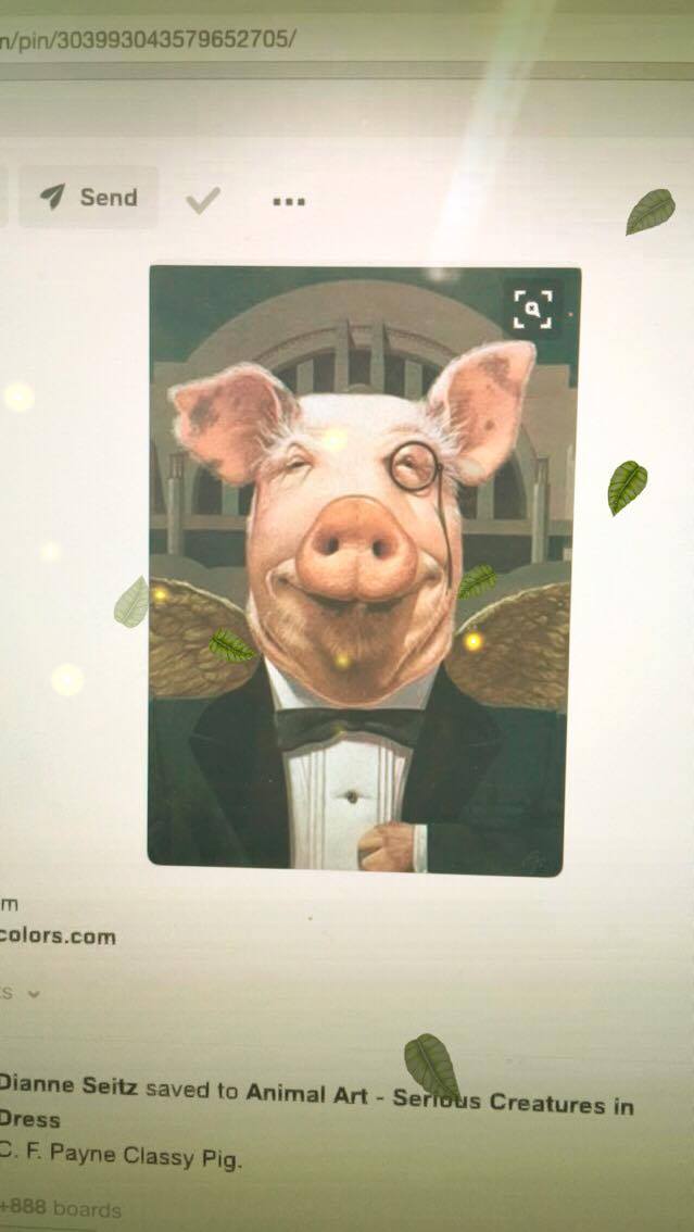
 This is the aim for drawing that feedback suggest was the most suitable for this brief

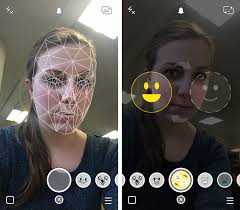
After search thought for images of pig face for previous research to see what type of faces work with the filter many realistic drawing or images didn't, to make sure this face will work a large amount of development will have to be done to the face once it's been mocked up.  Research showed that the faces that are more simailr to human facial features in layout and size worked the best with the mapping or the lens are these are picked up easier therefore the feature of the mock up will need to be as accurate to human as possible without effecting the asethetics.
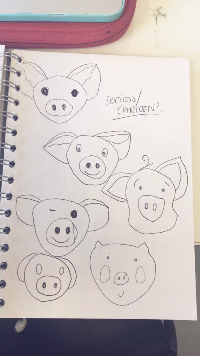


mock up face -


-eye have been changed to make it more human

 FEEDBACK-

Does it work??

YES!This face worked with the mapping feature and let the lens be applied

Adding text, as the face needs to have information about how the user can interact with it, this is so that more users is aware of why the pig face has been added and design. To express this type in the same style as the brands logo, and the bottle label has been created to see how this type can work around the images.
Including the logo in the image is vital as image that will be heavily shared on the soical sites yet the pig it's self has no obvious connection to the brand. Designing the logo as art of the image will mean every-time the brands logo is shared the user is also interacting and being made aware of the logo, this will increase brand awareness with the target audience via sharing the image.

The logo of the brand has be stated by the client not to be changed due to this the type cannot be alter to fit round the image but must be place a suitable area. The text cannot overlap the Pig Image as this would effect the mapping feature but also mean when the lens is add the text would be effected too due to alteration lens give to the image this could make the text eligible.Th text has been placed between the ears to frame the image, as well as this layout this fits best with the curve of the text due to the lettering placement in the logo.

 It has been identified the text need to inform about the 'hidden' feature of the image, so they audience are drawn to the image whist also encouraged to interact with it's social media feature more.  Making the snapchatable feature more obvious to the audience. The phrase 'snapchat me' has been used to give personality to the pig whilst also stick to the lighthearted casual tone of voice set by the client. The speech bubble has been added to draw attention to the text whilst also linking the text to the image via the audience knowledge that this style of symbol represent speech directly linking the text to the above image.  The speech bubble takes the colour from the current labeling of the bottle in aim to fit with the client colour scheme and branding style.


ISSUES


due to the largeness of the ears of the pig illustration once the text is added its forms large face  around the pig face which is instead picked up by the mapping feature, the ears take the form of the eyes and the text as the mouth. This means the ears will need to be made smaller as to reduce the risk of this happening again. Also the size of the eyes on then pig face will be made bigger as to increase the chance of these being picked up instead.

fix -


The ears have been made smaller and the eye made bigger, this had made the face large more suitble as it now its very easily picked up via the range of lens. These tests show that at this size the face picks up all the lens and applies the features of the lens to the correct part of the pig, the glasses are applied to the eyes correctly, the flowers applied to the head correctly showing this face works accurately with the mapping features. THE NEW FACE IS CORRECTLY MAPPED

adding text back -
Adding the text last time was the issue  with the design as this effected the mapping therefore the application of the lens on the face, tests with this now edited version of the Pig Face will see how the text works in combination.


THE NEW FACE WORKS WITH TEXT

Placement of the text Experimentation - The face now works with the mapping fitting with the aim of the idea create a piece that can be interacted with using snapchat via the users. Now the issue is to make this Pig Face label fit with the rest of the banding and label for client product, text developmental work into the layout of the label will be done to achieve this with the aim of allowing the label to fit more with the front label style and the rest of the bottle design.

The text has been added to the top of the image in attempt it not be picked up as teeth, changing the  layout to the top removes the lettering from reflecting teeth due to the layout. This has been done to reduce the risk of it being capture by the mapping as another face larger than the wanted pig face.

does it work?yes, type works more accurate at the top


layout development -


 colour experiment added-

 link to other social sites added, branding typeface used  -


 label colour scheme added-


decription added/type layout change


does it work??
YES


FEEDBACK


Saturday, 10 December 2016

503 Responsive Studio brief 1 -, Live Briefs, Development

Mapping Feature

The snapchat app appiles lens to the faces of the user via a face mapping technique, this picks up the many facial features on the user then applies to the lens to their face accordingly.

'The app uses computer vision to spot the user based on contrast patterns typically seen in and around a human face; however, that’s not specific enough to identify, for example, the border of your lips or where to put that dog nose.'via https://petapixel.com/2016/06/30/snapchats-powerful-facial-recognition-technology-works/


The final idea for this project relays on the Pig Face Label part of the bottle being picked up by the snapchat lens feature and therefore applying said feature to the a face. A test will need to be conducted to see if the snapchat mapping feature will work for pig faces, pigs illustration style faces or pig drawn faces. The test will done on basic faces from google of the same style to see which layout of faces, what type of style faces the mapping picks up. Once this has been identified the face can be designed so that it's picked up via the mapping feature.

does it work on pig faces??


cartoon faces are the most successful 


 real photography of pig does not work


simailr to human face structure the better


 lifelike imagery of pig doesn't not work either

This research has concluded that along as the faces include a basic layout of a nose, eye and face shape simailr to that of human the app seems to pick up the face. The app does not pick up real life accurate faces photographic images therefore the style of pig used has to be a more cartoon/ illustration imagery than a accurate pig face. Cartoon imagery works best along as the ears are picked up as ears not eyes.
 
style of design aimed/design style inspirations -

Eventhough research showed the more artist illustration style of pig was less picked up by  the app then the more cartoon basic style, this is the due to the less accurate layout design of the faces, the faces mimic those of human style feature less but the design/aesthetics of these images fit better with the tone of voice/brand of the client has set. The clients branding is a range of printed or textures style imagery or text, therefore to fit with the existing branding and bottle design the face need to follow simailr design style which is seen more in the illustration style faces than the more cartoon face style. Also the tone of voice set by the client is very lighthearted humorous style, these images fit more which this due to the playful nature, many of these pigs seem more happy than the other research, this need to be portaryed to reflect the positive style tone of voice set by the client.   


features/aims need in pig imagery-
-happy/smiley
-unrealistic/cartoon/illustration style not photography
-basic layout similar to human faces to allow mapping to work
-represent pink
-humourus/lighthearted/cheeky
-block colour/print texture, fit with branding

first sketches - 
does the mapping apply to any of these without any other editing/colour?photo taken using snapchat with the lens options on, none of the face where picked up, so basically NO.


After studying the branding of the Orchard Pig Cider, the logo depicts the pig with it's ear down, these sketches therefore experiment with the pig having the ears down rather than up. 
FEEDBACK -

After testing the ear down style of imagery it was feedback that these pigs out of all the sketch felt they had the saddest tone, this due to the nature most people relate ears down to animals being upset/not alert. As this contradicts the clients existing branding and tone of voice this shouldn't be included, as it was felt by the crit as the pig 'isn't going to accurate anyway to the logo as long as the pig takes influences from the bottle design/style, for example typography, bold colour choices, postmodern style ect'.TAKE INFLUENCE FROM BRANDING

'The brief has a very strong overtone of cheeky, funny jokes about the branding maybe try a more cheeky pig style, like the winking one more' MAKE IT MORE CHEEKY/FUNNY

'The simailr cartoon style imagery seem abit to simile, it's more something i would associate  with children's cartoon than alcohol' USE A MORE ACCURATE STYLE OF IMAGERY

'the images on the first page seem happier due to the smile,  try to include this' MAKE THE PIG SMILE'

'Cute pigs would appeal more,  it need to be playful, happy and cute'

'The ears look better up, it seems happier'

'don't want to be too child like as it could appeal to a too younger audience with alcoho, need to be fit the market' 

'make it realistic but cartoon style, so it looks like a pig but a cartoon pig, not like the too simile ones'

'far appart eyes works best, pigs eye aren't close so butting them close make ti seem too overly cartoon'

'the emoji one seems unfit for the branding'

'the sketched ones seemed to delicate, like too arty where are the brand is quite bold'

'smiley is defo better, cheeky and smiley'

From the overall feedback it was made clear the crit felt the best type of face suitable for the pig was the bottom one on this page, this was highlighted by many as the most suitable as the more accurate style of it fitted with the more adult target audience.The crit felt the smile on this image fitted the tone of voice set the best, whilst the overall sketch was that this is the style to take forward.Use this face but edit it digitally to make it work with the mapping and add colour.