Friday, 11 December 2015

How do you read? Flipbooks Reseach


FLIP BOOK RESEARCH

idea - basic flip book using different colours to over lap, mix and match to teach children interactively about colour theory and how CKMY work along with what colours make which.

existing research- 


This is the first flipbook i found in urban outfitter, it was a book allowing people to play dress up with the characters in different types of clothes, mix and match different outfits in a fun why to create unique looks. The way it was created was with a ring binder to allow more smooth flips and let the paper have more movement, this was a really good way to created a book as the sections where obvious and clear. A ring binder allows for the sections to bee matched more effectively as the audience has more control over the pages as they can move them completely round, rather than being restricted by any other binding method. It also adds to the visual look of the book as it looks more professional as there seems to be more of the image seen, the ring binding method has a visually and function benefits. Easier movement, full image view, more professional quality, full section rotation.  This book uses very free handwritten script to seem more high class/fashionable as these are are styles used by the traditional more fancy fashion brands, this books uses this style text and a simple layout to recreate this theme. The colour scheme is very loud and wide this is as they want to flipbook to seem fun and interesting, they want to appeal to the audience by seeming fun yet creative therefore using bright, loud, wide range of colours shows this. A simple colour scheme would seem too serious for this book, a large fun colour scheme makes it seem informal, fun and creative.

This is a more serious flip book, this is show in the dull background colour that seem more serious, also the imager seem more serious and less existing because of the sad illation why they are drawn. This book seems more formal because it uses more accurate realistic images, the artist does this because the issues is health which is a more serious depressing matter and they want to show the long term effects of drinking on young males ad use a flip book to show the change directly. The flip function is uses to show how they can still look the same face wise but the effect on the other parts of the body in different stages of alcohol abuse. This book is bound using a tradition binding method, this allows the pages to turn but in a more controlled why, there can be less combination of the section because they cant revolve fully.


 This book is very similar to the first , i've looked at this as is aimed more at children so uses different images and text styles, but the overall layout and design is the same.Even thought the target market is different and will have different needs this shows hoe the same idea can work for all ages, how this style is fun for everyone yet also doesn't need instructions. This book is very effective and popular as as functionality of the design matches the aesthetic value.


Tuesday, 8 December 2015

Typesetting/Study Task 8


Design Principles 

Typesetting

Grids are used in book cover deign and ideas, this create organised and intellectual elegance in the design, this fits with modernist principles. Modernist approach to typesetting is mostly associated with left aligned type, this is because we read from the left and also because it its better for the eye to do to the next text. this created a text that is easier to read, it makes it easier not he eye because it knows where to go and can be used for a lager paragraph because of this as it makes it less stressful for the read. For type always set 8 on 9, 9 on 10 and so on, this give the ye a larger break and spaces out the lines more causing a more balanced space that allowed the reader to focus on each separate word more clearly when reading. Legibility  and communication are different, don't confuse them, they can and are used for different thing. Use this idea to enhance the style of the work, express and explore the idea that what you are communication is more than just type, add details and different aspect to inform your design and improve the communication. 


TASK

The Mouse's Tale
by Lewis Carroll

"Mine is a long and a sad tale!" said the Mouse, turning to Alice, and sighing. "It is a long tail, certainly," said Alice, looking down with wonder at the Mouse's tail; "but why do you call it sad?" And she kept on puzzling about it while the Mouse was speaking, so that her idea of the tale was something like this:—
Fury said to a mouse, That he met in the house, 
“Let us both go to law: I will prosecute you.”
Come, I'll take no denial,
We must have a trial,
For really this morning I've nothing to do.
Said the mouse to the cur, 
“Such a trial, dear sir, 
With no jury or judge, 
would be wasting our breath.”
“I’ll be judge, I'll be jury” 
Said cunning old Fury; 
“I’ll try the whole cause, and condemn you to death."


post modern idea - 
this text is based around the shape of a converstation on a iphone/text, this is the shaped used and recreated for this poem to make it clear who is speaking when and what they are saying. 

`


modernist style - 


Sunday, 6 December 2015

Wayfinding Systems - Idea 3/ Road Signs


IDEA 3

SIGNS-
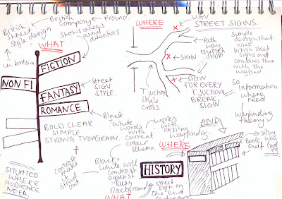
Idea books can take you new places, the idea is create signs for each area to reflect how books and reading can transport the audience to a new world or place. Signs that are recognizable and obvious, directly seen as directions because of visually literacy but also portray the idea that shop wants to be seen as strongly British by using retro British road signs.


this idea is based around the concept that the shop is so heavy typographical based that to make a sign/direction clear it need to be in a formate the audience understands and looks for.The signs taken the form of existing traffic or road signs will allow the audience to see them directly and focus on them when they are lost as they will be associated with this style as a direction in everyday life. Road signs will be bold and simple in a way that has already been scientifically proven to direct and stand out therefore would fit the aim of the brief well as the colour schemes, styles and design have been worked on by many different people to perfect this. The signs will be slightly edited to make they fit the style of the shop more, differentiate the style for the different main genres.

The signs will be placed at all the main entrances and path ways of the shop, the road fork style of design will then give a clearly direction to the audience so its clear which direction to take.

existing signs for guidance at cross roads - 


street sign research -


design sketches -


non fiction sign -
Kept realistic to reflect the type of books in this section, serious and informative but this style of sign was picked as it most creative yet direct also the white red and black will stand out against the colourful textual background because of the simpleness of the design. This work with the current wayfinding colour scheme as its the same colours, helping all the wayfinding systems link together. As the company is typically British and seen as a strong British brand using a British style of sign as the main signs will reinforce this ideology.

fiction sign -


Same sign used for all the main sections (children's, fiction, non fiction) to help keep a constant style but each of the sign has a different typeface for the title of the area. This is for the fiction which is a made up, not realistic, more creative style of books therefore this is a font has to reflect this. Finding a font to represent all the different sub-genres of this wide genre was difficult but this was picked as its very creative therefore reflects the idea of unrealistic in a general way. This was selected because overall its still very neutral, slightly different and crazy due to the unnatural forms and unique letter style which does differ between each letter but still not overly powering for one of the many different fictional genres. The only parts changed are the arrows and the title, this is to keep a common style between the signs and the make them clearly recognizable they couldn't be edited too much and lose their defining features.

childrens sign -
scrabble letter made bigger
Here scrabble letter are use to reflect the children's section of the shop, this is as scrabble is game therefore using this style will make the section more fun and interactive, scrabble will be recognised by children and adults as young/childish therefore will directly show the audience of the area. The letters are added is a more messy, mismatched less formal why also to make the area seem more fun and interactive, the area needs to be seen as less serious than the others and this does this. the arrows are hand drawn childlike arrows that will again make it obvious this area is for children as it looks like its been drawn by them.  

other directions - 


To create the directions to the other parts of the shop, the needed areas this idea was to a use a contrast colour style of sign but one that will still work with the other design. Therefore i uses this smaller style which is uses more for public footpaths, the letters are smaller as people will usually be on foot so can get closer and will be walking so they have more time to read the directions. This style fits with the other designs because it uses the same main fonts but with the contrasting colour scheme use is the opposite way to make them stand out. 


Friday, 4 December 2015

Wayfinding Systems - Idea 2/ Symbols

IDEA 2

SYMBOLS/COLOUR -
'A symbol is an object or a concept that represents, stands for or suggests another idea, visual image, belief, action or material entity. Symbols take the form of words, sounds, gestures, ideas or visual images and are used to convey other ideas and beliefs.'

For this wayfinding system the aim is create a way of expressing direction to each genre of the shop via symbol and colour scheme.This idea is to create a set of symbols/colours for each of the genres that reflect how people feel and think about it then to use this to direct them via the use of a sign or poster. Using colour and objects the general public associate with each different section will allow the directions to be type-less which is one of the main aims of this project as typeless symbols will stand out more against the type heavy background. The use of symbols and the addition of colour will working using the visually literacy of the audience and will allow them to directly see where they need to go. Symbols can be use by any audience and are multilingual which also fits the aim of this brief as they will not be in just one langue but use an idea that will relate to all people. The symbols will work with the existing system to give the more general direction for each section but then the type will allow them to search once they are there. These will also work for any age who can or cant read as they don't include type and will be very clear from a distance as the symbols will be simple bold and clear.

Symbols are the most common type wayfinding systems, they work for any target audience therefore are very versatile and widely used, this shows how they work very well as simple directions and instructions to inform the audience.


Design Sketches


Wednesday, 2 December 2015

How do you Read? Hexaflexagon/Primary Fold


Folds Ideas - 

for my children book design i found the last fold, the Hexaflexagon Fold would work well because it related the a fold they will be common with meaning it needs no instructions but also works for the idea it couldn't include much text as the audience might not be able to read that well. This fold is interactive in a way, they can see directly the infomation in the selected order the design will lead. it give 4 main sections at first then, the 8 the next level then 8 corresponding sections under.

steps showing the unfolding of this design idea


Tuesday, 1 December 2015

Wayfinding Systems - Idea 1/Interior

IDEA 1

INTERIOR – the aim of this concept is use the interior of the Waterstones shop as the main part of the way finding, use the surroundings to inform the audience of where they are while directing and separating the unique genres clearly using symbols, items, colours that reflect the genre. The aim is to make clear the different sections of the shop by using the interior as a direct way to navigate the shop so the audience will recognise with are they need and will be based completely on the decoration in the shop rather than signs or labels. This will be the more direct way to constantly inform the audience without the need for text or even for the audience to think it would work using their visual literacy thats part of the brain they wouldn't even realise they were using.  This will be an effective way to communicate in such a busy environment as it would be able to been from all angles, all heights and all areas of the shop as it doesn't relay on just one sign. Its also a more interactive wayfinding system that will enhance the visual look of the shop as it can be done is a suitable creative way.  The interior will also stand out clearly against the vivd book cover designs as it doesn't heavily relay on typography. 

This already done for the children’s section in most book stores and even some hip clothes store use this technique to attract a target audience to the intended department eg (mens uses blue women uses pinks), as it clear when the audience is in each section because its created to interest and draw their attention by specially appealing more to them. The shops display the produces in a way that appeal to them whilst surround the products with objects and colours that are associated with the intended market and theme. In book stores its only usually done in the children’s section as this is the younger audience that rely more heavily on visual design to keep them interest, the rest of the shop design as most use minimal simple designs to show their products in a serious more formal setting. The formal setting is very serious and sensible as it main idea is to showcase the book but would an audience prefer a more creative feel for the fantasy/ fiction section and a more direct why of noticing the fact area. Modern trendy more popular and expensive shops like Topshop and Urban Outfitter are starting to build their interior around their products and styles, they use different media and styles to gave their shop a more collective unique style overall as the audience feel more involved in the shopping experience.  

expressive shop interior - 


Here Urban Outfitter is aim at more hip different younger audience that will like retro style clothing therefore they uses a more mismatched style int their layout. Older more 'cool' stereos are included with non purpose but to add to the visual aesthetic appeal of the shop. To appeal to an audience that wants to see very vintage and unique the interior is all old wooden displays that make the products seem more casual, this shop doesn't seem posh or serious too appeal to a student audience.


existing children book shop interior -


From looking at existing children sections in bookstore i can infer that this concept already works for this section, this colours are bright, bold and the whole design are fun. This makes it directly obvious for the target market that this is their section because this is the main ideas that will attract and appeal to them, no signs or directions are needed because the interior speaks for its self. If this style works for this sections so well the aim is to transfer and use it for the rest of the genres.


The idea is that the audience can recognise where you are from the surrounds in the shop, no signs but relaying on the colours of the wall, future, book shelf ect to portray the genre the audience is in. Making the genre instantly recognisable so the audience is never lost as they can see which areas are for each selection of books fro afar, this relays a lot on the idea of creating a way

design sketches 


first two mock up for crit, help explain idea visually


How do you read? - Folds


FOLDS

Interesting folds can enhance book design in a way that interacts with the audience to spark inspiration and a pleasurable reading experience. Unique fold make the design more inventive as they are a different feature not usually seen, they can have practical uses or just aesthetically purposes. There are many different types of folding, all these below are uses for different purposes so the folds of a the book can allow the audience to read as they are guided by the layout of the design.


More delicate folding will only allow for smaller parts of text/content to be included where as larger section allow space to be used more creatively. Different styles of folding give the designer a large focus on which information the audience reads first, the first parts they look at and the over all visual hierarchy. Folds allow a direction in the book because they show the information at different point, there a way to follow the information whilst see the order,  this is as the user will open it showing the needed information first.


Folding may also help documents stand up or be displayed in a certain why, like above the designer has included the back fold to allow the document to free stand by its self.

Research, Creative Folding 


Here this leaflet is folded so the title is the first point of focus then when its opened up it expands to include more information, picture and data. Folding this booklet in this why reflect the concept and ideas of the creative college it is advertising, this is because its created in a more creative visionary way.  It expands from a smaller easier to carry document into a larger more informative document that shows all the necessary content . This allowed the first page to simple and direct, not over powering because the leaflet expands to include the rest, its informative but also designed in a way that isn't overpowering or seems to much, its simple to read because the folding shows directions to the order.


this is a more simple when to fold, it falls out in a timeline style document that follows the same pattern. The eye is drawn downwards to follow the text in a descending order. The text is separated in to different section by the folds but overall works as one document by being seen overall as the one leaflet because the audience doesn't have to flip over the text its seen in more flowing consent line rather than a broken design. The fold are used to combine the separate parts of information but not so much that the data context seems all the same. 


This is first a simple leaflet that fold relatively normally in to a hot dog book, but after that the design then unfold completely into a full map image. The back of the information is used to fold out into a full bigger image that relates to the topic, this allow a large image to be contained in a smaller book.


this here is a more delicate fold, it folds out to allow the image/illustration to seem to grow/expand. This make it seem more like the flower are more delicate and real, also it gives a direct hierarchy of information because the information on the outside is seen first, then the second layer, then the third last. Its has to be open part by part so the hidden information can be seen, this shows the reader the infomation at different points to allow it not to be too overpowering or confusing. It also mimics the same style of a Hexaflexagon, a game that is play mostly by school children in the play ground, its simple to understand and to make and therefore doesn't need instructions as the audience will already know what it is as they will have seen it before. its a widely uses fold that shows information in stages and gives folds that reveal selected information at different points and the layers have a direct connection, giving the fold a flow that connected the different compartments. It also uses folds that separate the different section because no everything can be seen at once, this would work well for a question and answer game, like it is in most school playground or for a guessing game.