Thursday, 3 November 2016

504 - Design Production, A - Z in Content, Final Mock up

Final Mock up 

This is the final mock up for this brief, form the planning schedule this should be finished for the final brief as this was intended to be the final publication but due to issues highlight here this is not the case. All the parts of the book have been completed in the correct time scale but due to mistake and issues this book will form another mock up but will be shown at the final srti so the peers can grasp an idea of the final book layout/design/style as well as this will allow any final changes highlight in the crit to be added to the final book.

WAS SUPPOSE TO BE FINAL BOOK BUT HAD ISSUES

ISSUES
-the binding was done too far back this meant hat the book has to have additional functional stitches added to allow it to close and open easier as well as to give some support to the book. do the binding closer to the fold/crease, also make the binding tighter to avoid this. 


-also the pages where folded by hand using a ruler, this mean that even thought all the pages where equal length when lined up the creases are not in the sam place or straight, this effect the end of the book as all the pages where different length which gave off a messy unprofessional finish which does fit with the idea of the book but wouldn't interest the target audience. use the folding machine in digital print to avoid this


-Also when putting this book together the bookrum was cut too short, this mean that when folded at the corners it left a space, this looks unprofessional as its an incorrectly covered book therefore doesn't fit with the aims of this brief. make sure the bookrum is 3mm longer at the corners and a rules thickness around.


- the glitter inside the book wouldn't stay inside or attach the page or cover, this meant the audience got covered in glitter when the open the book, this cold be good or bad as it can be used as a good point as people leave festival covered in glitter so it expresses the experience and reflect the aim very well but also the audience might find it very annoying. The glitter inside the book need feedback, should hair spray or spray mount be used or tested to allow it to stay inside the book. Ask in crit 

all this issues will be avoided with the next production of the book, learn form the mistakes of this final mock up to inform the final outcomes

CRIT FEEDBACK-

FINAL FINAL MOCK UP ISSUES

after completing the last mock up for the crit, the next step was to complete the final book itself, for this all the step needed to be done again, this is what happened with this production of this mock up -
pages printed 
then cut (issues)
then alined
then folded (issues)
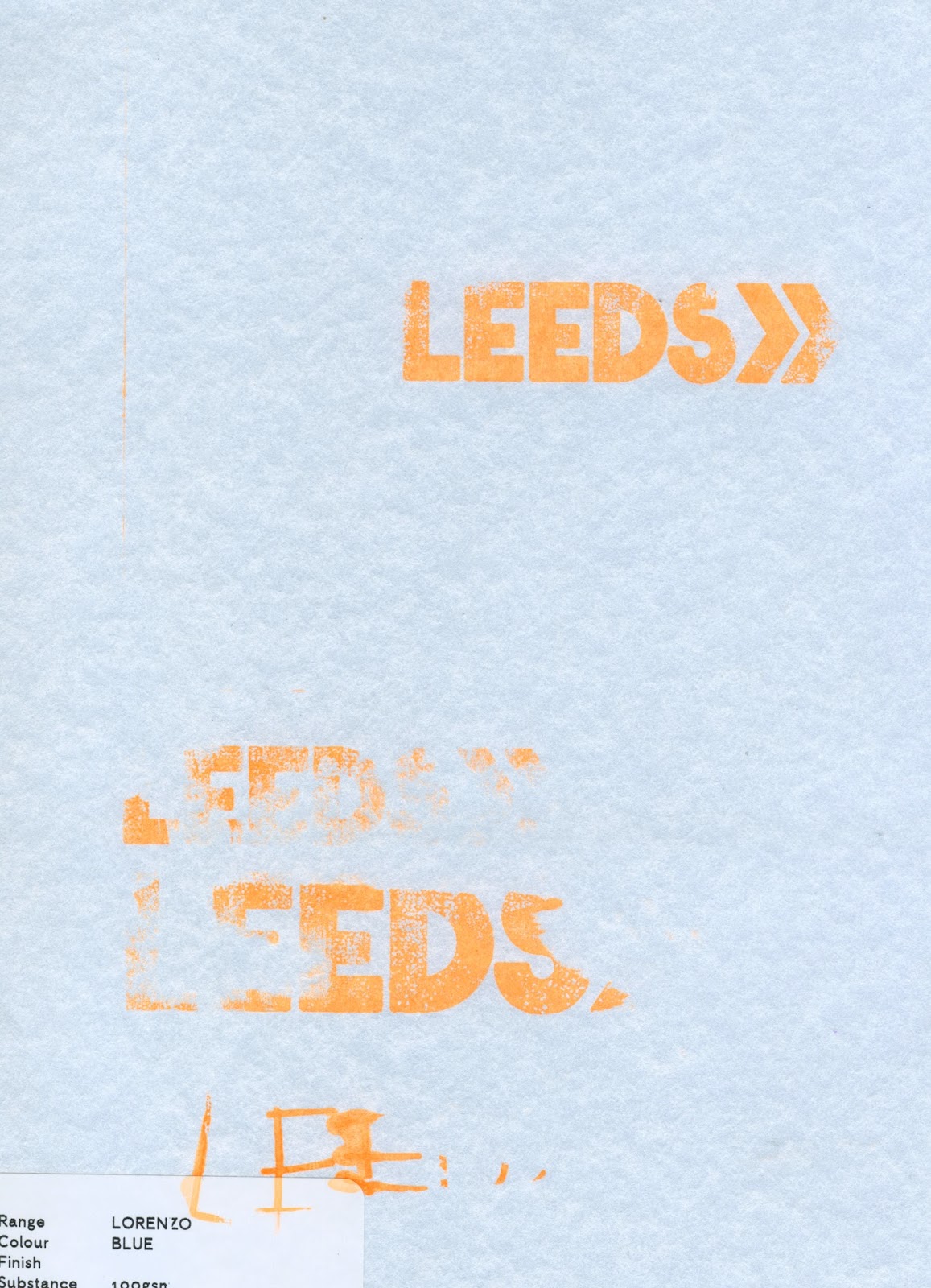
cover screen printed
book rum applied to grayboard (issues)
holes (not done as too many issues with other stages)
binding (not done as too many issues with other stages)

cut (issues)
all the book in this brief have been cut by hand this is due to past mistakes when pages have been cut down far too small due to the use of a cut machine, therefore cutting by hand it the prefer technique for this book to allow the most accurately cut out and equal page size. This worked fine for most of the pages for this book except 1, the one below which was cut slightly smaller than the other as i slipped whilst cutting. As this page has been cut to small it will need to be re printed for the final book. 

Also as this pages were left on the table when being cut one of the pages accidentally got a mark on it, as this page happened to be the white inside pages it will need to be re-printed. This pages need to imitate a formal book page therefore cannot have any mistakes as it will make the whole book seem informal/too casual to sell.  reprint this page and keep the pages in a plastic wallet so they don't get damaged again 


folded (issues)
When this book was created it was designed to fold at 2.5cm, this is where the crease on the cover is situated but if the fold on the pages is here it means that the pages have to be straight lined up against the the binding edge which wasn't design like this due to feedback and research that states it looked more pleasing with a 3mm gap, also folding can be seen from inside the book which makes it harder to open/read. The cover will need to be changed so the binding crease takes up 2.8cm -3.3 cm so the fold in the pages are hidden, the cover is being changed as seen below there was issues with this anyway, its cheaper to redo the cover than re-print the whole book, as well as all the pages would need to be redesigned as there are set with a margin of 2.5. Overall its more productive to redo the cover than the pages overall for this brief. Change the crease on the cover to 2.8cm -3.3 cm  


book rum applied to grayboard (issues)
When starting the final book the cover was done on the final bit of buckram available at the time, this as a smaller section that wanted but would work if pulled tightly. This caused issues when being produced as whilst trying to pull the cover tight over the grayboard it causes the production to be more messy, this got glue accidentally on the cover for both sizes. The nature of the bookcloth os that if glue gets on it leaves marks, therefore the cover couldn't be used for this brief as it would cheap/messy produced which wouldn't fit with the distribution channel style or apple to the target audience. For the final book the area when cutting and applying the glue will need to be very clean and more bookrum will extra space will need to be bought for the final cover so that it doesn't have to be pulled/to make application easier. 


THE FINAL FINAL FINAL BOOK will be done again with all the changes in mind, the same majority of printed pages will be used to reduce cost but the pages that need changing will be redone. The cover will be redone on both colours of bookrum as the feedback from the crit preferred the duller colour as they felt it  worked better with the colouring of the images. There will be screenprints redone on both materials again and the best version will be picked. The crease on the covers will be changes os the current pages can be used. Glitter will be attached using hair spray. biding will be done closer to the fold. Bookrum cover will be bigger and the application will be done with more time and effort so its perfect for the final cover. 


FINAL SIZING CHANGE`
since the feedback mock up created has issues with the folding crease on the pages not matching up with the one on the cover the crease will need to be moved to work with the pages due to final retrains. The pages are cut out so there 2.5cm margin on the left size for binding and then the images are full accurate size 6x4 imagery. To assure the cover fits and work with this size the cover a paper test has been preformed, this is so the size and crease can be altered to fit with the size of the papers easily. This will assure the final book cover is fit for the page size and folding.  

first test - 
18.5cm x 11.5cm, 2.5cm margin
This test doesn't allow for the same gap around the pages, there is more room at the sides that is at the top/bottom, therefore this size will need to be altered.

19cm x11.5cm, 2.5cm margin
this test has an equal bored around the paper but the folds only match up when the paper is placed at the edge of the cover, this need to be give more room. 

19cm x11.5cm, 3cm margin
This is the correct board around the book but also has 5mm so the pages start slightly later than the cover which is effective to give the book a more professional feel.


final book cover with the size change compared to the pages


503 Responsive Studio brief 1 -, Live Briefs, Picked Briefs

For this studio brief at-least 3 outcomes are needed, larger brief like for example D&AD, YCN, ISTD, RSA along with 2/3 smaller brief for example, Secret 7, Penguin random hose book design, Feathr wallpaper design.

These are the examples give the course as a whole, this will make these harder to win due to the fact that most people on this course and in this year group will be taking part. For this brief any student design award can be entered therefore personal research into over competitions will give a wider range of opinions for the final outcome and maybe more chance to take part in a brief with less competition/influences by peers.

WHAT IS NEEDED
-good ethics, helps students/promotes work
-price money/price
-low entry fee/no entry fee
-famous/recognized brands to get name out
-not just free work
-interesting briefs
-wide briefs, mean ca create output different to most submissions
-more than one entry/more than one chance
-feedback given

Research into design awards


-The Design Week Awards

-Design and Design Awards

-International Design Awards
entrance fee $30-$50
no site for this competition available
American based

-London Design Awards (Graphic Design category)
have to nominate one piece of work
advertising/graphic design sections
£220 to enter, very expernsive

-The Graphic Design Award by Yamaha (GDAY)
large price money
international
large amount of competition, 1100 last year
multiple submissions

-HOW Poster Design Competition & Awards
cost the enter, $50, less expensive than other expensive
no longer running

For this module the aim my personal aim is to create work for my portfolio, work that is visually pleasing personally to me as well as for the client and that i've over all proud of and enjoy to make. The aim is to create the same style of work i've enjoyed in the past but also Chagall myself to create a soultion to a brief that is maybe outside of my specialism or my area of graphic design, for this we can do illustration briefs or animation briefs as well as briefs for branding ect so it will give me chance to experiment with this type of design.

Interests -
album design - last year secret seven was the brief i enjoyed the most and also the one i felt was strongest from my work last year, had the most ideas.
adverting - the big ideas and conceptual work which attract the audience
decorative typography - fancy old fashion style type
book covers - the design of book covers has always been a keen interest but a few year ago i create an entry for Penguin Books and i feel over all this is one of the strongest piece of work i've personally made.
historical design - old style of design, like type and book covers
print - the benefits of print and how print can improve the final outcome for a brief
illustration - although i wouldn't class it as a strong point of mine, the over all style of illsutrationa nd the visual aspects
asethical work - worked created just to look good, i find this the most engaging work to produce and feel the outcomes are relevant to my porfolio the most, i need more visually pleasing work to show off this year.

 
Overall after looking at the brief as well as looking back at my previous work i've enjoyed the most creating, i've decided on the selected briefs;

Briefs Selected
Penguin Book - To Kill A Mockingbird 
Secret Seven - to be announced 
YCN - Orchard Pig / Greenalls Gin

Tuesday, 1 November 2016

504 - Design Production, A - Z in Content, Screen Print Cover Tests

Screen Print Cover Tests

For this brief the cover for the book is being screen printed on this is as the textured fabric book-cloth cannot be digital printed but also as screen print is a medium that allows fluorescent ink to used. Using a brightly fluorescent ink for the cover is done to represent the face paint used by festival goers, this brightly coloured paint is used heavily thought out people there and can allow the target audience to relate back. Screen printing also allow for sliver metallic ink to be used this is the tex on the cove will link to the glitter wore at the festival, an aim of the cover is to create in style that seems as it has ben created/wrote on publication at the festival therefore using materials that link/are inspired by items/decorative medias found at the festival show this concept heavily.  As well as the ink relating to the writing/paint materials found at the festival the ink has more stand out, vivid qualities that cause the audience to engage with the book as the inks detail becomes a unique selling point.


Sketches -

For the screen printed cover a hand-drawn typographical cover will be done, for this many different sketches have been done and most positive will be screen-printed as tests then the best final screen print cover will be used. The cover need to be in the style of type that someone has wrote the quickly down, an no planned, non perfect selection to seem as if the cover has been drawn that the festival. It needs to be readable so the book name can be read in a busy book store whilst reflecting the messy nature off the book content.

These manual test have been due to the nature the digital versions used in the mock ups seem too perfect, it appeared digitally created where as the book need to appear as manual as possible so contrasted with the idea of the book therefore these experiments have been done by hand to see if this style of type work better.


feedback fro the first two pages of type was that the lowercase swirly text seemed to feminine for the book subject which actually targets a slight more male audience 


These experiment where feed back to be too thin, the style suitable but the first page middle design where seen as the best ones out of these designs 


here the use of guide was included this was to give the book cover some content but feedback stated that the book isn;t actually a functional guide so this may mislead the market 


in these sketches the thicker type seem more suitable as would be more readable for a far whilst seems less harsh due to the curved terminals, the second page top layout was preferred
these seem to harsh, too unwelcoming to reflect the tone of the voice of the book 

Final 3 Ideas 

this is the preferred layout of the letters but the festival needs to be more central as currently this design is not balanced   

The kerning on these design idea was too large 


final design - this is the most suitable letter forms for this brief, the composition is casual and informal to reflect the tone of voice whilst the thickness make it suitable to screen print as well as more readable for a distance (like on a shelf in a store). The guide part has been removed as the book is guide but also an art book and also an experience so this isn't representable of all the content of the books. These letterforms are clear and readable with a personal nature give via the slight mistakes whilst the thickness of the form causes curved terminals which give more welcoming less harsh  feel to the cover. 


Screenprint has many different benefits, its durable which link to the idea that book will be used over and over again/has to last years without fading, it can be done on almost any fabric so will work on the textured book cloth/book-rum evenly, it can have ink with in


fluorescent orange ink tests
paper tests


book rum, dark blue/greeny


book cloth bright blue


the final type form screenprinted the best due to the thickness 


book cloth greeny/blue


sliver ink tests
paper test

book rum, dark blue/greeny


book cloth greeny/blue


As there was not much spare buck-rum to test the ink on more test where conducted on GFSMith paper, this was too how the ink worked and how it worked with the colour scheme, for example how the orange ink worked on a orange background without wasting any of the needed material but to see how it worked as a limitation of print is that the final outcome may differ from the intended outcome.

 to represent orange buck-rum

 to represent the darkgreen book-rum


to repesent the a lighter book cloth


 to represent the blue book cloth


504 - Design Production, A - Z in Content, Glitter

Glitter 

One of the issues faced from using book cloth as a medium for the cover of the publication is that if any glue or anything get on the cloth it leaves mark/stain on the cover. This give the book a quickly messy unprofessional feel which works against the idea of the book being durable enough to last the festival. A large amount of development has been done for this cover and this is the was found as vastly the most suitable material for the publication cover so instead of changing material again the issues will the hidden/fixed.

IDEAS how to hid the glue/use mistakes
-using sequins/collage materials, links to the pages designs, reflect the festival experince
-using glitter, this would cover the mistakes be also reflect the way everything at the festival get covered in glitter at the end
-using mud, impractical ideas but this would cover the mistakes on the cover and everythign ata festival does get covered in mud
-use the damage as part of the design, use these feature a way to show how the festival damages everything but it's still worth it
-enhance the damage, make the damage worse so it looks as if the book has been taken to the festival

From feedback the most suitable idea for the cover up would be the glitter, this as it would hide the glue stains but also show how when people go to the festival they get covered in glitter by the experience, in the same way the mud would but this idea is practical as it would link the glitter on the images. Also glitter is more suitable for the reader to be covered in glitter rather than mud. Covers the mistakes but add a engaging aspect the book as make the current simple cover more interesting, make it stand out on a shelf.

ISSUES- how to make the glitter stick without using glue??
since the glue stains are the issues this element of the design is trying to hide using glue to attach the glitter will be counter productive as it will increase the marks rather than hide them.

A way to attach items to paper without glue is by using spraymount, this is glue but is a light form and is sprayed evenly over the page rather then clumpy in sections but will this also leave a mark on the cover?? test this is to see.


the test showed the spraymout allowed the glitter to stick to the cover without leaving anymore glue marks

Does it cover the mistakes??
Before applying this to the final cover, test where tried on the mock up cover to make sure there where not any issues with this cover up technique. 


The glitter cover up worked surprisingly well, the outcome covered the mistake as it distracted from it whilst also adding to the visual representation of the experience by using a material common at the festival. The book overall was more appealing visually after this was done as it fixed an issue in the design but also made the simple cover more engaging whilst also linking to a feature seen on the pages as this is same glitter used in the scans. Overall the final effect of this feature seemed to benefit the book.  

APPLIED TO FINAL BOOK