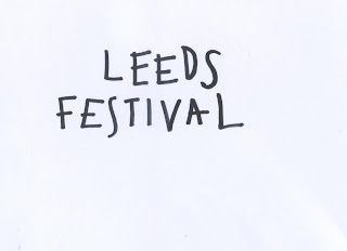
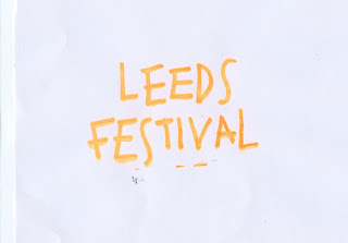
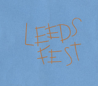
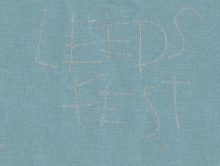
For this brief the cover for the book is being screen printed on this is as the textured fabric book-cloth cannot be digital printed but also as screen print is a medium that allows fluorescent ink to used. Using a brightly fluorescent ink for the cover is done to represent the face paint used by festival goers, this brightly coloured paint is used heavily thought out people there and can allow the target audience to relate back. Screen printing also allow for sliver metallic ink to be used this is the tex on the cove will link to the glitter wore at the festival, an aim of the cover is to create in style that seems as it has ben created/wrote on publication at the festival therefore using materials that link/are inspired by items/decorative medias found at the festival show this concept heavily. As well as the ink relating to the writing/paint materials found at the festival the ink has more stand out, vivid qualities that cause the audience to engage with the book as the inks detail becomes a unique selling point.
Sketches -
For the screen printed cover a hand-drawn typographical cover will be done, for this many different sketches have been done and most positive will be screen-printed as tests then the best final screen print cover will be used. The cover need to be in the style of type that someone has wrote the quickly down, an no planned, non perfect selection to seem as if the cover has been drawn that the festival. It needs to be readable so the book name can be read in a busy book store whilst reflecting the messy nature off the book content.
These manual test have been due to the nature the digital versions used in the mock ups seem too perfect, it appeared digitally created where as the book need to appear as manual as possible so contrasted with the idea of the book therefore these experiments have been done by hand to see if this style of type work better.
feedback fro the first two pages of type was that the lowercase swirly text seemed to feminine for the book subject which actually targets a slight more male audience
These experiment where feed back to be too thin, the style suitable but the first page middle design where seen as the best ones out of these designs
here the use of guide was included this was to give the book cover some content but feedback stated that the book isn;t actually a functional guide so this may mislead the market
in these sketches the thicker type seem more suitable as would be more readable for a far whilst seems less harsh due to the curved terminals, the second page top layout was preferred
these seem to harsh, too unwelcoming to reflect the tone of the voice of the book
Final 3 Ideas
this is the preferred layout of the letters but the festival needs to be more central as currently this design is not balanced
The kerning on these design idea was too large
final design - this is the most suitable letter forms for this brief, the composition is casual and informal to reflect the tone of voice whilst the thickness make it suitable to screen print as well as more readable for a distance (like on a shelf in a store). The guide part has been removed as the book is guide but also an art book and also an experience so this isn't representable of all the content of the books. These letterforms are clear and readable with a personal nature give via the slight mistakes whilst the thickness of the form causes curved terminals which give more welcoming less harsh feel to the cover.
Screenprint has many different benefits, its durable which link to the idea that book will be used over and over again/has to last years without fading, it can be done on almost any fabric so will work on the textured book cloth/book-rum evenly, it can have ink with in
fluorescent orange ink tests
paper tests
book rum, dark blue/greeny
the final type form screenprinted the best due to the thickness
book cloth greeny/blue
sliver ink tests
paper test
book rum, dark blue/greeny
book cloth greeny/blue
As there was not much spare buck-rum to test the ink on more test where conducted on GFSMith paper, this was too how the ink worked and how it worked with the colour scheme, for example how the orange ink worked on a orange background without wasting any of the needed material but to see how it worked as a limitation of print is that the final outcome may differ from the intended outcome.
to represent orange buck-rum
to represent the darkgreen book-rum
to repesent the a lighter book cloth
to represent the blue book cloth


No comments:
Post a Comment