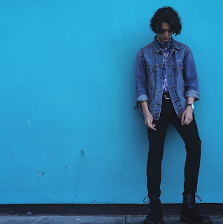
For the brand we are cow the images used on the website are drastically different form the images used on social media to portray the brand, when redesign the digital creative piece for this brief it need to be clear which style of imagery appeals more to the audeince.
The first style is the formal imagery used on the website, these photographs are taken to be a functional image of the item to show all the details, fit ect of the product. The images hightlight the selected mages only with all the other elements of the imagery being bland to showcase the vital aspect. The images are used for the client can see how the product would look on them, see the fit ect. This does not show how the target audeince would wear the piece but shows the piece as a individual item for sale.The tone of voice of the imagery used here is very formal/serious, this is showing the item not the theme or brand of the store.
The second style of imagery is taken from the instagram page of the brand, this show how the item can be styled and worn with other items. This photos sells how to wear the outfit or how the item be worn in a more real life application, this style is more similar to how the item would be worn by the target market. Overall these photos are less formal, more casual and more colourful where as the other imagery contrast by being more serious.
-TRY TO GET SIMAIL ITEMS TO COMPARE SO THAT ITS NO BIAS OF THE ITEAM
-BOTH GENDER TO SEE IF ITS GENDER EFFECT
-DOES ONE WORK BETTER?OR BOTH?
-WHICH INSPIRED YOU THE MOST TO SHOP/BUY?
male test
 |
| style 1 |
FEEDBACK
'the top image causes more interest in the store/brand'
'top one feels more friendly'
'gives better setting'
'gives more of feeling for the brand the first one'
'the guy looks depressed'
'the first one is enticing but the second is needed, i wouldn't trust the first to buy off'
'the first one looks more positive and happy'
 |
| style 1 |
 |
| style 1 |
 |
| style 1 |
FEEDBACK
'top one appeal more the audience'
'the first image reflect the shopping experince more''more casual as possible'
'the second image looks like a music cover'
'WHY IS THE GUY SO SAD'
'the pose doesn't sell the jacket'
'his outfit looks better on the other images than the last'
'vintage shop shouldn't look professional as it takes away from the experince, to commercial'
'not selling the personality of the brand'
 |
| style 1 |
FEEDBACK
'the top one again, due to the image being more interesting and engaging, shows how it can be worn'
'over all the t-shirt need to be seen, clearly expressing all the details, this might work best without a subject wearing the piece'
'these models are all boring'
'the models don't reflect the type of people who shop there'
'2nd images doesn't feel vintage'
'the second image shows the detail of the product but selling the product'
'vintage nature is lost'
female test
 |
| style 1 |
FEEDBACK
'prefer the bottom image'
'the wearer seem more postive in the bottom image, so this implys the buyer will be happier'
'the bottom is more appeal cause it look less sad, she's showing more emotion'
'the second images seems more like how the audience would wear it'
'the second seems styled better so it looks more appealing'
'i wouldn't buy it off the first imagery'
'the first women looks sad'
'why are all these models sad'
 |
| style 1 |
FEEDBACK
'the top want is more engaging as i want to find it more but the second would be more useful to see fit'
'second one feel more commercial, like not vintage'
'the first one first the vibe better but the second is more informative'
'these images are more simialr than the others'
 |
| style 1 |
FEEDBACK
'the layout of the top one looks more attractive'
'prefer on the person'
'the bottom image see better for function but doesn't appeal to me as much'
'in a vintage shop the fit isn't the most important part because they'll edit/make it fit'
OVERALL FEEDBACK/REVIEW
Overall the feedback from this primary research is that although the first type of images is more engaging for the user the second type of image need to be used to functional represent the product. This as the first image doesn't always show all the detail or the side views of the item where as the second one does, the second one allows the user to see the full product which is needed for purchase. For the site the second image style need to be used but if there is away to included the first type of as a way to attract the audience before they look at the individual products this would be a good way to engage the audience. find a way to included the instragram page?? or a link to the page


No comments:
Post a Comment