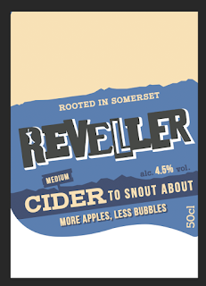
The client for this project Orchard pig have a very particular branding design house style, this is seen thought their bottles, promotional information, the given project pack and their adverts. As this branding takes over all these mediums and due to the nature of the brief set the client do not want a re-brand, they are happy with their loo and their design style. The aim of this project is to make them more active on soical media or find a way to connect with Generation Z via social media, for this project the idea is to design part of the bottle including a Pig Face which the audience can apply snapchat lens too, face swap ect. As the client doesn't ant a re-brand this element therefore has to be design into their current bottle packaging, fitting with their designs and style rather than a new label design.
To make sure the label with this element built in created an output which fits with the current branding the bottle packaging will be analysed to find the client popular colours, typeface, imagery and style. The bottle label will be edited to fit in the element rather than totally redesigned, the main feature of the current will bottle design will aim to be kept similar/ same as to fit with the client needs. KEEP IT AS SIMILAR AS POSSIBLE
what is it currently?
Current Bottle Packaging come in 4 parts, logo bottle top, the sticker over the bottle nose and a 2 main labels on the front and back of the bottle.
Primary images -
The main two/most assessable/most common cider sold by the company have been used as the basis for the research as these were the only bottle available in Leeds of the cider. As the company is a Southerner company the cider is not readily available or popular in Leeds, therefore these are the only primary research materials available.
dry cider bottle -
medium cider bottle -
Secondary Images
Secondary research into the bottle design showed that all the bottle for this range of cider use the same common house style design therefore if the design is added to these bottles it can be applied to the other easily.
This project will focus on the 2 main label design as this is where the imagery of the pig can be added and be big enough to snapchat/work/interact with. ISSUE- The digital files of the bottle design have not been given via the client, this mean to edit/change/experiment with the designs the label will need to be digitally mocked up using scans or photography. Once the files have been digitally created editing and re-design the labels to include the pig face element will be largely easier, so the labels have been scanned in then recreated using the most accurate type/colours to the original. This has been done to create a digital file that can be edited to include the new element part of this project.
LABEL SIZE - back 7.8 CM by 5.4CM, front - 10.1 cm by 8.43cm
Medium Front Label -
typeface test -
to find the most accurate typeface to the one used by the client 4 slab serif typeface where tested, as the pig face will need text it's vital the type used is the most accurate to fit with the client branding style/rest of their promotional work.
 |
| Chuck 5 Ex |
 |
| Iceburg |
 |
| sanchez |
 |
| sanchez bold |
 |
| Sanchez Bold and Bebas Neun where the typefaces that matches the current typeface stye the most accurately, these therefore will be sued in the other work produced for this brief/client. |
 |
| Final Digital Label Mock up |
Medium Back Label-
Dry Front Label -
Dry Back Label-
As both these bottle label are the only part of the design that are being changed these are the only parts where the digital files are needed, no all the element of the bottle have been collected and mocked u these can re-arrange and experimented with to include the pig snapchat face.


No comments:
Post a Comment