Thursday 29 October 2015

Interim Crit 1 - Studio Brief 2


HEALTHY

my theme for this brief is healthy, i felt this was a complicated idea as it means many different things to different people. Health is relative to the subject, it might be mentally healthy, physically healthy, dieting or natural. This gave me a few different way i can go with my type face, looking at mental healthy and physically well being were my preferred but i have to be careful not to impact any negative ideas or give the wrong idea off. i don't want to make healthy seem too skinny or too large because of the negative connotations.
- anorexia issues ( too thin)
- mental health ( seen as offensive )
- offend people who don't see it as healthy for them

IDEAS

after already looking at many different typefaces used in the same way as my type will be i'm going to look for different forms, shapes and ideas to inspire my designs. I'm going to ask my peers what they think of first when they here 'healthy', i want the first idea not matter how strange or unrelated but i need to really connotations of the word how it makes people think and feel. Engaging with my audience at this stage will give me informed design designs and ways to research more, it gives me a wide knowledge of the way people think about my theme.

"what do you first associate with the word 'heathy'?"
green
salad
diet
rounded shapes
green vegetables
clean eating
clean living
fruit
natural
shapely
strong
mental stability
enough
free
clean
skinny
light
positive
growth
lifestyle
good physical health
good mental health
balanced

From this research i can see that the main association with the idea of healthy is related to lifestyles and diet, clean eating and living. This gives me a clear path to go down as now i can work with natural forms seen in foods that are healthy, veg ect, i can be inspired by the shapes and styles of these to create a typeface that is a clear reflection of what the general public think healthy is.
There was only one mention of mental health which shocked me as this is one of the main things i'd relate to the topic, i feel this may just be mine and a few other thought because of this i will look into it in less detail, maybe just look at the forms of healthy brain waves or the chemical compounds for
inspiration. Mainly focusing on the main ideas of healthy rather than the few.


SYMONYMS + ANTONYMS


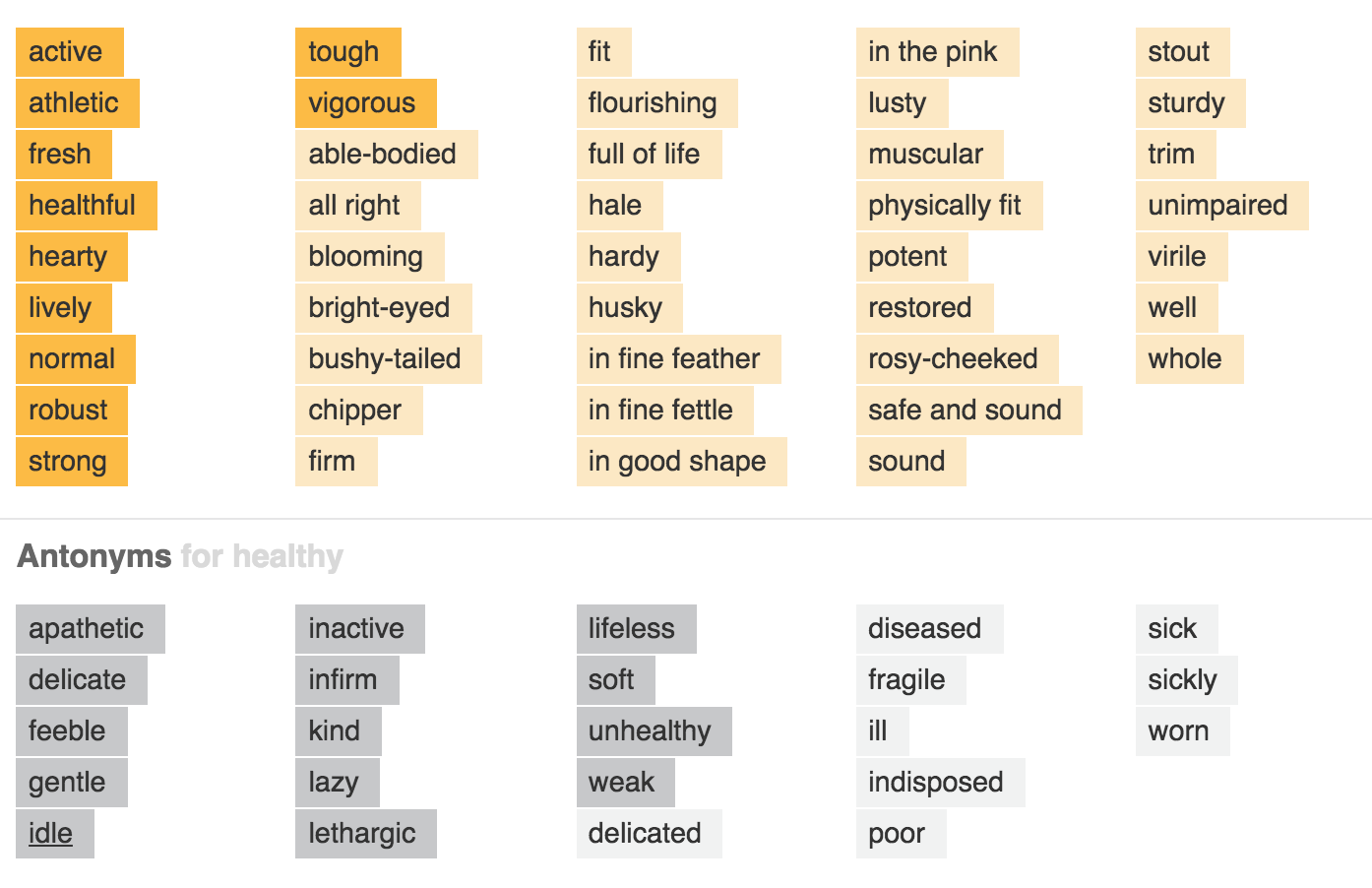
Again these support the idea of natural forms, inspiration from nature. But unlike my primary research of these are more focused around the ideas of strength and boldness, example sturdy, whole, well, muscular these give a more bold idea to the word and make it seem more like a positive/reliable theme.

MAIN IDEA SO FAR- POSITIVE, whatever i make it has to have a positive feel, this has to be clear.


RESEARCH INTO FORMS/SHAPES INSPIRATION


Here i have selected a wide range of different veg and meal imagery seen as healthy, i looked these too see if there are any shapes or forms that are seen throughout. The forms could influence the shape of my type, how it bends and how the stems are created. I wanted to pick up if there was any styles that will help highlight the idea of a very natural theme ,  the imagery isn't perfect and different each time which is an idea i want to relate to my text too ( this links to help being a personal thing that different for each person too) . The forms aren't straight edges all the time but unperfect curves and lines, these built up the idea of nature linking to healthy and a healthy diet. i picked very positive imagery as this linked to the idea my text needs to be positive, the word has too many positive ideas and connotations behind it to ignore this.


1 IN 3 surfer from mental health issues in their lives, this stat could be used to influence my design work too, i feel its personal and relate well.
From theses images i can clear see how their is a very drastic contrast in the weight of the lines in the neutons, some are big and thick then suddenly reduce to smaller thinner lines, this could be seen but the weight of the lines in the typeface. A similar idea to the veg imagery is that the forms seen here are all imperfect and unique too, every part is natural and unrestricted but perfection or planned out ideas and i feel my work should reflect this too.  Free flowing and wild, the imagery gives of a positive free idea that i feel relates to my theme of health well, healthy brain power and mind set. The images her are simple, they are basic uncomplicated forms which over lap and move to create a over all busy effect but on their own are clear and readable.

BASIC IDEA

- type based around muscle forms, strength 
-bold reliable text, strong makes a statement
-loads of running lines that overlap to create the text shape (like neutons)
- slightly edit x height, keeping the same thicken but appearing thicker shows thin but healthy
- waves, free lines text thats imperfect
-text with massively contrasting weights
-1 in 3, every 3 letter colours to show power in numbers and who effected
-curly bold shapes text, like imagery in nature
-thin vein like images used to create letter forms, body health neutrons


MANIFESTOS

Idea 1 - This bespoke typeface will be designed to work on packaging and promotional work for clean eating/clean living, it'll have a minimalistic simple style that makes it easy for everyone to understand. It will reflect the idea clean living and eating is simple and easy,  the idea behind it to sell the products, bringing this lifestyle to anyone who pleases so applying to a general audience. It will have to be readable at different sizes because till will be needed to scale up or down for different projects, it should work for different products fitting the theme. Its should reflect the figure of a healthy person , be lean, thin, (not too thin) but strong lively to reflect the synonyms of the words different meanings. A dependable text that has multi uses and is very easy to understand, versatile yet made for this theme and purpose. The shapes and forms will be inspire but natural ideas, the forms seen in the research with less harsh lines but curved edges that show the healthy free imagery.

Idea 2 - This typeface will be based around the idea of mental healthy and chemically balanced, a unique twist on the theme that will show it in a newer light and maybe inform the audience more about issues. It will be mostly used on informative posters, or medication leaflet helping people with these issues, a typeface bespoke to this theme that gives people a great understand of the ideas behind mental illness and the causes. Bases around the forms seen in neuron images will give it a scientific official feel that wont be too overpowering so it appeal as a casual text, it wont be used to scare or confuse the audience but inform them its a chemical issues not themselves. The text will need to be clear and readable for any audience as people with the issues may struggle reading, it has to be very clear and minimal because of this.


DESIGN SKETCHES


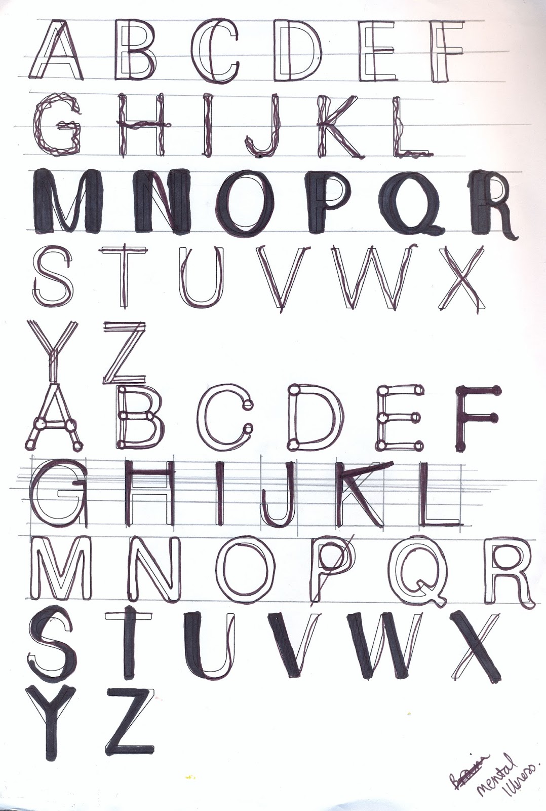
These are my design sketches for my typeface, they are a collection because i had many different ideas that i wanted to try out, they all relate to my theme in one way or the other. i've played around with the x height and other height of most of them this is give a more natural, free idea to the typeface. 
These are my manual design sketches, as I had no existing knowledge of creating a typeface I felt it was better to get a wide range or manual experiments created so that I can see how to make it work before I start digitally. I work manually most of the time because I feel it allowed me to express my ideas better and have more control over the outcomes but the I digitalise my work so it can be smattered up and copied easier, in the digital age I have to be aware that I will need to make my work digital for it to be used in industry.  This also allowed me to create the different ideas quickly as I thought of them, I looked at the forms I researched combined with my ideas of healthy and my feedback to create these simple sketches which I will then pick the one that works best to create digitally for my idea. I used a wide range of the 9 typefaces as the background to get a wide range of ideas that fit the brief, I wanted to try out the way the different serif and sans serif types worked for my ideas before selecting one to work with because although I think I will use sans serif over all I could still use the basic forms of the serif type with the serifs removed if the layout worked better.
I feel like getting all my ideas down next to each other gave me a way of comparing, I could see which worked best and why simply. I showed these ideas at my interim crit as well with gave people a physical way to see my ideas, they didn’t have to look on a smaller screen they could see how I’d create the letterforms exactly how I wanted, I wanted feedback on which to take forward and work on more so this was very important for me to have opinions at this stage to help inform my design decisions. Overall the idea of creating these really helped my design process as I learn how the letters works and what I could change without distorting the letters too much, so ideas didn’t work but this just allowed me to analyse why they failed and learn for this.


Tuesday 27 October 2015

Colour Relatively


LEAST FAVOURITE COLOUR


WHY: related to football shirt, too bright/bold, doesn't suit my skin tone, to contrasting.

STORYBOOK COLOUR SCHEME:


I piked a coral, light orange for with red and black for my colour scheme, this is as i felt this colour was a neutral, basic colour that wouldn't reduce my book to a gender ideal or make it only for one genre, it can be used to mixed because is flexible for a range of ideas, it also looks less powerful compared to the over powering red so it works well.


Typeface Design


FONTS

For this brief we have to create and design bespoke typeface based around Mueller-Brockmanns classic and lead typefaces. We are using these typefaces as a starting point to work with for our, they are the basis for our type. Then we need to create a typeface for a certain theme from edits of these, we can manipulate them in anyway we want or change the type but the final outcome has to have started off as one of the 9 types selected. The letter has to work as every word, it has to have endless combinations that still work together, it needs to be created as the individual letters rather than word.

9 TYPES:
Garamond
Carson
Baskerville
Bodoni
Clarendon
Berthold
Times
Helvetica
Univers

TYPEFACE LETTERING


THEME : HEALTHY

The theme i got given for my typeface is healthy, this means my typeface has to reflect this idea and be based around the appearance that shows health. My first ideas are that it needs to give of a fresh, positive,  strong, thin appoarch to the type. Seem to reflect veg (healthy eating) or a healthy life style, the type would probably be used on a fruit/health product packet, in a booklet promoting a healthy life style or it could be used in anyway that can promote or educate health to its audience. 


DEFINATIONS;

- In a good physical or mental condition; in good health.
(Of a part of the body) not diseased
Indicating or promoting good health
Normal, natural, and desirable
Of a very satisfactory size or amount
TYPE THOERY 

 As i have never created my own typeface before the first thing i thought i needed to do for this brief was to research how to design a typeface.  I need to know how it works, the steps to take and the rules to follow before i even start looking at design the type. A basic knowledge of how type worked and practises used by designers, how my type needs to be formed and what to be inspired by will be the basis for my research and project. I found this article which i feel is very useful, i can see the steps an actual type designer uses and how to recreate these for my brief. 


Start with a Brief - the brief i've given is around the word HEALTHY, this type face will be use don packaging, adverts, promotion work, labels, advice book ect.  


Fundamental Choices - Sans serif/serif? big bodies or small text? bold/italic/thin? which base type?

Early Pitfalls - don't just digitalise my hand font.

Start hand drawn - work over existing types manually first the work digitally after, easier to change, more free.

Starting Letters - control characters, n, o, H, O, first.

Moving Digital - outline in fineliner, scan/photograph in, trace over in photoshop.

Looking at words - "Type is a beautiful group of letters, not a group of beautiful letters" 

Scale - make sure the type works for any size, both scale up and scale down.

Print - constantly print out work to see how to edit it, see how it looks on paper manually.

Not just A-Z - try symbols, if i have time 


Monday 26 October 2015

Agatha Christie Book Cover


BOOK COVER

For this study task we had to create a book cover for the live brief of the agatha christie 125th birthday, we got given a title and had to create the design for it. I got given 'Evil under the Sun' so i first goggled the plot and its history to get a idea of the themes and ideas in the book.

PLOT SUMMARY 

'Hercule Poirot is called in to investigate a case for an insurance company regarding firstly a dead woman's body found on a moor and then a important diamond sent to the company to be insured turns out to be a fake. Poirot discovers that the diamond was bought for Arlena Marshall by Sir Horace Platt and Arlena is on her honeymoon with her husband and step-daughter on a tropical island hotel. He joins them on the island and finds that everybody else starts to hate Arlena for different reasons - refusing to do a stage show, stopping a book, and for having an open affair with Patrick Redfern, another guest, in full view of his shy wife. So it's only a matter of time before Arlena turns up dead, strangled and Poirot must find out who it is... ' 
                                  via http://www.imdb.com/title/tt0083908/plotsummary

Main clues - (IDEAS FOR IMAGERY)

Bath cap
Bottle
Bath
Wristwatch
Diamond
Perfume

THEORY

Next i googled book design theory and found this article, this was to give concept and ideas to my cover and to see how existing covers work, the ideas of hoe to attract an audience without given away too much of the plot.

http://www.theguardian.com/books/booksblog/2012/aug/16/book-cover-theories-edinburgh-festival

The main ones i felt were relevant to my theme are; zoom theory, association theory, obfuscation theory, zen theory.

ZEN THEROY : i felt this would work best as it s aswell know book by a very famous author so it doesn't need to be explained in much detail to attract people, the title and fame will do this. I felt keeping it simple, basic and clear would give the reader more surprise and interest into the story before they open the book. This would only work for a author of this fame though as people will buy it because of her name and history from first look, they don't need to know too much of the plot before reading into it.


EXSITING COVERS

i also looked into covers of the book that had already been create so i could see the main imagery and factors that they all included to see if i wanted to work with these.


FEATURES : bold text, text the main focus point, sells because of author, simple designs, images around beach/holidays, selling point the author name, sans serif font, TYPE IMPORTANT.

from my research i discovered my first idea of creating the book cover as writing on a postcode already exists, this stubbed me abit and i thought of using a boarding pass but decided to pick another design idea instead as i wanted mine to be original and this was too similar.

POSTCARD IDEA SIMPLE MOCKUP


just the text


ZEN/MIND GAME IDEA

this is the idea i chose as my final idea, its simple and bold but cause the audience to think and use its mind like the books do. Its a interesting cover that will appeal to a smarter audience that appreciate the joke but is so obvious i feel it will make people saw 'OOOOH' when they get it, this is the same feel when Poirot revels the murder so i feel it fits this book well. i used a serif font contrasting to the research into existing book cover as i feel its an older more traditional book seen as a classic these days and this reflects this better.


this is the simple idea, i experimented with colour and a blood drop as the full stop in the first idea but felt this looked to sinister for a holiday murder book, it look more like a vampire book so i picked the simple basic ideas as my final one.

FINAL COVER


SUBMISSION

i then added it to the guardian webpage with the ideas.


cover on the page:


Sunday 25 October 2015

Colour Theory


Colour Theory

Red, Blue and Green are the colours that make everything, they are the basic colours, this contradict what we've been taught form an early age using primary paint colours this is because its talking about light rather than paint, it works on different waves length and reacts differently.


For on screen we use RGB (RED + GREEN + BLUE), for print CMYK (CYAN + MAGENTA + YELLOW + KEY/BLACK) as print overlaps colours to create the shade.

SHADE - hue & black
TINTS - hue & white

PANTONE CHALLENGE


 For this we had to find representative colour and one alternate colour for films of different genres.

SCEINCE FICTION - 

 WESTERN -


FAIRYTALE - 


CHIC-LIT - 


Saturday 24 October 2015

Evaluation, Studio Brief 1 Final

EVALUATION


For this brief we had to create a logo for a shop we had picked, the logo had to be for a international shop so the idea had to be multi-lingual and work for a world wide company, I felt that the idea of the pen shop that worked best was the idea of the calligraphy’s style because this is obviously a Pen shop without having to be read. The overall idea was to reflect the aims of the pen shop as elegant, expensive yet bold and strong as it’s a historic British company that has been running for years that started in the uk and want to reflect this. The company currently uses navy blue to show this and I feel that keeping this would work well because it’s the same colour of ink as well as seem as a strong positive colour that shows wealth and status which is a main factor for the company. When I visited the shop for my research I felt that the current brand uses its displays to attracts a certain audience that it appeals too but because its so based around posh high classy ideas this put off a larger audience. Because it currently puts off the audience I feel the second design bring the company down to a younger and wide range off people, it seems more friendly and attractive because its more casual and less stuck up. This is an idea I feel will work for the brief and will help the company raise a different audience and widen the customer base creating more sales, but I have created 2 final ideas in case the client didn’t want to change the audience and wanted to keep the same, I wanted to make sure I had ideas that would work for the clients needs and wouldn’t leave them without a design. The handwritten styles is inspire by current trends but an old fashioned style, this mean its will work over time because it not going to go out of style because of the classic elegant nature create by the handwritten calligraphy style combined with the simple text. I’m happy with the final logo over all because in my opinion it reflect my research combined and I developed my ideas to explore the best outcome, I looked into most aspect in depth and this effected my design decisions which made my over all outcome the best I could produce.