Nina's Blog Evaluation
This brief showed a range of issues with my practice as well as things I need to consider in my work and future briefs.
For this idea, I offered to do more work for the client than was asked for originally (digitally drawing the images), due to this for the other brief I need to clarify this with clients at the very start of the briefs. At the start of live briefs form now on I aim to write a list with the client of what they want from me so we can define this at the start and make sure the payment fits with this.
One of the good aspects of this was the sending of research, doing this allowed me to pinpoint what the client wanted and their aims at the start. This gave both the designer and client a visual idea of the outcome so they both understood what was being produced. Also defining the audience and limitations at the start meant this where at the forefront of the design from the start. The lack of gender and age range meant that these styles were considered for the start of the brief.
I think on the most successful aspect of this brief was learning to send a wide range of ideas/designs to clients. This proved really useful, it gave them a choice and input to the design process meaning they were happier with the final outcome. This was then used for the Fine Art brief, Olivia’s Branding and Peter and Paul outcome successfully after being learnt from this outcome. Also visually the type was successful, this was due to compromising from designer and client. The client understood my role and knowledge of what looked better then consider this, I understood the client needs and aim so included these in the design. The final type fits with the genre, expressing the correct tones aimed for. Sending over research at the start to define the client aims and preferences was also very useful in brief, as it allowed me to visually assessed what the client needed and wanted from the start, so it could be applied for an early stage.
The weakness with this brief ended up being the colour scheme. This was defined by the client but personally, I feel it’s too bright and give a childlike tone to the outcome, I think this should have been more muted. I offered to do more work for the client than was asked for originally (digitally drawing the images), due to this for the other brief I need to clarify this with clients at the very start of the briefs. At the start of live briefs from now on, I aim to write a list with the client of what they want from me so we can define this at the start and make sure the payment fits with this.
Time management was very good with this brief, it took the set time and this was kept too even with the re-designs. This is due to taking on the project at a less busy time, allowing it to be the focus.
RGB was used of the design, this was as the outcome was purely digitally based so to work best for on screen. For the designs, Illustrator was used to focus on the manipulation of type. This gave greater creative control to the design and smoother edges to the outcomes, illustrator also works with vectors rather than pixels so the final outcome could be made larger or smaller for any need without pixelation for the social media use and applications. The final files were sent to the client over google drive to keep the high quality, in TIFF and PNG form so could be uploaded to social media. Also, the client does not have Adobe software so any adobe files would be unusable.
Besides the colour choice, I’m happy with the outcome. This due to the comprised made by the client and myself. The client originally preferred some other ideas, but I pushed my point and these were excepted. I think working with this client gave an insight into live brief paid a brief, and how to liaise with clients. It defines a range of things that need to do in future for live briefs
-decide on research/inspiration together
-set a list of needed outcomes
-ask for feedback at early stages
-push my design decisions if they are informed
-compromise is key
Saturday 4 November 2017
Friday 3 November 2017
OUGD603 - Nina's Blog Final Sizing
The outcome for this brief was originally a blogger header at 192x720 mm, but then it was also asked for a logo (for facebook and other social sites) and a facebook header.
blogger header final -

facebook header-
what size are facebook headers?
 820 by 340 (what, mm?)
'851 pixels wide and 315 pixels' via https://blog.hubspot.com/marketing/facebook-cover-photos-best-practices-ht
 overall size - 851px by 315px
final size -

test-
as i do not have access to the facebook page of the blog, i've tested tis on my personal facebook page just to check if the sizing corresponds.
 IT FITS, YES
logo -
For the logo as it's but specified what site or where it will be used, a square logo will be created at medium size so that it can work small without pixelating but also so that it can be used larger without pixelating. The size will be create so the logo is versatile and can be used for almost any size, therefor it will be created and sent over a TIFF file.
 test-
test-

also, to give the client some more work to use a circle logo was created, this is for the different media sites as some use circles.
 FINAL FINSIHED
blogger header final -

facebook header-
what size are facebook headers?

'851 pixels wide and 315 pixels' via https://blog.hubspot.com/marketing/facebook-cover-photos-best-practices-ht

final size -

test-
as i do not have access to the facebook page of the blog, i've tested tis on my personal facebook page just to check if the sizing corresponds.

logo -
For the logo as it's but specified what site or where it will be used, a square logo will be created at medium size so that it can work small without pixelating but also so that it can be used larger without pixelating. The size will be create so the logo is versatile and can be used for almost any size, therefor it will be created and sent over a TIFF file.


also, to give the client some more work to use a circle logo was created, this is for the different media sites as some use circles.

Thursday 2 November 2017
OUGD603 -Nina's Blog Development
Digital Mock Up/Scans
first mock ups -
After sending over a few quick hand drawn idea for the blog and getting feedback on these the first Digital mock up where created, these were done without colour choice ect finalised but just to get a feel for the style of design the client is aiming for. JUST ABOUT TYPE STYLE.
style 1- retro bubble text
applied the difference in type to draw attention to the bubble part of the type
-90's retro style used as both girls where born in this era
-sticks to the playful idea
-uses a non serious typeface to reflect the informal nature of the blog but combined with the harsh san serif type adds a level or seriousness/links to the topics discussed
style 2 - more post modern/trend type


 -links to current rends to keep the blog relevant/update
- uses the contrasting type to apply emphasis on the bubble part
-uses both 'gendered' colours to equal out the use
-uses most pink due to feminine nature of the stories, audience and writers
-uses illustration add a more playful tone
-sticks to pale yet contrasting colours to achieve the bright nature asked for
-informal due to the morphed type style, adds a playful aspect
FEEDBACK-

The first idea was seen as the best by the client, but personally i felt this idea was too busy, and the over decorative nature of the type mimic childrens books/child friendly ect which would give the blog a more immature impressions. Therefore a few mock up where created, this was to explore different more mature style but with the same themes.
After past feedback for the client more free hand drawn design have been created, this is to inspire the digital mock up for the final design the client wants. Personal experience is that type pieces work best when drawn then scanned in and digitise, therefor this was the method for this brief. This also gave more idea that could be sent to the client to receive feedback, this is as currently i'm still slightly unaware what the client aims for and wants. Currently the client and myself have very different views on what would work best, therefor these are to get a better idea of a design we both like.


feedback -
-likes the bubble/fluidity of the bubble writing
-make it 'bouncy'
-like the combination of simple type and bubble type, use both
-wants it very decorative and fun/playful
-likes the second and first ideas best, mock these up
After the feedback from the hand drawn designs, a few digital mock up of the favourite ones have been created, this is to see how the design work in the medium they will be used.
style 3 - mixture of hand drawn/digital/ take from feedback inspirations

style 3 - bubble text / take from feedback ideas
 FEEDBACK

-combine the idea together
-use the bubbled text with the shadowed background
Final Developments
Now a style has been created that the designer and the client are both happy(ish) with, this can be developed further into the final piece, the last two idea have very positive feedback. The next idea is to combine these together to get the final design, using the different style and colour schemes.


All these were then sent to the client as to get any last feedback and to see which the client and her partner felt worked best.


-make the colour brighter
-make it more colourful
-they are happy with this design
final final developments -
aim - MORE COLOUR


 I then gave the client the choice but with the idea that black would be more visible and the final design was decide on :).
final design-

first mock ups -
After sending over a few quick hand drawn idea for the blog and getting feedback on these the first Digital mock up where created, these were done without colour choice ect finalised but just to get a feel for the style of design the client is aiming for. JUST ABOUT TYPE STYLE.
style 1- retro bubble text
 |
-90's retro style used as both girls where born in this era
-sticks to the playful idea
-uses a non serious typeface to reflect the informal nature of the blog but combined with the harsh san serif type adds a level or seriousness/links to the topics discussed
 |
-fits with the idea of a no gender audience the client aims for, as well as the style reflect in the current blog
-playful style fits with the lighthearted nature of the blog and the writing style
-fun and lighthearted typeface used to mimic the theme seen and present on the blog
-overall very informal, as to match what the client aims for
-over all this design might use too much decorative letting for the small space available on the blog (simplify)
-reflects and links the bubble theme/name
|
style 2 - more post modern/trend type


- uses the contrasting type to apply emphasis on the bubble part
-uses both 'gendered' colours to equal out the use
-uses most pink due to feminine nature of the stories, audience and writers
-uses illustration add a more playful tone
-sticks to pale yet contrasting colours to achieve the bright nature asked for
-informal due to the morphed type style, adds a playful aspect
FEEDBACK-
The first idea was seen as the best by the client, but personally i felt this idea was too busy, and the over decorative nature of the type mimic childrens books/child friendly ect which would give the blog a more immature impressions. Therefore a few mock up where created, this was to explore different more mature style but with the same themes.
After past feedback for the client more free hand drawn design have been created, this is to inspire the digital mock up for the final design the client wants. Personal experience is that type pieces work best when drawn then scanned in and digitise, therefor this was the method for this brief. This also gave more idea that could be sent to the client to receive feedback, this is as currently i'm still slightly unaware what the client aims for and wants. Currently the client and myself have very different views on what would work best, therefor these are to get a better idea of a design we both like.


feedback -
-likes the bubble/fluidity of the bubble writing
-make it 'bouncy'
-like the combination of simple type and bubble type, use both
-wants it very decorative and fun/playful
-likes the second and first ideas best, mock these up
style 3 - mixture of hand drawn/digital/ take from feedback inspirations

-adds a modern twist to the type
-style taken from the research the client likes and the feedback the client has given
-drawn type to give a personal aspect to the type, taken from the current blog style
-combines styles as this was feedback that the client preferred a mix of style earlier
-appears formal but with a informal twists, linking to the idea the blog covers serious issues but in a non serious manner

-much more informal style of design
-taken from the bubble type idea
-based are fluid forms and shapes, inspired by the current style of the blog
-shadow added as to add colour to the design
-based of the feedback from the research the client liked, but with a more personal twist
-could be illegible at a smaller size
-not very easily readable
-combine the idea together
-use the bubbled text with the shadowed background
Final Developments
Now a style has been created that the designer and the client are both happy(ish) with, this can be developed further into the final piece, the last two idea have very positive feedback. The next idea is to combine these together to get the final design, using the different style and colour schemes.


All these were then sent to the client as to get any last feedback and to see which the client and her partner felt worked best.


-make the colour brighter
-make it more colourful
-they are happy with this design
final final developments -
aim - MORE COLOUR


feedback -
The client then asked for the hand drawn type to be placed on the over design, then placed in white but i predicted issues with the legibility of the white type at a smaller size, therefor changed it to white but also sent over a black version with an explanation about the white not being readable at a small size
(for the logo).
FINAL FINAL FINAL DESIGN


feedback -
 |
| FINALLY |
final design-

Wednesday 1 November 2017
Logo Theory
Logo Theory
research -

trends -s


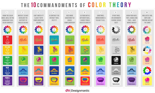
colour theory


restrictions//logo design theory-
use circles or squares


 don't follow trends

keep it simple, say what is intended and nothing else

keep it balance
use white space
represent equal with the shape
https://www.creativebloq.com/graphic-design/pro-guide-logo-design-21221/4
01. Understand your competition,
02. Ask the right questions,
03. Stay flexible during the process,
04. Respect a brand’s heritage,
05. Remember: a logo is just one ingredient,
06. Choose your typeface carefully,
07. Tweak and refine to add personality,
08. Consider illustrated, fully-bespoke type,
09. Explore serendipitous letter combinations,
10. Take ownership of an entire typeface,
11. Strip it back to basics,
12. Understand shape psychology,
13. Master grids and structure,
14. Employ negative space
15. Make use of wit and humour,
16. Understand the colour wheel,
17. Manage colour schemes carefully,
18. Use colour to control mood,
19. Research sector-specific colour trends,
20. Don’t forget black and white,
21. Always get a second opinion,
22. Develop the rest of the brand world,
21. Always get a second opinion,
22. Develop the rest of the brand world,
23. Consider how to bring it alive,
24. Help your client roll it out,
25. Deal with public criticism
https://www.webdesignerdepot.com/2009/06/12-essential-rules-to-follow-when-designing-a-logo/
1. Preliminary Work Is a Must,
2. Create Balance, 3. Size Matters,
4. Clever Use of Color,
5. Design Style Should Suit the Company,
6. Typography Matters… a Lot!,
7. The Goal IS Recognition,
8. Dare to be Different,
9. K.I.S.S. (Keep it Simple, Stupid),
10. Go Easy on Effects,
11. Develop a Design “Assembly Line”,
12. Use Other Designs for Inspiration Only!
features to consider-
research -

trends -s


colour theory


restrictions//logo design theory-
 |

use negative space
convey correct tone

make it black

make it work small and black and white

avoid cliches
make it stand out


keep it simple, say what is intended and nothing else

keep it balance
use white space
represent equal with the shape
https://www.creativebloq.com/graphic-design/pro-guide-logo-design-21221/4
01. Understand your competition,
02. Ask the right questions,
03. Stay flexible during the process,
04. Respect a brand’s heritage,
05. Remember: a logo is just one ingredient,
06. Choose your typeface carefully,
07. Tweak and refine to add personality,
08. Consider illustrated, fully-bespoke type,
09. Explore serendipitous letter combinations,
10. Take ownership of an entire typeface,
11. Strip it back to basics,
12. Understand shape psychology,
13. Master grids and structure,
14. Employ negative space
15. Make use of wit and humour,
16. Understand the colour wheel,
17. Manage colour schemes carefully,
18. Use colour to control mood,
19. Research sector-specific colour trends,
20. Don’t forget black and white,
21. Always get a second opinion,
22. Develop the rest of the brand world,
21. Always get a second opinion,
22. Develop the rest of the brand world,
23. Consider how to bring it alive,
24. Help your client roll it out,
25. Deal with public criticism
https://www.webdesignerdepot.com/2009/06/12-essential-rules-to-follow-when-designing-a-logo/
1. Preliminary Work Is a Must,
2. Create Balance, 3. Size Matters,
4. Clever Use of Color,
5. Design Style Should Suit the Company,
6. Typography Matters… a Lot!,
7. The Goal IS Recognition,
8. Dare to be Different,
9. K.I.S.S. (Keep it Simple, Stupid),
10. Go Easy on Effects,
11. Develop a Design “Assembly Line”,
12. Use Other Designs for Inspiration Only!
features to consider-
Subscribe to:
Posts (Atom)