ENVIRONMENT
For the environment for this project, my focus was to pick a place that the way finding would be an improvement to the current system but also allow me to creatively experiment with the brief. The brief doesn't specify if the place need to be situated in leeds but as this would allow me to partake in primary research i felt it was relevant, primary research via visiting the place would allow me to see how the space/area is design and how the current system works for the layout. Also allow me to make sure i created a system that would be suitable as i could collect primary pictures and visualise the area i selected with my final system in place. As this is a way finding brief the best way to find a place that the system could be improved would be to find a place that i got lost and other people find difficult to navigate, this would mean the current system wasn't very effective in directing. I first visited places in the centre of leeds, this is a busy town and would have a large number of people visiting the shops/attractions on a daily basis.
Out of all the shops i visited the most confusing was Waterstones, this was as there are many different egress of books no systems directing to each individual section, they audience has to walk around till they find the selected area but this isn't very efficient if the audience is busy/in a rush. There is no direct way to find the different sections of book straight away and as each section isn't clearly marked the audience needs to be close to each sections to see which is which, this takes time and will be very tedious. Also this is shop that while i was in it the other member of the public asked the staff for help the most, this proves the current system doesn't direct/allow they to find the sections on their own.
TARGET AUDIENCE OF WATERSTONES
After researching into wayfinding system i could see that the audience is the main influence on the designs, the intelligence of the audience influenced the design because it shows how straight forward the signs need to be. Overall the audience of Waterstones would be of a higher intelligence therefore be able to use their intelligence so the signs wouldn't have to be overly direct/obvious. The wayfinding system will be able to be more creative and less direct but whist informing, smarter design can be used as people who read/shop for books are mostly more intelligent, wouldn't mind decoding the signs, they may actually find it interesting. Around Waterstones the sign will need to strand out clearly as the will be in environment surround by different type, symbols, colours, imagery ect which will create a busy background, this should be thought of when creating the system. It will take a lot to make the signs stand out clearly against this contextual background.
Waterstones target audience ranges as they stock a lot of different books and types of books, from children's stories to more complex adult stories they sell a wide range of fiction and no fiction titles. Because of this the wayfinding system should be understood by all ages, the shop also sell multilingual / translation books so when designing this may be a factor to make sure the signs are very legible for a wide range of audiences from different background. The target audience is can be narrowed down assuming that as they read book/care about books/learning and have the aim to learn they will be of a slightly higher intelligence, this is only because books enhance knowlegde and anyone buying books would have an aim to learn/already have learnt. Waterstones is a lot more expensive then online bookstores, this shows that the customers of the actual shop will be visiting because they want better quality experience when making the purchase, people will come to the shop and spend more money to have to chance to read/feel the book before they buy it. This shows that price isn't the main factor in the audiences mind, they'd rather pay more to have a visit to a shop, the customers main focus will be to enjoy the aesthetics of the book and the shops environment. As the environment is important the signs needs to fit with the look and add interest, they need to pleasing signs that expend the experience not put people off or confuse anyone.
basics so far-
readable
clear
understood by any age
multilingual (is possible)
aesthetically pleasing
fit with the environment
can be slightly decorative but doesn't take too much thought
enhance the experience
stand out against busy background
WATERSTONES: RESEARCH
first thing i looked at was the titles of the book genres that would be included, this was to see how many there is before i visit the shop to take my primary images, it also showed me that there is enough titles to do before i start, there was a large list so its suitable.
book categories -
brief history -
secondary images -


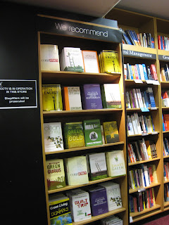

The collected a selection of secondary images of inside and outside of waterstones across the country, this was to show how their current wayfinding system works in all the different shops rather than just the primary leeds store. This was a quick looking into the existing system which is the simple black and white san serif signage above the book columns, this is consistant and clear therefore makes it stand out against the colourful decorative book covers. The signs look formal because of the use a simple, legible but theme less typeface, the type is simple white on a black background for all the different genres this makes it hard to distinguish between the different genre until the audience can read the title, the have to be relevantly close to find each name because the type isn't that large it can only be read from about 5 feet away. The typeface used is theme-less because this makes it useable for the different genre but this makes it very boring as it has no noticeable feature which cause the wayfinding to be lost in the background of contextual vivid typeface used on the book covers. The labels don't stand out enough against the other fonts. The type is white on a black background because this is a high contrast colour scheme making it very legible. The type is crisp again the block colour background but again this isn't not noticeable because the colour is lost again the more attention grabbing book covers, over all this design is too simple/theme less to stand out and be noticed for far away by the audience of waterstones, it very serious and created to be informative rather than enhance the reading experience. Its works because its readable, but overall there needs to be other signs added to shop to make it more obvious which sections are which from far away, therefore i will work with the system but created a set of more directional system that distinguish more the genre.
Overall from my research i can see that the current wayfinding and signage for waterstones is very basic, clear and simple. This is fit for purpose but sometimes lost with the existing typography surrounding it, the text is lost as background imagery and its therefore unclear from a distance which section is which, it really heavily on the audience have a general idea or knowlegde of books to help them find their way. My aim is the change this and create a system that is more creative interesting, visually pleasing while using colours, typography and imagery to show which section is which distinct and added to the overall appeal of the shop. People visit waterstones for the experience and i feel the wayfinding systems should add to this, its should create a visually interesting space that also informs in a indirect way.
basic principles:
in print use serif
on screen use sans serif
sans serif is easier to read small/broken (why waterstones probably uses it for smaller titles)
children read sans serif easier
sans serif reflect emphasis
sans serif is more versatile
san serif has no implied meaning, it works as neutral
serif has a classic older feel
serif is easier to read over all
USING CURRENT SYSTEM/AIM
Working on adding more signs to make each section more noticeable from a distance and more obviously distinguish each genre but keeping the current column guides. This is a they are fit for the purpose of informing about the order of the sections and link to the overall branding of the shop but not clear enough unless close up or interesting enough to attract each audience. They are created for the purpose of informing the basic information so they will still be use but with new directions to the different parts combined.
PRIMARY IMAGES TAKEN FROM THE LEEDS STORE


Children section is more creative to appeal to children using bright colours and imagery to appeal to an audience that may not be able to read fully yet but also will want a more interactive background . The use of more handwritten fonts for the columns adds a more personal kinder style because it feels less harsh, this is so the children section feels more homely/safe as this will make children more interested. The difference between this style of wayfinding and the rest of the store is vast, the whole design of the area here is inspired by the audience and how to appeal to theme because of this its clear which section is which. Bright colours, fonts, carpets and even chairs are uses to make it appeal more to children and to grab their attention. The different sections in this area are then separated by the uses unique colours, blue for younger children fiction, young adults being purple and the younger readers being green. These direct section dividers mean that people aren't wasting their time in the wrong section or looking for the needed sections but can directly see where they need to be and see when the section ends and starts. This wayfinding system using the interior to state the genre is more effective because its clear for the door of the store straight away which is the children section because it contrast with the themeless ideas of the rest of the store, its very obvious which section is which, this is lost int the adult genres.
These are the existing signs for the different sections, they inform which genres is on each for and the opening times. They are very basic, simple yet organize, this works as it clear to read but doesn't directly show here each section is or give any more advice then the floors, for visiting the shops i could see that the floors are very large so this doesn't show were each genre is.
MANCHESTER WATERSTONES PRIMARY RESEARCH
I also visited the shop in manchester to see how the different shop uses the same wayfinding systems, to see if there was any different features for either shop and to see how its uses in a bigger shop.
blurry image quality but included to show how this shop uses the light blue for all the wall colours, this is the overall colour of the shop to seem calming. The same font is used in the manchester shop as the one in leeds and the ones in the secondary research, this shows how the existing branding relay heavily on this system. Just adding to this will make it easier to re-wayfind the whole brands shop and they will not need o take down all the current systems but just add other signs to their shops.