Thursday 31 March 2016
406 Studio Brief 3 - Collaboration Brief - Blog Contact
Blog Contact
One of our concepts is to ask professionals/artists/allium from the course to enter a small brief related to our exhibiton then we will showcase this work along side our own, this work will need to be slightly different to ours but along the sam theme.
Another idea i had was to send the brief to art magazines/art blogs like 'its nice that' and 'creative boom', hopefully if they share a link to the brief we will increase the amount of artists that take place. We can reach a larger target audience by doing this by sparking interest in completely the brief and having work displayed but also then increase the amount of professionals and potential clients who will visit/know about the exhibition. The more professional that are interested in completing the brief the more chance we have at getting them to visit the exhibition to see their own work along side ours, so we will use as many sites/social medias as possible to achieve this.
magazine/blogs to send the briefs too -
http://www.itsnicethat.com
http://www.creativeboom.com
http://www.gooddesignmakesmehappy.com
http://www.peopleofprint.com
http://www.creativereview-magazine.co.uk
https://eyeondesign.aiga.org
http://designspiration.net
http://print.pm
Sunday 27 March 2016
406 Studio Brief 3 - Collaboration Brief, Exhibition Branding
Exhibition Branding
For this exhibition the concept we are using is 'Reverse', this is related to the idea of not telling anyone why the subject of the exhibition is, create a surprise feature for the content as its the 'unexpected exhibition' taken from research into first direct the 'unexpected bank' which is one of the sponsors, also to reverse people opinions on money, change people negative feeling toward money and change them to positive thinking via the new designs and the work in the exhibition promote money as good not bad, and also to reverse back traditional print method that have to used for the production of the note, reserving back to the older styles of production.
REVERSE
rob and kieran where doing the branding for the exhibition but i have a few ideas
-reversed letters
-reversed typed
-black and white to link to older film styles
-surprise theme so no mention of money till the night
-older style text
-older graphics
-traditional print method for the poster ect
-arrow to reflect backward/reverse
-mirrors/reflected text
Branding Work
for this idea i felt the arrow looked bait strange, it seem unbalanced, it didn't fit wight he text as it was thicker and not the same thickess


the first two block of text are too over overpowering, theres too many differs typefaces/sizes/text and this makes it hard on the read as they don't know where to focus first, this need to be simplified to one/2 at the most typefaces and then spaced out more, like the invite part, they need to be amore constituent style applied


For this exhibition the concept we are using is 'Reverse', this is related to the idea of not telling anyone why the subject of the exhibition is, create a surprise feature for the content as its the 'unexpected exhibition' taken from research into first direct the 'unexpected bank' which is one of the sponsors, also to reverse people opinions on money, change people negative feeling toward money and change them to positive thinking via the new designs and the work in the exhibition promote money as good not bad, and also to reverse back traditional print method that have to used for the production of the note, reserving back to the older styles of production.
REVERSE
rob and kieran where doing the branding for the exhibition but i have a few ideas
-reversed letters
-reversed typed
-black and white to link to older film styles
-surprise theme so no mention of money till the night
-older style text
-older graphics
-traditional print method for the poster ect
-arrow to reflect backward/reverse
-mirrors/reflected text
Branding Work
 |

their idea for the branding, personally i preferred the top ideas, felt this was the easiest to read and understand which is vital for the posters for an advent, i felt the time/date need to be bigger and the social links include but the over all concept and type was direct and kept the idea secret whilst appealing to a modern audience via the type used

In my opinion the idea worked better s the arrow seem softer do to the curved edges, the hash arrows seem bit off putting/serious for this brief. the type style work best in combination but the din typeface used for the middle text seem more readable as it was less compacted and the letter forms where easier to read backwards. This is were the group was hard as everyone had their own vision of what they waned the branding too look like of the exhibition, branding and graphic design is aloo about opinion as wells suitability, i'd said i wanted to do the advertising work therefore as long as the brandon was suitable and they listen to my idea/opinion and could explain their left his part of the work to the brander .

the first two block of text are too over overpowering, theres too many differs typefaces/sizes/text and this makes it hard on the read as they don't know where to focus first, this need to be simplified to one/2 at the most typefaces and then spaced out more, like the invite part, they need to be amore constituent style applied

this concept was removed as it unreadable and confusing, it can't be seen what the word is saying of the arrow, this needs to be changed

The idea of reversing back to old style print technique was a strong concept so for the invite there was an idea where the audicene could stamp/print on their invite, this would engage with the audience and allow the to take part in the exhibition
406 Studio Brief 2 - Licence to Print Money, Developed Ideas
Developed Ideas
After experimenting with the first design sketches for the design of the money, the design then needed finalising for screen printing. The design needed-
-include the plum blossom
-reflect current graphic deign styles in china
-reflect the traditional painting styles
-use san serif modern text
-include Chinese graphics
-include cartoon/illustration style imagery
-modernist
-use large white space
(taken from concepts)
-include an amount (example 50)
-include the country
(taken from research)
samples -
(Again the colour scheme has been worked out yet, these colours are to just highlight the different screen printed layers)


experiments to see if the full cover both illsuration over the text is too busy/overpowering for a simpler design , this has been changed to see if the text can be read easier when one of the images is just an outline. the outlined images makes the text the focus of the note as then it is the boldest more dense part of the design, both ways look aesthetically pleasing but when the other information is added the outline might work best to add more white space to the note.
need to include country name and currency amount as well as informative text,
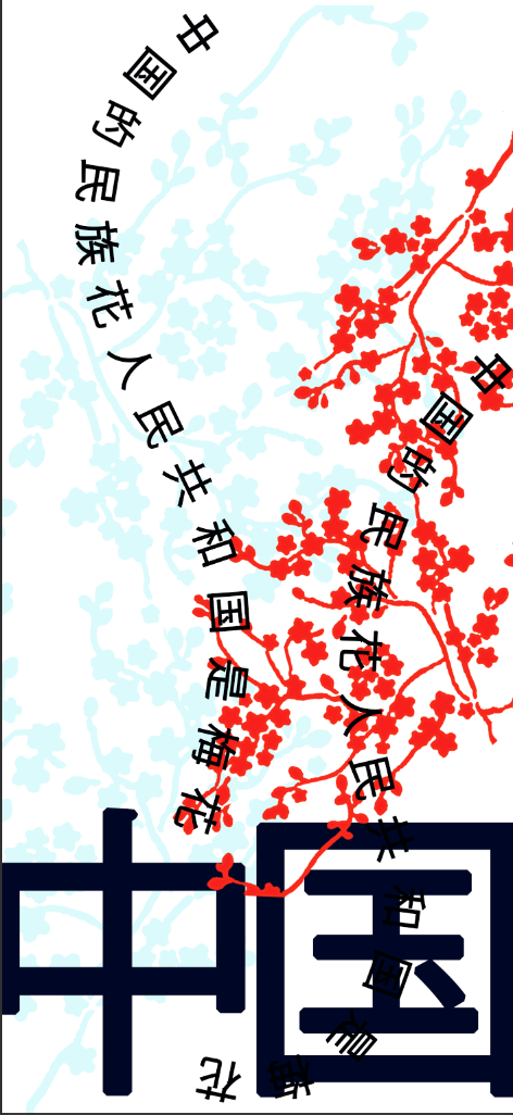
text follows the flows of the branches, this creates a more involved designs as the text and the illustration over lap and now interact rather than seeming like separate parts of the note then seem as one. This also adds a less harsh feel to the notes, the text involves a lot of straight harsh line already having it curving make it seem more gentle and attractive as a design feature.


all the information is included in these design but even when the layout is changed and the amount is small the design still seem overly busy, there is no main focal point which is confusing for the audience. The sonly par that draws attention is the china text which needs to be included but its distracts form the amount and the flower too much with doesn't fit with the concept where the flower needs to be bought to attention.
the text used as part of the design is the same phrased repeated (the plum blossom tree is the nation follower of the republic of china) changed this to include more cultural information.
more text inserted -
文化與自然的統一一直是中國傳統的重要組成部分,與自然元素體現了重要的文化價值。

 |
| Here squares are added instead of text, to try and change this i will translate to traditional Chinese instead of simplified, this might mean it can have all the letterforms available. |


To keep with the style of minimalism and large white space, the note need to included all the information but keep the design balanced, since when the information is added to these design they look too cramped/busy the next experiment will be conducted on to creating a back and round to the note.
Have two sides to the note will allow more information to be included but also allow more white space to balance out the complicated illustrations and text, this will make the design fit the current trends more.


Here the flowers different on both sides but come from the same place to make the design fit together, the same colour follower flows from the edges on the pages to seem as the flowers are one but run over the edge of the note to the other side. China text included at the bottom to blanche out the op heavy design on the other side


First the flower is changed to make the text more readable as well its behind the flowers it can't be read as parts cant be seen, this also make the text the figure because its not the boldest part of the design which would help it be noticed more. Also the outlined shape seem to balance out the note better as now it less busy and more white space it added to the detailed design to make it less over powering. The back is first changed so the blue flower is outlined, this will match the front style and also help keep the design more simple, this style of line drawn was seen a large amount on the research into Chinese design so is a style popular with this culture. In the first design the currency amount is changed to be at the top of the note, this places it in a empty part of the note so draw attention to it as its very clear compared to the last design but this doesn't match with the placement currency on the front which ma cause confusion. The bottom part of this design is very heavy due to the strong bold text used to include to country name which contrast with the front with is more equally spread thought the page therefore this looks strange. The second back design moves the text to the top and the currency amount back to the bottom to allow it to stick to a simp liar style to the front, this will be easier to find the amount of currency in a rush as the audience will know its always in the same place rather than changing deepening on the side of the note. As the text is not at the top of the it still feels slightly unbalanced , its very top deign heavy and the attention ti straw straight there,the next step is to experiment with how to equal out the back page design.


To balance out the back note better here the for china is made smaller, its less demanding on the eye and therefore help the flowers bee the main focal point which is the aim of concept. Its situated in the opposite corner to the currency to make sure the note is balanced, it spreads the information equally throughout the note now whist keeping with the idea of Chinese design here the focus is the middle.
- more balanced
-less focus on the china
-flowers keep simple to make sure the design isn't over complicated
after more research into china i have found out that the official name for china is the peoples republic of china rather than just china, therefore this will be changed on the note to make sure they are accurately representing the country as a whole as it wants to be represented.


Here the simplified version of the name is used but again photoshop cannot use the symbols so it will need to changed to the traditional version.
here the placement of the text has be changed to see which works best, the attention needs to be given o the whole note, to make sure this is down the text reds to highlight the illustration but not distract from it, the text needs to be the secondary point behind the flower which is the concept also if the note is benign used in china having the country on it will be very obvious. The curved text seem too similar to the fount design, this make the text seem more like part of the information rather than the title of the country so this idea does work, it need to be more different to see more important, also to make the design seem more serious on this side of the note.


Here the straight text is situated at the bottom to match with the currency, but this feels as if the bottom of the note now is too design heavy because of this it does seem like a full note. The audience will only pay attention to the bottom which has now become the focal point and ignore the main concept with is the flowers, because of this the second design works better, it give a fuller note highlighting the shape of he note which links back to Chinese historic art and their current style of movie poster design. The second piece encourages the audience to look down the note to read the top then the bottom which draws attention to the flowers in the middle whilst give the flower white space so they don't seem over crowed or over powering.
Final Development


'The only think i could think of is perhaps moving the chinese symbols on the first one down vertically above the 50 maybe?'
'Would you not do red and yellow with it being China?? Rather than red and blue??'
'i think they look pretty, they have a very oriental feel'
'well you got the intricate spot on and i don't know if it should look like the ceramic stuff they have but it does'
'on the second i think the 50 touching the pattern people might not get but apart from that'
'i;d change the colour scheme, even those it seem pretty i'd experiment more with it'
'i prefer the first one'
Saturday 26 March 2016
406 Studio Brief 2 - Licence to Print Money, First Mock Ups
First Mock Ups
After developed design sketches for the money design influenced by Chinese design and the culture, these are some quick first mock ups designed for the bank note. The text will be checked as it is googled translated so i can use it on my experiments.


experiments -
The colour schemes are not relevant to the design, the colours are to separate the layers that would be screen printed, the colour scheme/colours code will be decided after for, these mock up where created to produce the exposed screens for the screen print.


This idea is taken from my developed design sketches, where the background is less detailed with the intricate line drawing over the top, this style is take directly from some of the painting research where artist used to have less detailed flower overlapped with thin lined branches to create the effect of flowers. This style seems draw attention to the flowers which is the concept but the background layer might be to over powering and mean that the delicate nature of the painting is lost in this idea. Its eye catching in the right places but it needs to be worked on to make it more pretty and elegant like the aim of the note is to achieve.


 These are more simple experiments where i have to tried to add more detail to the mocks ups to make them seem more elegant and delicate like the paintings but feel because of the back ground thick line being so over powering this design is hard to make elegant. The design are getting to busy as the more detailed is added which doesn't fit with the idea of minimal Chinese current graphic style, because of the business of the design the flower its self is lost as it become more part of a pattern the flower needs to stand out as individual part of the design as its a vital to the concept.


Removing the over powering background image has lighted up the not design and included more whitespace make it seem more modern and minimal like the current style which helps the design seem more balance and will mean it appeal more to younger hip audience which is the target market.


Here the 50 is added to give the not a currency value, this needs to be included in the design as all the research into note rebrands and redesign includes this to make it work as physical note. A modern san serif font (helvetica) is used which is the same seen in research into current graphical design style in china but the weight of the font seem too thin to work with the weight of the illustration and text , it makes the value stick out as odd which draws too much attention to the number. Drawing attention to the number is valid for a practical brief as the notes would need to be differentiated by their value, but as this is a brief for an exhibition the concept need to be the focal point which in this design is the flower and this is lost when the attention is grab by the number.
-text needs to fit with the illustration more
-number need to be linked in
-attention drawn to the flower
feedback on current ideas -


what do you think of the designs? which dont work and why?
'thick line illustration seems to heavy to be Chinese as Chinese are is very light and delicate'
'the simplest one is the best as it seem the most modern'
'the number looks better when its not included or try it smaller?i feel the thickness of the lines makes its stand out for the wrong reasons'
'i like the minimal ones the best'
'the last one seems thicker than the rest? i think the look better skinner, it seems more balanced as there not one part on its own'
'the text is very decorative, because of this the illustration need to be simple or there too much detail'
'you can use the text as part of the illustration? link it more so it seem like one design rather than an image with text over the top'
'if the text is important it needs to be readable, make sure it stand out against the background'
which do you prefer?
3/6
3
4
1
3
6
3
6/3
4
3
6
6
3
from feedback
-keep it simple
-use the thin lines only
-stick to two sets of flowers
-make the text readable
-make it long and thin
-make the number smaller
-use more text to add detail rather than imagery


After developed design sketches for the money design influenced by Chinese design and the culture, these are some quick first mock ups designed for the bank note. The text will be checked as it is googled translated so i can use it on my experiments.


experiments -
The colour schemes are not relevant to the design, the colours are to separate the layers that would be screen printed, the colour scheme/colours code will be decided after for, these mock up where created to produce the exposed screens for the screen print.


Here two different illustration style of plum blossom has been used, this is to see which outline works best in comparison. The first is more detailed realistic but doesn't include any of the bud with fits with the Chinese idea of painting including all forms of the flower to reflect the life cycle but this reflect the more intricate style of the ink drawings. Where as the second style is a bolder style that is more reflective of the plum blossom definitions, 5 petals and with buds, this means it will reflect the traditional form of the flower which might make it more suitable for the concept. Also if this design is being screen printed the second is less detailed so will come better out of the press and some of the detail will be lost on the first illustration. As cherry blossom is the national flower of japan, the first image might cause confusion as it look more like that flower therefore the second will be used.
IGNORE COLOURS, TO SEE THE SEPARTE LAYERS, FOR SCREEN PRINTING


This idea is taken from my developed design sketches, where the background is less detailed with the intricate line drawing over the top, this style is take directly from some of the painting research where artist used to have less detailed flower overlapped with thin lined branches to create the effect of flowers. This style seems draw attention to the flowers which is the concept but the background layer might be to over powering and mean that the delicate nature of the painting is lost in this idea. Its eye catching in the right places but it needs to be worked on to make it more pretty and elegant like the aim of the note is to achieve.


Removing the over powering background image has lighted up the not design and included more whitespace make it seem more modern and minimal like the current style which helps the design seem more balance and will mean it appeal more to younger hip audience which is the target market.


Here the 50 is added to give the not a currency value, this needs to be included in the design as all the research into note rebrands and redesign includes this to make it work as physical note. A modern san serif font (helvetica) is used which is the same seen in research into current graphical design style in china but the weight of the font seem too thin to work with the weight of the illustration and text , it makes the value stick out as odd which draws too much attention to the number. Drawing attention to the number is valid for a practical brief as the notes would need to be differentiated by their value, but as this is a brief for an exhibition the concept need to be the focal point which in this design is the flower and this is lost when the attention is grab by the number.
-text needs to fit with the illustration more
-number need to be linked in
-attention drawn to the flower
feedback on current ideas -


what do you think of the designs? which dont work and why?
'thick line illustration seems to heavy to be Chinese as Chinese are is very light and delicate'
'the simplest one is the best as it seem the most modern'
'the number looks better when its not included or try it smaller?i feel the thickness of the lines makes its stand out for the wrong reasons'
'i like the minimal ones the best'
'the last one seems thicker than the rest? i think the look better skinner, it seems more balanced as there not one part on its own'
'the text is very decorative, because of this the illustration need to be simple or there too much detail'
'you can use the text as part of the illustration? link it more so it seem like one design rather than an image with text over the top'
'if the text is important it needs to be readable, make sure it stand out against the background'
which do you prefer?
3/6
3
4
1
3
6
3
6/3
4
3
6
6
3
from feedback
-keep it simple
-use the thin lines only
-stick to two sets of flowers
-make the text readable
-make it long and thin
-make the number smaller
-use more text to add detail rather than imagery


 |
| some of the text formed used couldn't be applied to photoshop, causes the square box, this meant i was limited to what type i could have on the note |


Subscribe to:
Posts (Atom)