Sunday 13 May 2018

Fine Art Logo, Final Evaluation


This brief had a range of weakness and issues, but overall these were then learnt from in my other brief and informed major issues in my practice that I can work on to fix. This was due to the communication issues with the client. The brief was for a logo design originally, which I won and then a set of posters/social content were also needed. This is a was thought to be about 3/4 weeks work, a week for each aspect. In the end, the brief took over 4 months to work out the final poster design. This was not constant work for 4 months but was draining and hard to get feedback, often thought to be finished only to then be changed again. The client was Jenny Beard, a fine art representative, and I was under the impression that it was her choice on the poster design. It turns out that the whole course of over 70 students with greatly different style had to decide on one poster together.

This is borderline was impossible, as some of the students also took out personal issues with Jenny on the brief, and regretted concepts due to trying to make her life harder. They also refused often to give constructive feedback, but just complain. There were polls set up on estudio and feedback boxes made, idea but no one reacted to these. The course also supplied the fee, these means they wanted more control over the design as they were paying for it themselves, which causes more complaints. Due to all these issues, 5 set of poster design was created, before the final idea selected. This has informed my practice as now when set a brief, the client will be defined more, a set of design stages organized before more payment is needed, and also how many people will have to approve the design will be decided. I really happy with the 4th set of design for the brief, so was Jenny and others and feel these would have been a better final outcome.  Next, with a client, I will be more forceful when setting the final designs.

Another aspect of my practice this defined was the need for in-person meetings. During the 5th stages I was very annoyed with the brief and the client, due to this a meeting was organised with Jenny in person for the first time, rather than over facebook. This meeting was a turning point in the brief, as it allowed me to understand the issue with the course more. To realise the issue Jenny was facing to, and how we had to resolve this. It also was easier to define the set changes and explain these in person, in general, gave more clear insight into the brief. This should be done more with future briefs.


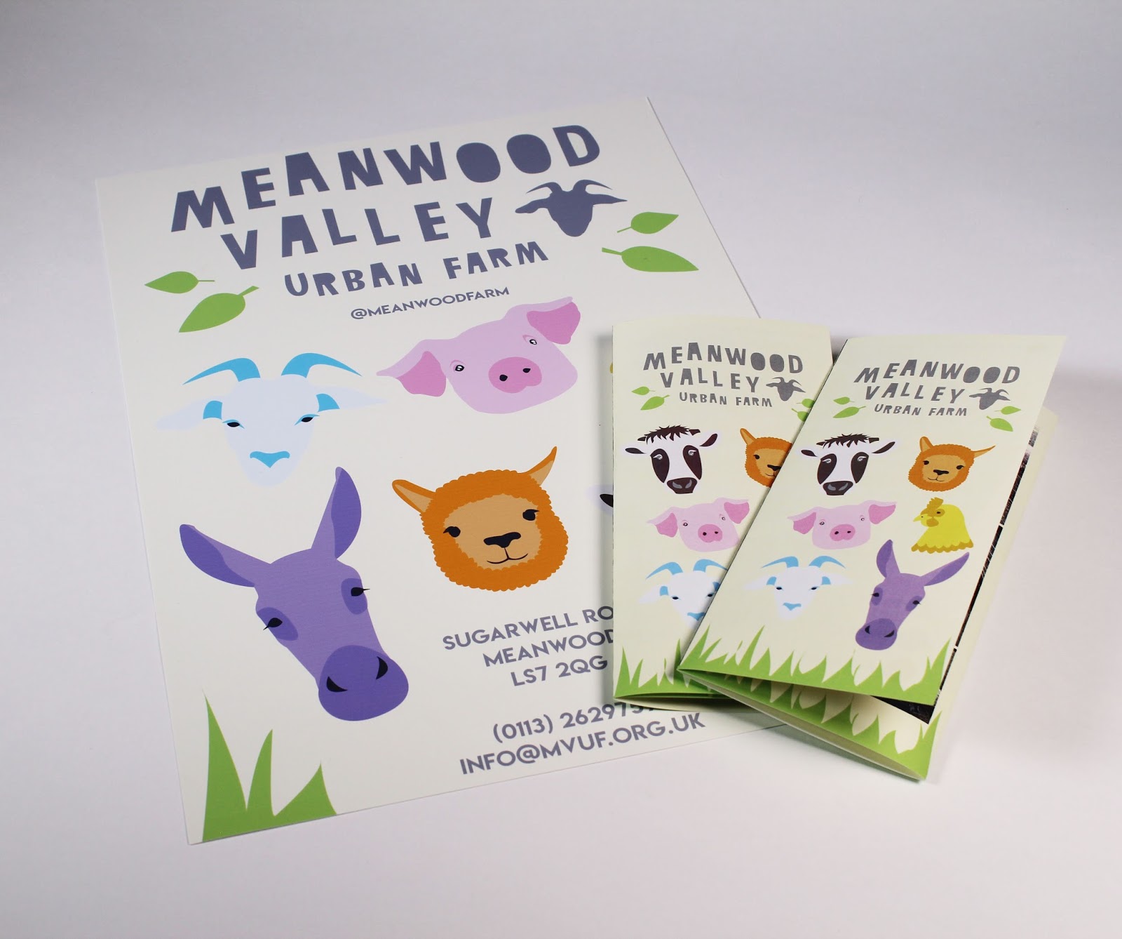
This briefs strength focused on the amount of development of my practice. I’ve learnt largely for the issues and this informed Olivia Marshalls and Meanwood farm brief, as I made sure the meeting focused on being in person and setting a list of outcomes at the start. I also do really like the 4th opinion I created and will use this in my portfolio as this is a big brief and client. This brief also allowed me to connect more with a different course at uni, creating connections with future artists I might work with. The design pushed me outside of my comfort zone, as it had to concentrate on visual design rather than conceptual advertising I prefer, but this showed I do like this and can do this style of design. 

Friday 11 May 2018

603 EP - Petting Zoo Brief, Collab, Final Evaluation


This brief was one of my personal favourite, this is due to the strength of the collaboration. At the start of the brief, we defined what each of us would go along with a list of outcomea, (due to fine art issue). These were delegated based on specialist areas and this worked really well to enhance the final design. We both worked on the different areas and didn’t need to redo or change anything, as it was done to a successful level. This meant that we managed to create more outcomes in the shorter time. A full rebrand was completed, but this was relatively easy compared to the workload, done as it was split in half. In past collaboration, I've had to pester, or do work the other partner was supposed to do to fit deadline but Nanami and I worked well together so this was not needed.  Playing to our different strength was successful, in future, we could work together again and defined what I need to look for in collaborations. Another aspect learnt for Fine art was to meet in person, this was a defining aspect of the effective nature of the brief as we explained our idea better and communicated more productively.

I feel the visual of the outcome are the main strengths, the outcome is fit for the different audience whilst fulling the set issue. Visiting the client area also allowed for the issues to be pinpointed in more elaborated ways, this showed the map didn’t work and also the lack of consistent style, which were fixed by the final outcome. In general, the outcome covers all the needed area and fixes all the issue we encountered and set in the brief. The work was equally set, meaning we both had a large input to the final outcome.

The only weakness of the brief was the with the printing of the final sticker, and the financial issue with the production of stamps. We did want to make stamps children could interact with on the map, but could not support this idea without funding from the client. There were issues with the final print of the sticker, even booked in advance of the deadline the sticker could not be printed correctly due to the illness of the technician. Again if this was funded they could have been professionally printed.

The time planning of this brief was morphe slightly to work around both partner other deadlines but each partner was understanding of this and the final outcome was produced on time.

Adobe Illustrator was used for the design of the outcomes, this software gave large design control. Both collaborators had access and knowledge of the software, meaning we could work on one document keeping the style and guidelines consistent applied over the media. A shared google drive was created at the start of the brief, this was heavily used so both partners had access to full high-quality files alongside the other work.

The final outcomes connect all the client current inconsistent branding as well as fix their outdated and no longer fit for purpose design style. All the assets where re-designed, and the two set of poster sell the client to young adults/teenagers by creating a new, more modern design whilst the family poster allows the brand to still appeal to the current audience of children and families. The social media was added to all their assets to promote this advertising channel, as well as the sites updated for their audience and to match. The outcome covers the set media, advertising and branding, including the website design, social media and print advertising. A total rebrand was completed, that balances the audience ages via informed research. The brand's aims, tones and style are also reflected via the rustic nature of the design.

Tuesday 8 May 2018

603 EP - Petting Zoo Brief, Collab, STOCK

STOCK

To keep all the final outcome consistent fitting the client brief on print aspect where printed on MATT stock. MATT was used to fit with the rustic and texture theme, seen in client research. Also the poster research showed these all used matt stock, to fit in with the student posters the same stock was used.

P&P LUA Art Work - FINAL OUTCOME

FINAL OUTCOME


MOCK UP FOR SUBMISSION OF HOW THIS WIILL LOOK-


Friday 4 May 2018

603 EP - Petting Zoo Brief, Collab, Social Media

Social Media 

NEEDS UPDATING WITH NEW DESIGN / BRANDING

-instagram
-twitter
-facebook

CURRENT
https://www.instagram.com/meanwoodfarm/


https://www.facebook.com/MeanwoodValleyUrbanFarm/


https://twitter.com/MeanwoodFarm?ref_src=twsrc%5Egoogle%7Ctwcamp%5Eserp%7Ctwgr%5Eauthor

NOTHING MATCHES
NOT BRANDING
UNPROFESSIONAL
DIFFERENT IMAGES ON EVER SITE / INCONSITENT 


added logo -


need to make the background the same and apply branding 


603 EP - Petting Zoo Brief, Collab, student poster

Student poster

primary research -


-easy to read
-bold sans serif type
-all upper case
-simple background
-use of shape/forms
-bold colour schemes
-list of artist playing
-centered text
-landscape
-type is main focus
-type and backgrouns
-little use of images
-have the bottom sectioned off 


NAMES -
alpaca trio
lonely donkey
petting sheep ft little lamb
the noisy pigs
feed the goats
the chicks
plus special guest - crazy cows

ELEMENTS TO INCLUDE/HOUSE STYLE

USE THE HOUSE STYLE ELEMENTS

-idea use the shapes from the map as the background?


with the current typeface-


using the colour the animal is for the background-


FEEDBACK FROM COLLAB -


feedback -

likes the 'the best farm and petting zoo in leeds' but needs petting zoo to be on one line
like it without the white background text, harder to read


603 EP - Petting Zoo Brief, Collab, Website

For Mean-wood Farm a collaboration i'm designing the website, to do this as it need to be able to work live i've decided to use a website building site. Allowing them to use the website without having to hire a developer. I've never used this site before, and only need to design a home page.

current page

ISSUES
-OLD BRANDING
-TOO SERIOUS
-OVERLY  BUSY/ TOO MUCH INFORMATION
-OUTDATES
-DOESN'T MATCH NEW STYLE
-NOT INVITING FOR AUDIECNE DUE TO COLOUR SCHEME
-DOESN'T APPEAL TO CHILDREN
-SOCIAL NOT SHOWED
-NEEDS TO BE MORE VISUAL INTERACTIVE/ ENAGAING 

THIS ALSO MEANS THEY CAN SEE HOW TO WEBSITE WILL WORK/INTERACT WITH IT


-NEEDS TO BE CHILD FRIENDLY,
-USE COLOUR SCHEME AND HOUSE STYLE
-USE LOGO AND TYPE

using the colour scheme -


ALLOW CORRECT COLOUR


ALLOWS CORRECT TYPEFACE TO IMPROVE CONSIENCE


added home /page buttons -


adding bottom page -


adding social page to promote follows and show collection of visitor imagery


cannot use typeface due to issues-

used most similar to lemon milk 

made this link to their social media pages -


change contact to about us, due to website already including all contact info on the header/all pages. 

current page 
-make it match other pages-


MOBILE SITE, NEED TO WORK FOR MOBILE TOO


benefits of mobile -


editing the menu pages, making it match branding -

use test changes -
used the site on my phone and made the changes needed to make it work on this device / run

CHANGED SO BIGGER GAP AT THE BOTTOM OF THE PAGE

https://beth-fitton18.wixsite.com/meanwoodfarm

this would be a real domain is bought by the client, currently just used as a prototype 

final phone images -