Presentation Feedback
After the presentation the feedback was very mixed, the audience felt like the images worked as they displayed the feel of the festival. The photography capture the moment, experience and feel of the place which was a benefit of the style of camera uses and the imperfect layout of each photo. The mistakes and the blue hue gave reflected the imperfect, messy, cheap feel of the festival which was postitive as i wasn't sure if i should redo the imagery, but the audience felt it expose the correct emotions which links the reason this style was used. The media was effective in capturing the vibes therefore the bad quailty of the imagery had meaning, they understood the reasons behind the design decisions involved in the brief.
-IMAGERY WORKS AS IT HAS MEANING
Although the audience felt it reflect the festival well it was pointed out that the images where effectively a photo album my personal trip to a festival, the images are a collection of my experience and even thought other people will have visited the same place the needed a link to be interested. No one would buy someone else photo album as the audience don't relate to it.
-ISSUE, MAKE IT RELATABLE NOT JUST MY EXPERIENCE
The feedback said that i should add something else to the book to make it either funny or relatable, represent the whole experience via quote or funny stories as this what make will make the book appeal more to an audience. To make the book have more of a hook as it makes them laugh or it makes them relive the experience, things they can relate too.
-ADD QUOTES/STORIES TO MAKE IT FUUNY/RELATEABLE
- GO TO THE VILLAGE BOOK SHOP OR COLOURS MAY VARY AND LOOK AT THE ZINES
After the crit i asked for feedback if i should redo the project with a easier theme that would sell better but the images have a unique charm to them, they needs a substantial idea to link them. Give the audience a feature that not just my recollections. The images have potential to be great but they just need something more or something that sells them, to find out how current quirk style books do this i aim research into existing products to find ideas/inspiration of how to do this.
-DONT REDO IMAGES
Thursday 29 September 2016
Saturday 24 September 2016
504 - Design Production, A - Z in Content, Festival Associations
Festival Associations
As the publication for this brief is being to design and created to express the festival, things taken from leeds festival ect. Primary research into asking people what they need/take/associate with festivals as well as knowledge for items i've taken or seen over the years will be conducted to see things that can be included or represented in this brief.
Primary Research - 'What things do you thing of when you thing of leeds festival?, What things do you take?,What thing do you see there? What things do you need for a festival?'
'glitter'
'neon face paint, in the weird circles'
'tents'
'guide ropes, and falling over them'
'MUD'
'beer/alcohol/vodka/cans, often cheap beer or cider'
'sick'
'rain, rain, rain'
'drunkenness'
'haze'
'music'
'messy/dirty/unorganised'
'free, fun, drunk'
'waterproof materials, for tents, clothes, chairs, bloody everything cause it will rain'
'hangover, and tents'
'wellies, everyone has wellies'
'things breaking'
'bucket hats'
'maps, the land yard things with the band times on'
'shit expensive burgers'
'fast food'
'walking'
'usually hygiene levels, BABY WIPES'
'glitter, neon, henna, body art'
'sunglasses, flower handbands'
'sock and jumper, it get cold, sleeping bags'
'fags and beer'
'bright lights, flags and bunting'
'sun, sometimes'
'disposable cameras, actually disposable everything'
'spray paint and hand drawn text'
'ALAN, STEVE'
'camp fires and burnt shit'
The aim of the book is too look into ways these items can influence the design or the production of the festival, express these thing and include them as much as possible to make sure the book represents the weekend and allow the audience to remise via not just the copy and the imagery. At the moment theres no idea on to how these can be used as the concept for the book has been decide on be a few ways these things could be used- neon screen printed text, glitter on the pages or screen printed text, string in the binding to represent guide ropes, burnt pages (campfire/fags), waterproof cover/case (tent), landyard for the book to be made on, messy book cover, mud book cover, mud colour scheme, spray printed/hand sign copy, hazey design (hazey drunk vision), vodka/beer stain pages.
Friday 23 September 2016
504 - Design Production, A - Z in Content,Target Audeince
target audience-
The due to the content of the book target audience of the publication will be past and future visitors to Leeds Festival, therefore it will be the same target audience/market as the festival itself. The festival visitors will be music/festival enthusiasts but the elements which encourage them to visit this festival over other similar event will be location, genre of music and the overall experience.
'We welcome all ages to the festival. However, there are entry restrictions for under 16s and we do advise not bringing young children. Anyone 15 and under must be accompanied by a ticket holder over 18 years old at all times. Children under 13 years are admitted free.' via http://www.leedsfestival.com/history/leeds-festival-2016
Although any age range is allowed the target audience for the festival from primary research at the festival was 18-25 year olds, whilst at the festival most people seen there fit this age range. The was mix between genders, women and men both attend the festival but due to the rock nature of the music style it was slightly more male as in generally more men are interested in rock music and the festival experience. There was roughly 90,000 people visit the festival each year, this range from children seen a few times ta the festival with the parents to older 50 year olds.
As Leeds Festival allows in any people over the age of 15 without an adult this causes the festival to be a end of school celebration for many school leavers, this was done every year at my school so i have personal experience of this but also from many other school near me. This is done as this gives the leavers their first taste of freedom but in a controlled environment, this is why the target audience is 18-25 as younger people attend the festival heavily.
As the festival play different bands each year the audience of the festival depends on the line up, people will go the festival is their favorite band is playing or if they like the line up but also will not go if they don't. Most of the visitors to the festival will depend on the line up but also many will go for the experience. Leeds festival is a camping site festival, many people will go for the festival experience of drinking, rides, food, bands, sun ect.
Location
Location is very important for the festival target audience, this is as the festival has a twin festival Reading situated down south where the same bands play but on difference night. The experiencea of the festival are very simailr except the Leeds festival is not recorded for Tv, this means the festival has a wilder nature than the reading festival which has to be controlled more to be suitable for Tv Viewers. As there is effectively a north and south version of the festival means that the audience of Leeds will be mostly from the northern as this is easier to travel too.
SUMMARY -
people who have visited the festival
people who are going to the festival
18-25 who might visit the festival
northern based
interested in music/festivals
504 - Design Production, A - Z in Content, Leeds Festival Research
Leeds Festival Research
For the summer brief the content research of this studio brief was taken as Leeds Festival, this area was selected due to the nature that festival are seen a weekend experience shared by the visitors that can be capture but photographic imagery. Festivals setting are completely different to everyday normal life therefor this would make a totally unique content for book, it would give the book a specialized theme that aim to reflect the once a year weekend experience. Event, stores, things, drunken mistakes happen at festivals that wouldn't happen anywhere else therefore capturing this is a book will full a current gap in the market for festival realistic books.
NO OTHER FESTIVAL BOOKS EXIST, FULFILLS THE PROBLEM
To give the imagery captured content for the book research into the festival need to be completed this is to a understanding into the features of the festival, what make it unique, what is it, what genre is it, who goes.
Leeds Festival Research

Branding For the Festival
logo/posters -


colour scheme -
bright yellow and red
target audience-
'We welcome all ages to the festival. However, there are entry restrictions for under 16s and we do advise not bringing young children. Anyone 15 and under must be accompanied by a ticket holder over 18 years old at all times. Children under 13 years are admitted free.' via http://www.leedsfestival.com/history/leeds-festival-2016
Although any age range is allowed the target audience for the festival from primary research at the festival was 18-25 year olds, whilst at the festival most people seen there fit this age range. The was mix between genders, women and men both attend the festival but due to the rock nature of the music style it was slightly more male as in generally more men are interested in rock music and the festival experience. There was roughly 90,000 people visit the festival each year, this range from children seen a few times ta the festival with the parents to older 50 year olds.
As Leeds Festival allows in any people over the age of 15 without an adult this causes the festival to be a end of school celebration for many school leavers, this was done every year at my school so i have personal experience of this but also from many other school near me. This is done as this gives the leavers their first taste of freedom but in a controlled environment, this is why the target audience is 18-25 as younger people attend the festival heavily.
As the festival play different bands each year the audience of the festival depends on the line up, people will go the festival is their favorite band is playing or if they like the line up but also will not go if they don't. Most of the visitors to the festival will depend on the line up but also many will go for the experience. Leeds festival is a camping site festival, many people will go for the festival experience of drinking, rides, food, bands, sun ect.
Location
Location is very important for the festival target audience, this is as the festival has a twin festival Reading situated down south where the same bands play but on difference night. The experiencea of the festival are very simailr except the Leeds festival is not recorded for Tv, this means the festival has a wilder nature than the reading festival which has to be controlled more to be suitable for Tv Viewers. As there is effectively a north and south version of the festival means that the audience of Leeds will be mostly from the northern as this is easier to travel too.
For the summer brief the content research of this studio brief was taken as Leeds Festival, this area was selected due to the nature that festival are seen a weekend experience shared by the visitors that can be capture but photographic imagery. Festivals setting are completely different to everyday normal life therefor this would make a totally unique content for book, it would give the book a specialized theme that aim to reflect the once a year weekend experience. Event, stores, things, drunken mistakes happen at festivals that wouldn't happen anywhere else therefore capturing this is a book will full a current gap in the market for festival realistic books.
NO OTHER FESTIVAL BOOKS EXIST, FULFILLS THE PROBLEM
To give the imagery captured content for the book research into the festival need to be completed this is to a understanding into the features of the festival, what make it unique, what is it, what genre is it, who goes.
Leeds Festival Research
The Reading and Leeds Festivals are a pair of annual rock music festivals that take place in Reading and Leeds in England. The Leeds
event is held in Bramham Park, near Wetherby, the grounds of an
historic house. Campsites are available at both sites and weekend
tickets include camping. The festivals are run by Festival Republic.
Festival Strap Line - Leeds Festival is the number one UK music festival taking place over August Bank Holiday Weekend. via http://www.leedsfestival.com/history/leeds-festival-2016
Stages -
Main stage – major rock, indie, metal and alternative acts.
NME/Radio 1 stage – less well-known acts, building up to an alternative headline act.
Dance tent – dance music acts, previously sharing a day with the Lock Up stage, now a stand-alone 3-day stage.
Lock Up Stage – underground punk and hardcore acts.Due to demand, from 2006 this stage took up two days rather than previous years where it was only one day.
Festival Republic stage (formerly known as the Carling stage) – acts with less popular appeal and breakthrough acts.
1Xtra Stage – new stage for 2013 that stages Hip-Hop, RnB and Rap artists.
Alternative tent – comedy and cabaret acts plus DJs.
BBC Introducing Stage – Typically unsigned/not well known acts. (Formerly known as the Topman Unsigned Stage at the Leeds site).
types of music-
alternative
rock
dance
indie
house
rap
but the heavy focus is now rock/indie music, the main headlines for the last few years reflect this.
line up for this year/when the content was taken-

Branding For the Festival
logo/posters -


colour scheme -
bright yellow and red
target audience-
'We welcome all ages to the festival. However, there are entry restrictions for under 16s and we do advise not bringing young children. Anyone 15 and under must be accompanied by a ticket holder over 18 years old at all times. Children under 13 years are admitted free.' via http://www.leedsfestival.com/history/leeds-festival-2016
Although any age range is allowed the target audience for the festival from primary research at the festival was 18-25 year olds, whilst at the festival most people seen there fit this age range. The was mix between genders, women and men both attend the festival but due to the rock nature of the music style it was slightly more male as in generally more men are interested in rock music and the festival experience. There was roughly 90,000 people visit the festival each year, this range from children seen a few times ta the festival with the parents to older 50 year olds.
As Leeds Festival allows in any people over the age of 15 without an adult this causes the festival to be a end of school celebration for many school leavers, this was done every year at my school so i have personal experience of this but also from many other school near me. This is done as this gives the leavers their first taste of freedom but in a controlled environment, this is why the target audience is 18-25 as younger people attend the festival heavily.
As the festival play different bands each year the audience of the festival depends on the line up, people will go the festival is their favorite band is playing or if they like the line up but also will not go if they don't. Most of the visitors to the festival will depend on the line up but also many will go for the experience. Leeds festival is a camping site festival, many people will go for the festival experience of drinking, rides, food, bands, sun ect.
Location
Location is very important for the festival target audience, this is as the festival has a twin festival Reading situated down south where the same bands play but on difference night. The experiencea of the festival are very simailr except the Leeds festival is not recorded for Tv, this means the festival has a wilder nature than the reading festival which has to be controlled more to be suitable for Tv Viewers. As there is effectively a north and south version of the festival means that the audience of Leeds will be mostly from the northern as this is easier to travel too.
504 - Design Production, A - Z in Content, Presentation
Presentation
As a form of crit for this brief created over summer, a small summary of the images needed to be shown to part of the class to receive feedback/advice on how the use the brief for the book brief the other day. The presentation will be to about 15 people and must show the idea, some photo the theme but only last 3 minutes. This presentation is to help with issues, it will allow feedback from any questions and to show the images to a wider audience to see how they respond to the work.
ideas/issues-
One of the issues with this outcome is that as the presentation is blown up on a smart board the image quality of the images which is already low will be look worse on the screen, to avoid this the images shouldn't be too big on the slides. Busy images might need simple design for the layout of the work as not too over powering. Select the best photos as can only talk for 3 minutes so cannot show every photo, 5-9 to give a feel for the project, a range of different type of shots but allowed talking time about each image, shot with finger on, shots with blue background to show issues and ask advice.
questions/ideas for the Crit-
The quality links to the concept of the outcome to express the atmosphere of the festival and give off a more festively accurate vibe, although this is done for a purpose after comparison with other outcome within a peer group i'm not sure if i should redo the project with a different them?. This is a question i will ask during the feedback time, get options on if the photos achieve what i wanted too or if they don't fit the brief or this purpose. The image quality is low but this makes it hard to create a graphically aesthetic book, should this be embrace and based the style around this or should i redo it? SHOULD I REDO THE BRIEF? How will the book sell, who is the target audience, does the idea behind the photos give them more personality?
First Presentation Layout


On this presentation a title page was added, this was so that i got time to explain the theme/idea before showing the images. Define what i wanted achieve via the photos before showing them, this would give the audience a chance to focus on what i was saying rather than looking at the images straight away. A simple quick hand drawn title page was added as i felt the digitally created text used on the other presentation gave a too harsh feel to the project, a hand drawn fitted with the messy style of imagery/concept.

3 images where added to each slid in this design, this is as feedback said that the images on their own were weak from a photography point of view but worked as set to express a common style, therefore displaying them in group showed how the theme worked better. Also this meant the images could be smaller on the slide without leaving too much white space, an issues found here was that as making the photo bigger reduce the quailty so did making them smaller, but it reduce the quialty but less then making them bigger did. SCAN NEGATIVES IN ON A BETTER SCANNER. 3 seemed to work best as they were big enough to see the letter, but not too big so that the slide was overly complicated as the images are busy the design needed to be kept simple.


As a form of crit for this brief created over summer, a small summary of the images needed to be shown to part of the class to receive feedback/advice on how the use the brief for the book brief the other day. The presentation will be to about 15 people and must show the idea, some photo the theme but only last 3 minutes. This presentation is to help with issues, it will allow feedback from any questions and to show the images to a wider audience to see how they respond to the work.
ideas/issues-
One of the issues with this outcome is that as the presentation is blown up on a smart board the image quality of the images which is already low will be look worse on the screen, to avoid this the images shouldn't be too big on the slides. Busy images might need simple design for the layout of the work as not too over powering. Select the best photos as can only talk for 3 minutes so cannot show every photo, 5-9 to give a feel for the project, a range of different type of shots but allowed talking time about each image, shot with finger on, shots with blue background to show issues and ask advice.
questions/ideas for the Crit-
The quality links to the concept of the outcome to express the atmosphere of the festival and give off a more festively accurate vibe, although this is done for a purpose after comparison with other outcome within a peer group i'm not sure if i should redo the project with a different them?. This is a question i will ask during the feedback time, get options on if the photos achieve what i wanted too or if they don't fit the brief or this purpose. The image quality is low but this makes it hard to create a graphically aesthetic book, should this be embrace and based the style around this or should i redo it? SHOULD I REDO THE BRIEF? How will the book sell, who is the target audience, does the idea behind the photos give them more personality?
First Presentation Layout


This presentation design as created to add the information about the images next to them, but since feedback from last year said to add less information to the slides and to talk more i've decided against adding type to the presentation. Then without the text the images still need to be small or they will be very low quality on the full screen. A light blue background was added to work with the the colour tint effect caused on some of the photo due to the use of disposable camera. This effect give an over all blue hue to the photos, rather than see this as a negative it is feature which is a very strong feature given by the use of the selected media. This colour scheme highlights the issue with the photos but celebrates it rather than hides it. After creating the design it felt a bit empty, and i wanted to talk about selected styles of pictures, as the audience if the mistakes added personality to imagery or if gave a negative effect. Therefore i decided to experiment more with larger imagery.
Second Presentation layout


This style of presentation was created with a grid to give a more formal look to the presentation, with a simple background and typeface to make the photos standout more. Make them the main focus of the slide and bigger so the audience could see the content more clearly even if it effect the quality . After creating this it showed how much using a blue background not only highlighted the blue hue but seemed to add more blue to the photos , the photos looked more blue on the background which wouldn't be useful for this presentation as i wanted feedback on the basic photos to see if they where useable (not the photos which seemed more blue). The was a very clinical look for the presentation which i didn't think fit with the the style/concept of imagery, i needed to add something more manual or messy to the slides to give a feel for the idea as well as express my personal style more as this would make me feel more comfortable when presenting.
Presentation Style 3

On this presentation a title page was added, this was so that i got time to explain the theme/idea before showing the images. Define what i wanted achieve via the photos before showing them, this would give the audience a chance to focus on what i was saying rather than looking at the images straight away. A simple quick hand drawn title page was added as i felt the digitally created text used on the other presentation gave a too harsh feel to the project, a hand drawn fitted with the messy style of imagery/concept.

3 images where added to each slid in this design, this is as feedback said that the images on their own were weak from a photography point of view but worked as set to express a common style, therefore displaying them in group showed how the theme worked better. Also this meant the images could be smaller on the slide without leaving too much white space, an issues found here was that as making the photo bigger reduce the quailty so did making them smaller, but it reduce the quialty but less then making them bigger did. SCAN NEGATIVES IN ON A BETTER SCANNER. 3 seemed to work best as they were big enough to see the letter, but not too big so that the slide was overly complicated as the images are busy the design needed to be kept simple.

-Combined contrasting imagery to show the range of different style of type collected
- Used the images with the finger over to ask the audience how they felt, (bad or good)
-included blue hue images to see how this worked (good or bad)
- used the images that reflect the feel of the brief best, more interesting and reflective to get feedback on the concept
-included imagery that had anecdote to ask audience if gave more personality to the imagery
Even thought this was just a presentation design for a crit it was the first experimental time using the images in a layout/editoral design style. Playing about with how the layout design effected the imagery highlighted issues that will be applied to the book style when design the layout for that. It showed some aspects of design used in the presentation experimentation which can be applied to the brief outcome.
-blue makes the images seem more blue
-blue fits with the colour scheme of the imagery
-images work better smaller (too big the quality is lost) but not too small as this makes them blurry
-images work better combined/as a set
-manual/imperfect style seems to work better with the style of messy imagery
-dark images work well combine with light images to balance out the theme
-digitally created text gave a too harsh feel to the project, a hand drawn fitted with the messy style of imagery/concept.
-images are busy the design needed to be kept simple.
Thursday 22 September 2016
504 - Design Production, A - Z in Content, Time Plan
Time Plan
After receiving the module bring and the brief briefing a time frame plan has been set, this has used google calendar to work out when all the work well be needed to be produced for the session and crit. Setting this plan early on in the brief will allow planning for around this amount of work and make sure that near deadline there not a build up of work that needed to be done.
The main current aim is that the final is finished for the brief deadline on the 8th November and that print sessions are booked to make this possible, 3 session have been booked, these are on 2 weeks before the final crit for a mock up test, 4 days before the final crit for the final book and the week after is there was an issues. 3 sessions have been booked so that i don't needed t go to drop in as this gets very busy around deadline time.
CALENDAR OF OBJECTIVES -


The main aim for this brief is to get the final outcome and the blogging done for before christmas so i can do h other brief over the holidays, also if this is done i can get feedback on the final solution.


Wednesday 21 September 2016
504 - Design Production, A - Z in Content, Content
Book Content
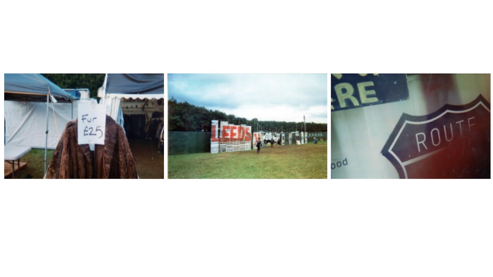
The content and subject for this publication is disposable camera photography taken at the Leeds Music Festival Weekend. Many festival goers use this medium as a way of capturing their weekends therefore mimicking this style is done to reflect the common feel of experince. As well as this analogue photography often has print or development issues which make it less predictable and reliable compared to digital mediums, this theme can be transferred to the festival experince it also has these aspects. The photographic style of the content is messy, drunken, vibrant imagery taken to express the atmosphere at the festival, the aim was the capture the vibe of the weekend visually, to create a a-z of the festival whilst also reflecting the experince. At festivals its very hard/expensive to get charge for digital devices therefore this medium of photography is preferred by many festival goers as it doesn’t relay on charge to work but can still capture the moment and picture. The subject of the photography is things seen annual at the festival, stalls etc that appear every year this is to make the subject more relatable for the audience who have seen in past years.
Some of the imagery didn’t appear as aimed, therefore the best outcome photography have been selected, even with mistake/issues a few of these images have been included as to a personal feel to the content in aim to reflect the messy nature of the weekend. The content is a record of a personal experince but this summaries the experince from the visitors point of view so it’s relate able for anyone who's been or aims to go to a festival

Tuesday 20 September 2016
504 - Design Production, A - Z in Content, Studio Brief 1
Studio Brief 1
Based on of primary research exploring type in a specific geographic context, the outcome of this brief is to produce a publication entitled "Type in context: Leeds Festival". Through the summer task a collection of imagery has been collected including numerous images and written copy about uses of typography in the Leeds Festival Surrounding. This content will become the basic for the book along with a given theme or style that will allow the book to fulfil a current gap in the market.
The publication will feature images and text related to typography, as this model is focus around production the book will be printed and bound to high standard. The publication will be sold commercially based around the art and photography style publications. Unique aspect of the publication will be informed by the target audience, content research, distribution channels and price point. The final publication ca take any size, format and number of pages but these will need to fit for the outcome.
Content considerations:
Research - art & photography books, grid systems, audience
Experiments, developments, evaluate
Type and layout
Photo quality / editing
Preparing your document to print
Production considerations:
stock
print method
binding method
mock ups / experiments (evaluate)
finishes
commercial considerations vs. access to resources
Preparing documents to be sent to print - any considerations in regards to print methods (digital or offset)
Understanding colour/ink and related standards and systems (CMYK, Pantone, etc.)
identifying spot colour, spot varnish, die cut, emboss, and other finishes in digital art work ready for print
what printers will be expecting - marks, bleeds, etc.
Outcome -
The focus of this module is design production therefore you must consider very carefully by what means you produce your publication. Any considerations and discussions about production methods and processes should be documented in your blog.
Your work must demonstrate an in-depth understanding of all the facets of publication design and production. This will be communicated through your blog, design boards and finished publication.
1. Finished publication
2. Studio practice blog
3. Design boards
4. Any mockups / experiments
5. Evaluation (500 words)
Saturday 10 September 2016

Thursday 1 September 2016
504 - Design Production, A - Z in Content, Selected Edited Leeds Photos
Edited Leeds Photos


best images -
Subscribe to:
Posts (Atom)