Thursday 28 April 2016

406 Studio Brief 3 - Collaboration Brief - Facebook Event

Facebook Event

Since we are target creative and student for this brief one of the main way fresher, events, gigs and gather are organized these days are via facebook events, this is as facebook hare the event you are going to with all your friends and this happen for everyone who says their going, this gives a larger audience to the events as people will see the event via association . Also it allows the people to invite other to the event via a notification, so you can share events with your friends ect. For this exhibition a facebook event has been created for the exhibition using the same branding and house style as the other social media platforms.

examples of it being use by clubs ect


The time, place and links to the other sites have been added to allow people to switch between site to see a greater knowlegde of the exhibition.  


This shows the event being created as private but this was changed after the screenshot


The stamp was used as the background to link the group to the branding work for this brief and exhibition as the branding will be used across the work produced for this brief.


This allows us to have a event available where we can be messaged and ask questions, creative can see all the details need to attend and see who is going to the event and create a social awareness as this as a event. The other social media platform present this as a idea, as a profile but this defines the exhibition as a event that people can go too.
If people put they are going to the event on facebook they will receive at notification on the day reminding them, this allowed us to to remind people about the event so they don't forgot but without being too annoying/forward as it done via facebook.

example of the notification they will receive-

but this will be for our even not this one.

406 Studio Brief 3 - Collaboration Brief - Twitter Update


Twitter Update

After updating instagram with the new logo and the new stan idea, this was then applied to the twitter page to make it reflect the house style we are aiming for. This will keep a current branding style thought all the social networking connection help them link together more a set for one event, feedback from he presentation like the branding on the twitter page therefore link the Instagram page the only part that has been changed is the logo, its be added the same logo as the Instagram and the pages now link together as a set visually as well as via a actual website link.


the tweets form the page link to the Instagram site too, they have link between each pages to allow creative/the audience to flick between the page to see more professional as the style link with the styles done by the researched exhibitions. 


same hashtag used as the on on the Instagram to keep it simple and easily to remember

One of the ams of the twitter page was to follow ether creative so they would be aware of the exhibition, this will focus on ones i collected for the list to sent then invites too. Using this account they have all been followed, this is the second social media site they have been followed on now by the exhibition so that aims to make them interested in the exhibition. 


406 Studio Brief 3 - Collaboration Brief - Instagram Update

Instagram/Stamp Update

After the feedback from the last presentation, on the things we needed to change was the branding as they liked the social media networks but it needed to be update to fit with the ideas of the stamp i created for that branding. All of the promotional work and work for this need to have a same branding therefore the stamp i created will be used off all the imager on the social networking site and the stamp its self will be used on stamp on peoples hands when they visit them exhibition, taken the idea from clubs/events that do this when people visit. The stamp at the entrance to brand everyone who visit the exhibition so that everyone where they go after people and see the logo, this will raise more awareness of the brand and the indenity

Stamp example 


Stamp logo applied tot he branding for the instagram, the rest of the page ash been kept the same so its not a too overpowering change and so that it balances with the way finding ect which hasn't been changed, the style need to be reflect thought all the work so it will be the same branding but then the logo changed to stand rather than the whole branding redone.This logo uses a picture of the branding as the logo, the cut out square print as the stamp will stand out best against a white background due tot eh contrast but this makes the logo unclear when its smaller as the line are only thin, due to the primary use of  intagram is on smart phone where the log will be smaller so it need to be scaled down and stamp part made bigger .


stamp size changed, istagram doesn't allowed any control over the movement of the logo of the size of the logo just the image you select therefore tis image had to be alter before submitted to make it fit in the correct space and be seen, this image seem too dark therefore will be lighten up and used again.


This is lightest the logo could be changed to before ti started to effect the quality of the image making it too faint, this is the final Instagram page this layout/style will be applied to the twitter page.

As i have been creating my person submission for the studio brief 2 for this module which is what the final exhibition will be one i have been updating my Instagram page with images of my note and photos of the production, whilst doing this i have used the hashtag and tagged the exhibition in the photos,this is to allow my follower to se the exhibition, one of the aim for the exhibition is to get all the exhibitors to do this for their work, this will allow all their flower to see the exhibition branding and find out about it again raising awareness about it and meaning that more people are interested in visiting to see the work. 


GET EVERYONE TO DO THIS FOR THEIR WORK
GET MORE FOLLOWERS
ALLOWS PEOPLE TO SEE ALL THE WORK AS A COLLECTION
LINKS FORM ONE ARTITS TO ANOTHER
CREATES A FOLLOWING
CREATE A STORY/EXPERIENCE

This hashtags can also be used by people who visit the exhibition when they take photo whilst they are there and upload them to either twitter or Instagram, there will be lists of links and list of the hashtags will be placed around the work in the exhibition and the room so that people can see it so when they upload their images tag it or it will be seen in the photos. This will promote the use of the social media site and the branding more to the audience. 

Wednesday 27 April 2016

406 Studio Brief 4 - Speaking From Experience - Evaluation


Evaluation


For this brief we had to create e piece of design based around out first year experience of the course, i picked a topic that was relevant to me and fitted the brief and had an outcome that overall i’m happy with but looking back i would have picked a more conceptual idea, picked something more original i could have looked into different parts of advertising i received during freshers week and highlighted why they work and how i could create something like that as i aim to specialised in adverting in the future. I could have picked an idea that would have taken less time to produce so therefore would mean i could have spend more time on the ideas and concepts part of the brief. The idea behind this book is still useful to me but the final outcome isn't as funny as i aim for, the first idea was a very funny lighthearted piece but to do this i should have added more quote that were ridiculous but after looking into the idea i and to think about the safety of the audience as don't know what they would and wouldn't do but i didn't want tot be the reason they did something stupid and injured themselves. This is the first time i have design nothing in this style of graphics, its a style that appeal to me and i wanted to experiment with to see how it works and how i could apply it to this brief and over all for the first time i created it i’m happy with the aseptically output, every part of the design has been done with the audience hungover state in mind so it easily readable, easily useable and easy on the eyes but over all the design is still interesting due to the added detail/type style on the pages. The pages of creating a book took a lot longer than i expected for this brief but it was done to make sure that the layout of every double page spread was balanced, balanced was a major feature of this book as no aspect of the design needed to stand out too much as this would cause stain on the audeince which wasn't needed. The colours scheme picked works for this brief as it created a cool looking book, that also reflect clean healthy design but due to the design style being lighthearted isn't to overly serious. The only thing i would do differently is i would reduce the size so ti was A6 more pocket size or experiment with this to see if its then too small on the readers eyes, and i would print off more copied for submission so i could give them out to the new first years.  

Tuesday 26 April 2016

406 Studio Brief 4 - Speaking From Experience - Final Crit/Feedback

Final Crit/Feedback


For the book the final book i have got feedback on the design and the content of the book in its final form, this is to that se what i could improve next time and how i can learn for this brief.

'i don't think eating a raw egg is that health'
'the colour works well to seem calm and refreshing'
the dot are a design aspect seen into a lot of work recently and it relate all to this brief'
'maybe din is a bit too formal for this book and harsh'
'the design have be balanced and works out well so each page is different but not over powering'
'why is just one part of the text white'
'the colour scheme is the best part, it really reflect what you aimed for'
' the over all aesthetically look is good'
'i'd use it, it appeal to me'
'good use of illustration, its seen but not too heavy'
'i'd same of the contrast are still too high but i guess otherwise it wouldn't be readable'
'i like it, the design seems calming to me'

over all this brief has allowed me to focus on the work of a calming design style and i feel this feedback reflect the aim of the book as their are so personal design issues that would be changed but over all the colour scheme and style seems fit for the purpose and the general feedback was positive therefore this outcome has been kind of successful. it does have a down fall with tis the page with the egg quote, i don't like the deign of this page and the text, the design is too heavy and seem to too much like kath kidson style deign.


406 Studio Brief 4 - Speaking From Experience - Binding/Stock

Binding/Stock

The first print for this book was printed into glossy 120 gsm stock, the 120cgsm stock was so that it can be saddle stitch bound easily and so that book could include 20 pages without being too thick. The book need to be light and handy so that i can be found when the subject is hungover and it wont be hard to turn/flip the pages over, the stock was also selected so that the gloss on the paper would make it easier to read the pages but in the first print it made it harder. The glossy stock made it harder to read as it reflect the light which wont be useful if the subject is hungover as they will be sensitive to light, due to the light reflect the book was hard to concentrate on the text, this want help but the  the overly powerful pattern background withs design seemed to be enhanced by the finish, therefore for the next print it will be done in matte finish paper but with the same gsm as this part was successful.

The binding method for this book was going to be saddle stitch as this would hold all the pages together in a thin light bound that wouldn't add any unnecessary detail to the pages, it would seamless hold the pages togetehr without adding any design aspects to the pages. This binding method also make it easily to open all the pages and see them clearly so it would improve the usability of the book for an audeince that was hungover. But it was pointed out that the binding method would rip the pages due to their thickness when it was pulled tight, this happen to the book in my last brief that used the same stock of paper so a simple staple was added to the pages instead for the test, this bound the book together efficiently   but also without distracting from the purpose/content, also the sliver fit with the idea of cool, calming design therefore this method will be used in the next book.

Monday 25 April 2016

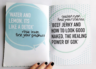
406 Studio Brief 4 - Speaking From Experience - Final Print

Final Print 


406 Studio Brief 4 - Speaking From Experience - First Print

First Print 

paper - glossy 120gsm


ISSUES - 
when research the drink aware logo it stated that the products its on can not promote drunkness, the bottom page (page 4) states a quote that involved 'never sober up' this therefore doesn't fit with the aims of this produce there will need changing
Also on the same page a white square was added after the test print as it overlapped on the other page but this had been placed too close and now doesn't situate in the middle wither, this will need re printing
The stock of print for this book make it look cheap, the images didn't suit the enhanced shiny quality. This book is based around calming and soft design to help the reader if they are hungover, in this print  the glossy paper reflects light which make the pages overall harder to read, this is as it harder to focus on one page or the text thought the reflection therefore the paper needs changing 


changes 


the alinement has been changed and the quote altered to not imply drunkness