Feminists Rebrand Crit
After considering a range of different ways to rebrand feminism after a crit was organized, this was to gather feedback on my current ideas and which to take forward.
FEEDBACK
-too board issue, too many different issues within feminism
-don't re-brand feminism as it's not a brand
-feminism is different for everyone in different country and each person therefor branding it as something ties all the issues together which is not correct
-women do need feminism more than men, so that why it's that way
-just does what the meninist do, makes the worse
-good idea could be probably to board to rebrand it
-social media is a good platform to use
-rebranding as a politic party might imply political parties are sexist
-political party would he hard with no leader/views on all the issue like tax
-ignored all political part stuff, too much to stand out
-issue is to board, what is the issue currently?
-can;t just brand feminism, look into the issues more and pick of of them
-very wide topic
-do more research into feminism and the areas it covers
After the feedback crit it was made clear that currently i do not have one issue, i have a few different ones surrounding feminism and what it is. This is too much of board issue for this brief therefore need to be refined more for the final outcome. Pick one of the issues feminism covers then research this and selected this as currently it's too board. NEED ONE QUESTION/PROBLEM
ideas areas to research//
gender pay gap
stereotypes of feminism
glass celling/why women don't go for better jobs
gender roles
Friday, 28 April 2017
Thursday, 27 April 2017
503 Responsive Studio brief 2, Evaluation
This part
of the module was a group project, at the start of the brief I was excited but
also anxious about working in part of a group. This was a I get very stressed
about working being completed before deadline and hate leaving thing to the
last minute. Throughout this brief I had to work on this control issue, we had to work on other people’s time scale
rather than just mine. Time management was an issue in our group, and we did
leave most of the work to the last minute and large amount of this was due to external
issues for member of the group. As a group we tried to work around these issue
and it meant that the other members of the group had to more work to make up for this. This showed how
vital communication is in group work, and how technology can help with issues
as we worked around these issues using facetime and messaging to get feedback
from the group
The benefit
of working in a group was the different skills of the different member, we
tried to experiment with different areas but also allowed ourselves to do work
personally as well. The final campaign shows the different we work we all made
and due to this represents the group effort. It was very useful to work with an
illustrator as they had skill I couldn’t do as well as knowledge into different
aspect of design, even though the course are very similar subject areas the focus
is around different aspect of the project.
This brief
allowed exploring into how to work a group and how to work around issues out of
my control but till to create an effective output that fits the clients brief. The
final outcome of this brief created a set of work that showed how I can work
with a group successfully for my portfolio. There were times I struggled in the
group work but I’ve tired work around these and this show the important of
communication, without constant communication about idea and meeting this project
wouldn’t have been submitted
503 Responsive Studio brief 1 -, Evaluation
This brief was selected due to personal preferences to advertising and also how to use social medias a form of advertising, this is the subject of my next years works sot completing a project that explored this for this year was really helpful to understand what form of social advertising there are available and how these can be bent to fit the client aims.
Throughout the project the client aims and tone of voice was a major aspect of the design , this was as this is live brief the final outcome could be picked as the winner and use by the client. Also the aim was to find the most unique interesting way to use social media sites and personal knowledge of the target audience to explore ways of advertising which bent to the market preferences.This idea was build around using social platforms and the customer use of them as way to advertising and to connect with the target audience.
The development stage of this brief was the longest process as intended for the final outcome to be functional, i aimed to create a final idea that could visualize my idea to client. As the final product do actually work this made the whole project ore successful so in my opinion was worth the extra time taken. this also allowed content photos of the item to be taken so the client can see how the product will be interacted with by the user.
An issues with the outcome of the brief is that although it promoted the brand ons coal channel to the target audience there is only a little mention of the 'craft cider' aspect of the brand. The unique selling point was the pig rather than the craft cider element which the client highlighted as important this was due to the type effect the snapchat filter when surround the imager. In the professional world a designer or developer with more knowledge of the software and how it works would have found ways around this. Besides the focus not being on the craft cider aspect of the brief personally i'm really happy with the final outcome of this brief this is due it being a functional campaign feedback form he audience stated they would use.
Wednesday, 26 April 2017
Tuesday, 25 April 2017
Friday, 21 April 2017
505 Design Practise 2 - Studio Brief 2 - Feminism Rebrand Ideas
Feminism Rebrand Ideas
As many of the issues surrounding this area are around the idea that society seem feminism as a female only issue and view. Therefore this idea is to rebrand feminism in some way to that this is no longer reflected.
idea 1)This idea would brand feminism as a colour-less, genderless, strong concept rather than the current media/design proception. This takes the issue which is shown in many different exhibitions/events based around feminism that reflect a common girly, pink house style of design. This is a cause of many of the stereotypes related to who and what feminist are, branding it as a girly issue and subject therefore implies it's a girl issue. This also related to gender role issues with feminism aims to combat, gender association with selected colours ect.


To combat the existing stereotypes seen in graphic design this would brand it as a neutral subject area which it is, the campaign would focus around a a unisex branding of the subject to express the unisex beliefs and support. Express its about equality rather than just females. VISUALLY SHOW THE STRONG ISSUE IT EXPRESSES, SHOW THE SERIOUS NATURE OF THE FEMCIDE ECT.
idea 2) As feminism is not currently seen a strong powerful respected movement in mass media or by the general public which is an issue as it effects how the audience perceive the issues as non-serious or non-relevant. This idea would be to rebrand the Feminism as a political party in it's own right. Design a independent politic party around the ideologies feminism follows, which fights for the issues acciasted with the ideas it supports. To create a campaign based are the same way existing politic campaigns target their audience and run, this would be in aim of expressing the serioness nature of the ideas and the issue. The design style, structor and products would be based around the way normal political campaigns sell themselves to the market.


This would also serve as to inform the aims of feminism and to teach many about who are ill-informed about the ideas the correct definition. This would correct the current incorrect perception of what feminism is, what it does and it's relevance.
idea 3) As research has showed that many of the ways 'meninist' fight against feminism is via social media, in the form of sexist related memes and jokes. The aim of this idea is to create correctly feminist memes/memes page which would only share correctly feminist memes which would then create a direct way to contrast this, as to inform the correct aims of feminism. Using humour related images and text in a lighthearted non-serious manner which will inform the intended target market.


Pointing out the humourous and ridiculous nature of the issues non-feminism support as sexist would allow a wider audience to understand more about the subject, this also would cause the audiecne to agree or related to the content expressed which would show them themselves are feminist as they agree with feminist principles.
idea 4) This idea would take a currently popular trend which is buzzfeed quizes, and would create a very simple direct one which expressed the correct meaning of feminism. The quiz would consist of one questions, 'DO YOU BELIEVE IN EQUAL RIGHT FOR THE SEXS' 'YES' would respond with 'WELL DONE, YOU ARE A FEMINIST' where as 'NO' would respond with 'OH NO, YOU ARE A SEXIST'.

This quiz answers would directly remove the confusion around the issue and which what a feminist is which is an issue research highlighted. This would allow in very simple term the audience to understand the definition of the term removing the stigma and misconception in an interactive way that works of current trends. Allows them to find out they are them selves.
idea 5) Feminism is not a trend, it's a belief campaign. Advertising poster set/campaign that shows feminism is not a trend or an brand but a thought process, to contrast the brands benefiting of the label.
As many of the issues surrounding this area are around the idea that society seem feminism as a female only issue and view. Therefore this idea is to rebrand feminism in some way to that this is no longer reflected.
idea 1)This idea would brand feminism as a colour-less, genderless, strong concept rather than the current media/design proception. This takes the issue which is shown in many different exhibitions/events based around feminism that reflect a common girly, pink house style of design. This is a cause of many of the stereotypes related to who and what feminist are, branding it as a girly issue and subject therefore implies it's a girl issue. This also related to gender role issues with feminism aims to combat, gender association with selected colours ect.


To combat the existing stereotypes seen in graphic design this would brand it as a neutral subject area which it is, the campaign would focus around a a unisex branding of the subject to express the unisex beliefs and support. Express its about equality rather than just females. VISUALLY SHOW THE STRONG ISSUE IT EXPRESSES, SHOW THE SERIOUS NATURE OF THE FEMCIDE ECT.
idea 2) As feminism is not currently seen a strong powerful respected movement in mass media or by the general public which is an issue as it effects how the audience perceive the issues as non-serious or non-relevant. This idea would be to rebrand the Feminism as a political party in it's own right. Design a independent politic party around the ideologies feminism follows, which fights for the issues acciasted with the ideas it supports. To create a campaign based are the same way existing politic campaigns target their audience and run, this would be in aim of expressing the serioness nature of the ideas and the issue. The design style, structor and products would be based around the way normal political campaigns sell themselves to the market.

This would also serve as to inform the aims of feminism and to teach many about who are ill-informed about the ideas the correct definition. This would correct the current incorrect perception of what feminism is, what it does and it's relevance.
idea 3) As research has showed that many of the ways 'meninist' fight against feminism is via social media, in the form of sexist related memes and jokes. The aim of this idea is to create correctly feminist memes/memes page which would only share correctly feminist memes which would then create a direct way to contrast this, as to inform the correct aims of feminism. Using humour related images and text in a lighthearted non-serious manner which will inform the intended target market.


Pointing out the humourous and ridiculous nature of the issues non-feminism support as sexist would allow a wider audience to understand more about the subject, this also would cause the audiecne to agree or related to the content expressed which would show them themselves are feminist as they agree with feminist principles.
idea 4) This idea would take a currently popular trend which is buzzfeed quizes, and would create a very simple direct one which expressed the correct meaning of feminism. The quiz would consist of one questions, 'DO YOU BELIEVE IN EQUAL RIGHT FOR THE SEXS' 'YES' would respond with 'WELL DONE, YOU ARE A FEMINIST' where as 'NO' would respond with 'OH NO, YOU ARE A SEXIST'.

This quiz answers would directly remove the confusion around the issue and which what a feminist is which is an issue research highlighted. This would allow in very simple term the audience to understand the definition of the term removing the stigma and misconception in an interactive way that works of current trends. Allows them to find out they are them selves.
idea 5) Feminism is not a trend, it's a belief campaign. Advertising poster set/campaign that shows feminism is not a trend or an brand but a thought process, to contrast the brands benefiting of the label.
Thursday, 13 April 2017
505 Design Practise 2 - Studio Brief 2 - Meninist
Meninist
As a rebellion against stereotyped feminist 'Meninist' is a term that has been created over social media sites.
'Meninism is a semi-satirical gender equality and men's rights movement. Its followers are known as meninists.'


As a rebellion against stereotyped feminist 'Meninist' is a term that has been created over social media sites.
'Meninism is a semi-satirical gender equality and men's rights movement. Its followers are known as meninists.'


These definition explain how meninist are a form of society the rebellion against feminist stereotype. The purpose of Meninist is to contradict what society partly believes incorrectly feminist are and what they believe in, they are the opposite version of a feminist as certain people see this yet are infact the same.Also these are seen as people who call out sexist feminism, people who stand against feminism or the empowerment of women, highlight the hypocrisy of feminist. FEMINIST AND MENINST BELIVE IN EQUALITY THEREFORE ARE THE SAME.
Whilst explaining what a meninist is these definition also explore more the stereotypes of a feminist as it shows that people think feminist support the abuse and rape of men where this is far for the correct definition, feminist support equality therefore would fit against this idea. This concept of creating an effectuality 'anti-feminist' party shows the deep misunderstood nature of the the label/ideaolgy.
The main platforms used to promote this
'The BBC reported on it last year, describing it as a hashtag "started by men sharing jokes", but said some were also using it to “express the difficulties of being a man in the 21st century".'
'#MeninistTwitter hashtag has picked up steam, and now features memes and questions about why "men can't have the same equality as women"' SOCIAL VERY POPULAR
'originally hijacked from male feminists' STARTED BY MALE FEMINIST
Was then used as a platform to promote anti-feminist and sexist tweets.


The term meninism was used in the early 2000s to describe male feminists who opposed sexism and supported women's right for equality in society, politics and at work. By the next decade, the term was used on social media to make jokes which mocked and criticised radical feminism. In 2013 the BBC reported that the hashtag #MeninistTwitter was being used on Twitter, first to share jokes about feminism, but later to share more serious difficulties facing modern men. In 2015, Nolan Feeney of Time reported that those who used meninist hashtags "generally fall in two camps: people who use the term to call out ways they believe they’ve been victimised by feminism, and people who make fun of the first group for not understanding what feminism means in the first place"
where?
social media is the main place for this


Wednesday, 12 April 2017
505 Design Practise 2 - Studio Brief 2 - This is What a Feminist looks Like Article
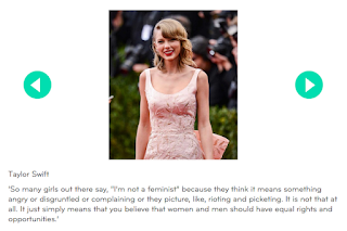
This is What a Feminist looks Like Article
http://empowering.hearst.co.uk/be-informed/this-is-what-a-feminist-looks-like/
Elle has created this article as part of their 'Empoweing Women' movement shown via the t-shirt campaign explore in earlier research, the aim is to show and contradict the common misconception of what society view feminist as.
The article content is expressing and showcasing some famous feminists, this article explore their view on feminism. The aim of the article is to fight the existing mis stereotypes of being a feminists, the common view many people have of what a feminist is as shown by other research into urban dictionary highlight that many people see feminist as 'men hating' where as this is far for the definition and the beliefs of feminists.


The whole underpinning concept of this Elle camping is to fit with the idea of changing this social stereotype, but again even though the idea is here by accident there is an a issue with this article as it does not show a very diverse range of feminist.
In this article due to the subject it chose to include this articles expresses feminist to be mostly white heterosexual females, the lack of diversity in the article again is setting a different stereotype for what it's expressing as a feminists. The lack of males in this articles is adding to the idea that feminism is a purely female issue and belief.
Friday, 7 April 2017
505 Design Practise 2 - Studio Brief 2 - Feminist Memes
Feminist Memes
https://www.buzzfeed.com/hattiesoykan/memes-you-should-send-to-your-feminist-friend-right-now?utm_term=.jdqzMl17e#.yrD7KJz6X
One of the most popular communication current trends is via social Memes, these get shared vasty over different social sites and see a very wide range of audiences. Theres usually take a relatable issues then use humour to make it appeal to the audience and to encourage the audience to share/repost ect increasing the view of the image/showing the image to a wider network.
As meme are a popular trend one theme of a range of memes has been feminist views. This promotes female empowerment and raise awareness round issues women face daily in an inform style which a younger target audience will be receptive too.


The main theme of these is to poke fun at beauty standards and misgynistic views as to empower women and promote feminist ideals which is shown in some of the memes in the article. This type f meme reflect what feminism aims to promotes whilst calling out gender inequality to raise awareness.


An issue with some of this content is that some of the meme in the article pictured above do showcase feminist as just relating to or retable by heterosexual women rather than show a diverse range of different subjects. Also many are offensive or show offensive views towards to men, or make jokes surrounding putting down men ONE SEX CANNOT BE EMPOWER BY PUTTING ANOTHER SEX DOWN, this is not what feminism is and goes against the main principle.
This directly shows where and whats societies view on feminism steam from, this sort of thinking goes against feminism theories yet is reflect as feminist. The repost/sharing of these images with a 'feminist' tag is contributing to the 'men hating, female' only feminist stereotype. This shows an example of what needs changing in the media and online via this project outcome.
Wednesday, 5 April 2017
505 Design Practise 2 - Studio Brief 2 - Feminist Adverstisement Research
Feminist Advertisement Research
As over research currently explores feminism covers a range of different social issues, there are many different subcategories this area cover but for this brief one need to be selected. Therefor to identify an area which need to be promoted/ issue effectively research into successful or existing (or both) campaigns and adverts related to the area will be explored as to identify where the gap is, ton needed to be taken, style and also to show any pitfalls of issues which can be avoided.


Women's Equality Party
 -simple yet direct
-facts used to back up ideas
-uses imagery to visually reflect the idea
-links directly visually to the theme/idea
-uses shock but also humour
-not complicated for the views, makes the issue seem simple via this, easily understood
-not just aimed at females
Virgin Slims

-
As over research currently explores feminism covers a range of different social issues, there are many different subcategories this area cover but for this brief one need to be selected. Therefor to identify an area which need to be promoted/ issue effectively research into successful or existing (or both) campaigns and adverts related to the area will be explored as to identify where the gap is, ton needed to be taken, style and also to show any pitfalls of issues which can be avoided.
Polkey Me -


-shows directly what people think of feminist
-humanise them
-shows the power of social media
-shows mass views
-shock tactic
-shows worse/extremes to highlight drastic nature
-relatable
-simple yet clear
-not used aimed at females
Women's Equality Party

-facts used to back up ideas
-uses imagery to visually reflect the idea
-links directly visually to the theme/idea
-uses shock but also humour
-not complicated for the views, makes the issue seem simple via this, easily understood
-not just aimed at females
Virgin Slims

-
Sunday, 2 April 2017

Saturday, 1 April 2017
505 Design Practise 2 - Studio Brief 1- Printing Second Attempt
After the first print attempt for this brief failed to product a sucessful screenprint for this project outcome the design need changing, to fix the issues then the print will be need to be redone for the deadline. This print will be shown in the end of year show where the target audience is professional therefor the print need to reflect the work to the best ability as to achieve this the print will be redo till a successful outcome is produced.
things learnt from past screen printing fail -
-don't add to much detail
-don't made the design fill an A3 pages this is heard to equally pull though, leaves ink in the screen which then dries or over leaks
-keep the layers simple
-drawn over the laser jet printed design in back pen if it's not printed probably before exposing the
screen
-wet the screen straight after exposure
-measure the paint to medium ratio better
-wait for the screens to dry before changing colour
redesigned pattern (no full edges/bold full shapes)-
print final -


After making the selected and not rushing this print test, the final outcome has actually worked really effectively to product a poster that reflect the cultural influences yet also the visual light aspect of the festival with the correct intended tone playful childlike tone .
This print is very similar to the aimed for outcome designed digitally yet uses the benefit of the print medium to include the fluorescent ink, it's not yet perfect but a drastic improvement from the last print therefore this outcome is of a quality which can be entered and showed at the exhibition.
The final outcome visually reflect the aesthetics and cultural aspect of the festival whilst is created in a style which set the playful tone of the event and it's market whilst taking influences for cultural relevant designers. The poster reflect the cultures coming together equally, whilst uses the print method benefits to enhance the final outcome. This poster is a accurate representation of the design the quality aimed to be reflected at the event to the audience whilst also use bold colour and style to stand out against the rest of the poster event designs.
Subscribe to:
Posts (Atom)