research -
trends -s
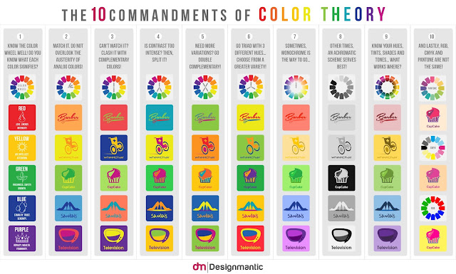
colour theory
restrictions//logo design theory-
 |
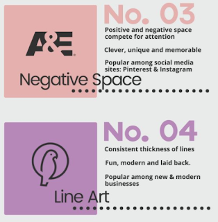
use negative space
convey correct tone
make it black
make it work small and black and white
avoid cliches
make it stand out
don't follow trends
keep it simple, say what is intended and nothing else
keep it balance
use white space
represent equal with the shape
https://www.creativebloq.com/graphic-design/pro-guide-logo-design-21221/4
01. Understand your competition,
02. Ask the right questions,
03. Stay flexible during the process,
04. Respect a brand’s heritage,
05. Remember: a logo is just one ingredient,
06. Choose your typeface carefully,
07. Tweak and refine to add personality,
08. Consider illustrated, fully-bespoke type,
09. Explore serendipitous letter combinations,
10. Take ownership of an entire typeface,
11. Strip it back to basics,
12. Understand shape psychology,
13. Master grids and structure,
14. Employ negative space
15. Make use of wit and humour,
16. Understand the colour wheel,
17. Manage colour schemes carefully,
18. Use colour to control mood,
19. Research sector-specific colour trends,
20. Don’t forget black and white,
21. Always get a second opinion,
22. Develop the rest of the brand world,
21. Always get a second opinion,
22. Develop the rest of the brand world,
23. Consider how to bring it alive,
24. Help your client roll it out,
25. Deal with public criticism
https://www.webdesignerdepot.com/2009/06/12-essential-rules-to-follow-when-designing-a-logo/
1. Preliminary Work Is a Must,
2. Create Balance, 3. Size Matters,
4. Clever Use of Color,
5. Design Style Should Suit the Company,
6. Typography Matters… a Lot!,
7. The Goal IS Recognition,
8. Dare to be Different,
9. K.I.S.S. (Keep it Simple, Stupid),
10. Go Easy on Effects,
11. Develop a Design “Assembly Line”,
12. Use Other Designs for Inspiration Only!
features to consider-


No comments:
Post a Comment