Infographic Design Research
infographic type theory research -
- legible
- match the style of the communication/tone of voice
- combine similar styles
- simple and clear
- clean and legible font sizes only, if cant be read point less
- less is more
- uses a small amount of type
- use a small amount of typefaces
- make the headline big
- guide the reader though
- have a visual hierarchy
- have a consistent layout
- don't include anything unnecessary
- basic
- have an order
- have lots of negative space to keep it simple
- avoid over designing
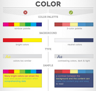
Infographic Colour Theory Research-
- between 3-5 colour per leaflet only
- can use different shades
- no bright colours more neutrals
- use contrasting colours to draw attention and be legible
- use colours that contrast the background/stand out against it
Infographics Icon Theory Research -
- no the main focus
- simple
- never distract
- multilingual
- universal


No comments:
Post a Comment