Page Development
For the book the inside pages will be mostly coloured acetate which overlap and combine in different orders to show the audience how CMY works. To separate each different order of sheets there needs to be white page after every 3 pages, this will be used a background sheet that is placed after the 3 colour combinations to stop all the pages combining as one overlap, it will be section into C+M+Y, M+Y+C, then Y+C+M. to make they work as separate orders rather than just having all the sheets over each other which would create a messy uncertain colour till the last two pages the white pages will work as dividers. Having white sheets as dividers will allow only 3 need sheets (one of each colour) in the correct order for that section to be overlapped at once which will produce the correct output colour. Basically the sheets break up the sections so the colours don't all mix together as one.
At first the sheets where just going to be flat white paper but then i realised that i could use them to also explain what combination the audeince where looking at, it could explain the book. The pages will have to be white space mostly but a small amount of text could enforce the information the audeince just received about CMYK. As this book is for children it could explain what colours they had just overlapped and matched and what colours they created, it will inform on the names of colours as well as how to make them.
The front page of the book uses futura in all capitals, to keep a common style through this book and because there is many reason this text is suitable for this audeince for the dividing pages they will include the same text.
-has to be mostly white so the colour combination can be seen
-has to be as simple as possible
-use as little words as possible
-big enough to be read by a younger audience
-has to clear
-easy for them to understand
grid
first i created this grid which is used on the cover for the book too, the middle space if the only rectangle where the text on the front is added too therefore using this will keep a consistent style thought the pages and make sure that no text runs over the edges or out of place. It will mean the text is the same on every page which will help make it seem like a group of colours and link the sections together. its a very simple grid as the aim is to use as little text as possible on the pages so its not overly complicated for the audeince.
experiments
Final Pages Picked
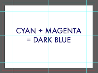
This was the page i felt worked the best from the development ideas, as it is the colour of the final product it has visual impact as well as meaning which helps reinforce the idea behind CMY and how they work. As the page is mostly white still have the text in the middle gives space around the text which can clearly show the combination overlaps but the text will not be missed if the audience is flicking through, this was an issues with having it at the top or on the bottom of the pages. Alining the text in the middle also makes it easier to see it as a addition, it seems more like a math sums which links to the use of maths symbols in the writing (uses to simplify the page whist using less text). Th text is bigger but more spaced out to allow it to be read as the book will only be small, the text needed to be readable at A6. After selection this style as the most suitable page layout i then applied this style to all the pages for the needed content.
FEEDBACK -
After showing this to a few of my fellow designers, an idea was suggested that this will stand out whist the audience is flicking through the pages so they will read the combination before they get to see it as it will be readable before they can turn the pages to see how its made. This give the concept of the book away before they have had chance to explore the book ti find out how the colours overlapping works, if i change the text colour to the colour of the last sheet that will be over lapped the text will only been seen once all the pages have ben turn, once they have seen how the mix works for them selves. This will allow the book to teach in the way it is designed better therefore i have changed the colour of the text to the colour of the last screen before the white one for each page.
colour change


No comments:
Post a Comment