Friday, 27 October 2017

OUGD603 Nina's Blog First Sketches

Nina's Blog First Sketches 

First ideas
-based it around the name, a bubble bursting
-based it around the images send over of the blogger, show them talking
-based around speech bubbles (links to blogging and title)
-based around imagery of bubbles
-based around bubble type

Very quick first sketches to get feedback from the client 


FIRST IDEAS BASED OF THE CURRENT DESIGN OF THE BLOG

BASED OF THE THEME OF THE BUBBLE
-loud and positive hand drawn type
-emphasis put on the bubble part of the text
-uses two different type style to cause the emphasis, drastic difference draws attention to the intended section

based around the personal nature of the blog/ how it's the different girls talking and give their opinions
LINKS TO THE PERSONAL ASPECT / WHAT THE BLOG IS 
feedback -


-stick to just type
-digitise the images for the logo/other work
-trust my judgement
-give creative control
-BRIGHT ANF COLOURFUL
-like the bubble type idea

-next step digitalize the images
-create some experiments

OUGD603 - Nina's Blog Current Blog

Current Blog 

For this brief i've been asked to redesign and create a new look for my friends blog, this will take the form of a word press outcome and a facebook/social media page. Currently the blog uses image drawn by nina, the client wants these (or might want) these included in the final blog.

Current Page -


styles aimed for -
-bubble text
-colourful
-capital letter used
-loud
-non gendered
-bright
-make a statement

What is the blog?
Before designing the blog analyzing the content and the theme will be useful, this is as this will inform what style the blog will reflect and will allow the designs to be specialized. It will allow the design decisions to be inform but the content, and fit the style the client aims for to be portrayed.

who??


CONTENT
-alternative durham views, news and reviews
-talks about feminism
-discussion on life in Durham
-talks about evens in durham
-dairy for nina and ruby
-very personal
-non gendered
-powerful/strong opinions
-fun and lighthearted
-informal

USE THESE TO INFORM THE DESIGN

OUGD603- Nina's Blog Brief

Nina's Blog Brief 

Some of the work commissioned over summer was for a friend Nina, a student at durham university. This year nina has started a blog, and has asked me to design the back ground for this.


The brief is to design the background header for her WordPress Blog, for the title 'Bursting the bubble'. the dimensions for the header are 192x720 mm so this limits the size of the design. The themes aimed for by the client are colour, positive, playful and  non serious designs. The header needs to include the image sent over by the client as well as the type, but nothing else (unless i add a header ect). The creative direction of this brief has been left to myself, but with themes set by the client.

Research 

Nina has given me creative direction over this brief, the information given is very basic but informs the outcome as it'll be need to be positive playful typography, therefor research will be conducted as to explore styles and other ways the brief can be created. Piece that fit the criteria set will be used as influences and examples, so they way they achieve the aim can be applied to this brief.

-bright colours
-contrasting colours
-bold fonts
-illusataion aspect added
-curved forms
-shadows/drop shadows used
-pink/oranges common

current questions-
does she want it hand created or digital or a mix?
any colour scheme ideas?
feminine or mixture?
who is the target audience?
which does she like best?

To get a deeper feel of style the client is aims for this was discussed, idea of typographical styles/patterns/colours where shown and feedback from this will influence the design of the outcome.  This was done with the aim of getting more knowledge of what outcome the client is aiming for, this is so the work produced will fit her ambitions.

style feedback


preferred images/style


-scruffy chic
-hand drawn but digitalized
-give a sense of personality/imperfections

target audience 


-non gendered
-students (18/24 age range)
-females but not  to focus on this
-BRIGHT COLOURS/NOT PASTELS


outcomes

-a logo, facebook banner and header
-create a brand guidelines then apply these over the range


deadline-
next monday/one week

Wednesday, 25 October 2017

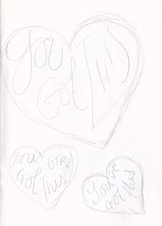
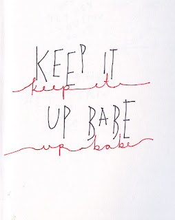
602 EP - The Mighty Live - Hand Drawn Scans

Hand Drawn Scans 

After feedback on the last idea was that as it was created digitally it last the feel of personality experiments into a more hand drawn/created style will be expressed. This due to the brief being very personal based as reflecting my journey there needs the style and content to relate to me personally. Also hand drawn has a more free, less imperfect style which fit the theme ideas. The style of the outcome for this brief is as important as the content.


digital developments -


FINAL OUTCOMES-


 FFEDACK-
don't like the you've got this one,
get you shit together is insenative, trying to avoid this issue.

USE THE OTHER 4


602 EP - The Mighty Live - She Mock Ups

She Believed She Could Mock Ups

One of the common phrases highlight in research as negative reflecting into mental health was ‘she believed she could, so she did’. This implies that anyone can do anything if they believe, whereas mental health issue cannot always be fixed this way. This idea would be to take the phrase and to relate it to a more realistic idea. Validating how hard is it to do selected task/things due to mental health, but also saying this is ok.
Eg –


‘She believed she could, but it involved making phone calls and that made her nervous’


FEEDBACK
-make it less computerised/digital
-try writing it out, seems unipersonal like this
-content is good but the style is too perfect
-like the idea
-the idea is strong, but maybe made more?
-strong concept
-it's fine being she as it's about a you, a girl