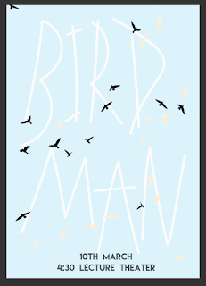
idea 1- Typographic Style
The film follows the main characters constant battle with his inner voices, and inner persona of BirdMan a role he played famously for many years. This typography idea shows the differences between the bird man persona and Riggan Thomas in the form of 2 different typefaces, the first is the wild free crazy ‘birdman type’ this is then overlapped via the more serious digital functional type, the drastic difference in the style has been selected to reflect the difference the main character and his alter ego. as. This shows a script that has bee wrote for him but where he has been called BirdMan as his identifier rather than his correct name. In anger at this Riggan has crossed out the name and replaced this will the correct term.
This idea is taken from research into past poster selected by the society, the college style and mix media is popular visual picked. The college visualise the ‘Birdman’ part of Riggan as drawn wings, this shows how this idea of being held back by the role is his own perception rather. The poster allowed see type to cover the actors eyes, this is done as eye are seen as our unique identifier, the most accurately way to identify us, therefore this shows how the ‘birdman’ persona has taken his identity and replaced.
idea 3 - Cross out Style
Script - This ideas comes from the way Riggan is associated as bird man in the industry, this is his nickname and what people use to refer to him as. This shows a script that has bee wrote for him but where he has been called BirdMan as his identifier rather than his correct name. In anger at this Riggan has crossed out the name and replaced this will the correct term.


No comments:
Post a Comment