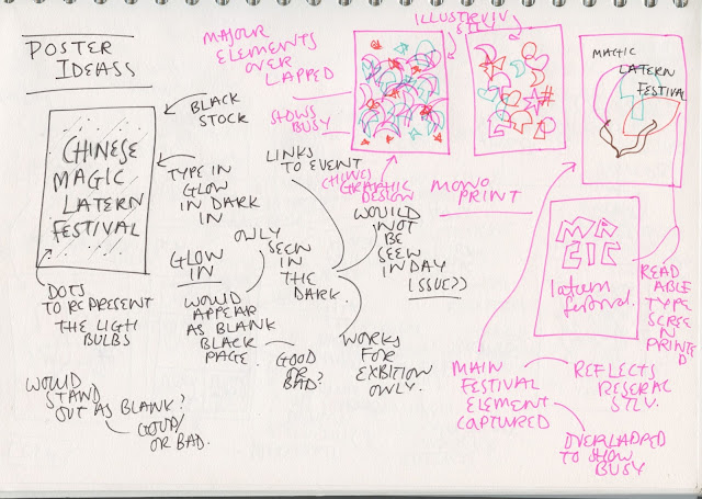
The aim of the poster is to be a celebration of the Magic Lantern Festival, the poster is being created manual printed for the level 5/4 end of year exhibition. Poster research into British and Chinese graphic design styles has conducted as to highlight elements of each that can be brought together via the poster to visually reflect the combination of culture expressed via the event. The research has concluded in similar design style which can be used to informed a most of the design elements of the poster, this has defined the intended style aimed for by the poster as an Illustration based brightly coloured, pastel based, abstract, visually heavy, overlapped elements, child aimed/themed poster design which used text as a design element using type for both languages whilst reflecting the handmade aspect of the lanterns in a positive celebration tone.
The main feature of the poster have been taken for research, the aim is collect a range of concept and design decision informed by the research then to experiment which this visually to find how to combine/explore the different aspects.
CONEPT IDEAS
-glow in the dark poster
a poster that overlays type and imagery representative of the different cultures, and uses glow in the dark in, the is to reflect the light expressed via the lanterns in the festival and also the combination of cultures. this also link to the time frame and imagery of the festival as these are all dark pictures with glowing lanterns. The poster for this will be manual printed, one of the benefits of this medium is the glow in the dark and florescent ink available therefore this would apply this benefits to the theme as to reflect the light at the event.
-mono print poster
a poster that reflects the manual style of the exhibition and the lanterns via the more express style of output, created as each print will be different as each light looks different at different times due to reflection and light, reflect the nature every time the audience views the work it can be different /unique to them. This shows the busy nature of the festival whilst reflecting the overlapped busy design style in seen in both the research for Chinese and British graphic design.
 |
| green ink would be glow in the dark |
digital mock up of what the mono print could look it
-depict the experience
This idea would be to print one o more elements of the festival lanterns to show the main feature of the event, to show the cultures but in the style of Chinese graphic design as to reflect the culture
-cartoon style poster
This links to the Chinese graphic design research style but also the intended target audience and tone of the event. The event attracted mainly families and was very child friendly, this is seen clear in the lantern styles and themes as long with the research into the other elements of the festival, therefor this would focus the event as a child experience, reflect the event as a education cultural event for children from their point of view.
-combining cultures
This idea would be to create a poster split in half, half would be Chinese and half would be english as to reflect the different element coming together as one poster. As this poster is for the exhibition rather than a functional poster to advertise the event the focus has to be on the visual design, the design need to stand out therefor this drastic contrast would. The idea could only be used for this style of poster as it would not be readable or informative therefor could not be used to find or to advertise the event
-over lapped Chinese text
This idea comes for the Chinese graphic design influences, in many of those posters they combined text as the design elements rather than just being right aline informative or readable it became a illustration aspect. This idea would create a typographical poster that showed the combination of cultures via using type from both culture as the Chinese poster do. Show both cultures coming together by overlapping both languages.
-could overlap to of the same poster but in the different languages
-just overlap the main text
-use aspect of both in one
-imagery from the event redrawn
This idea would be to redrawn the famous aspect of the festival in a style fitting with influences form both the poster research elements. Visually show the festival aspect yet in the style of a more illustrative poster reflect the influence and the target audience/tones aims.


No comments:
Post a Comment