Book Research For Content
Books that contain the same content as my book will to see how they use design/layout/type/imagery/grids to showcase and display the record sleeves, see existing work and how it can relate to my book with will be different as it MY favourite covers, not the top 10 by my top ten.
100 Record Covers
design features
Since the record sleeves in this book are heavy based around photography (heavy busy imagery) the layout and design is kept very clear and minimal, this is causes by a heavy use of white space around the covers and a very no distracting text. The page is designed to draw attention to the bright colour and vivid imagery of the covers rather than the layout of the book, its attracting people to read the text because of the imagery therefore relays on the imagery being the attention grabbing part of the design. The pages are plain white, this is to make sure the basic colour of the book matches every cover, white doesn't clash with any colour/colour scheme therefore it will match with all the cover no matter what their design.
-minimal design
-white space around the imagery
-text situated next to the imagery to explain
-every page includes a description
-strong grid system that can be broke to drawn attention to selected covers
-all covers (except specialise one) the same size
-very simple text to not distract from covers
-very minimal
-white and black to match all style/colour schemes
-covers the focus of the pages
-records on in the in different space on each page but still in the grid system
-text close to imagery to show its a description
-focal point is the covers
design features
Here this book uses white as its back ground because all the covers are of relaxing albums, the white space chills out the reads are it easy to read and glance at rather than being very bold and their faces that would cause strain on the eyes. The concept behind the book is to chill out the audience so the design is created to make it easier to read therefore the design is easy to read and eye on eyes of the reader.
-very minimal/clear
-grid uses
-text very small
-text bold for titles
-capital texts only
-record put in pairs for double pay spread that match/similar styles
-large white spaces
-records on in the same space on each page
-simple layout
-text next to imagery
-text close to imagery to show its a description
-focal point is the covers
12' Sleeves
design features
This book is more vivid that the rest of ones, this is because the selection of covers are louder and the themes of them are more younger and hip, this is reflects in the design of the book because the the back ground of colour is solid black. Having a heavy backgroud means that it add a more swashed look to the pages, they are more design heavy than the rest which grab attention to just the covers where as this grabs it to the whole page spread just to the soild black background. White makes the background seem almost invisible to the reader as it doesn't highlight anything, this black highlights the shape of the book by clearly showing the edges, the shape is the same a single record sleeve is, this links to the content showing the cover as a single record sleeve.
-same shape as record sleeve
-imagery takes up most of the page
-very small minimal text to draw attention to imagery
-focal point is the covers
-black background to make the colours seem more vivid
-black background links to colour of records ( these covers have been designed to work with records so they will match the colour of the record)
-text is around the imagery
-one record per page
-bigger images than the rest
-minimal
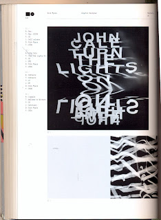
Cover Art By : New Music Graphics
design features
This book is different to the rest as most pages are different, there is completely different design on each double page spread with is used to link chapters and brief selected cover to the attention of the audience. The only grid used here is to keep the text always alined to the left, at the top corner of the page, this is done to keep one feature the same which links the pages in the book as a book, if every page is different it feel like a collection of posters/page rather than a set of collective imagery.
Even though there is not grid system for the record covers i feel this works better, the images are fitted as they work together making it seem more organized as it designed for the images to enhance them and show their defining features. Even without the grid section there a rules followed by every page but the movement of the cover is different within a selected area, theres no grid but rules it will follow that are set for each page which works to keep the book organized yet more intriguing.
-small text
-text takes back ground
-short text
-image of cover shown big
-white space around cover to not over crow page
-plain background flat colour which is changed to correspond with the images
-clear layout
-attention drawn to the covers
-covers bigger that the text box
-branding in the top corner
IDEAS TO TAKE TO MINE-
minimal design
text has to take background
take seem almost unnoticeable till looked form
modern style as it quite a modern design/idea
black and white work best for the colour scheme as they are neutral so wont clash with any covers
make the layout/design/colours/style work for any design the sleeves will be different
keep it clear
small san serif text, mixture of capitals and lower case
look into size
use white space around the images


No comments:
Post a Comment