abstract geometric record sleeves
Based around triangle
brightly colour
no link to song
collection of triangles used
used to add a sense of mystery to the covers
inide music
triage used to create pattern
wide colour scheme
Wild Humm
https://wildhumm.com/collections/watercolors/products/empty-nest-in-the-rain
Wild Humm is a abstract watercolour artist that produces work based around natural forms and the way watercolour paints interacts with the paper. Her style uses brightly colours water painting with harsh sharp lines in contrast to create artwork that is bright bold therefore interesting. Found on Instagram there is little information about her work but its bright lightly colour patterns and bold style standout.
As one of the ideas for this project was a watercolour inspired design (focusing on the freeness of the baseline, emotions and brain waves ideas) this artist seems very relevant, looking at the way she uses both lines and watercolours could represent the idea of worrying being different for each person. How anxiety has waves of confusion and freeness along with the medical chemical issues with anxiety, the contrasts of the line seem like the brain being taken over by the waves/connection of anxiety associated with worry.
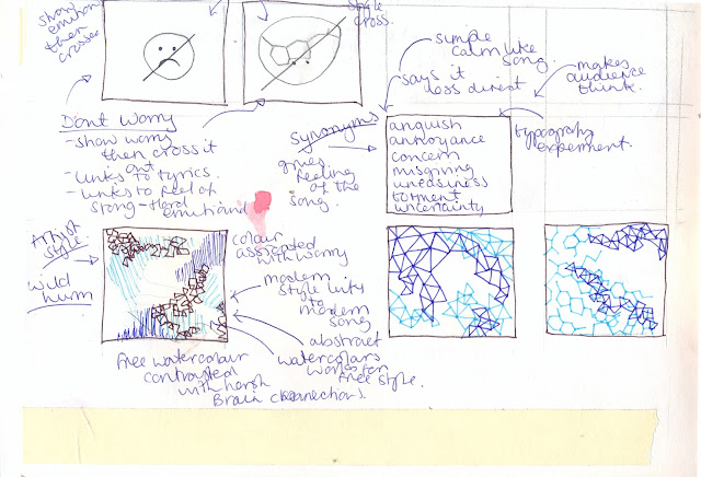
design sketches -
 ideas - simple thumbnail sketch of how this artists style could be be combined with the chemical symbol idea to create a trippy bright unique record sleeve, very basic examples of how this style can be manipulated to fit the brief and the colour scheme that could be used.
how it could be used just the triangles or combined with the chemical element version of worry, these symbols will work together because they are the same geometric styles, combing them will create a style that shows the brain waves being attacked with the worry, how worry takes over the brain waves.
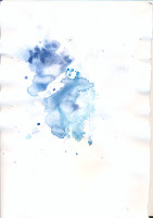
designs - here the experiment are made with the same materials the artists uses, these are quick samples to see how i can use the materials and how they work together. i have used watercolours with fine liners then added water to the fineliner, or overlaid both techniques to see how i can used the styles applied to my ideas. The colours used are blue to show calm and red to shoe pain/love, these are the colour people associated mostly with the song.
This style can be used to represent peoples different feelings of anxiety/worry, from my research it collected that some people feel anxiety is a flowing, natural power that takes over like a wave where as other people feel its harsh bold and strong like lines, this style combines the two styles to represent how anxiety effects everyone differently.
CONTRAST - contrast represent the difference in the physical effect of anxiety on the brain (from brain scan research) which is shown via the watercolour with the harsh sudden trapped/caged imagery represented by the harsh geometric shapes that are overlaid.
examples -
scan in water colour experiments, not edited
more detailed design sketches -
example two
basic shape of the watercolour smug based around the form of a brain showing it being taken over via the chemical of anxiety (the geometric forms), this reflect how people talk about anxiety attacks and how it suddenly taken over the brain. the harsh lines represent the idea of trapped as they seem like bars of a prison cell, describing how this chemical effect everyone differently.
photoshop edits
After creating this sketch using watercolour and fine liner i then scanned them in and used photoshop to created edited version of the covers, this is used to add a more abstract look as this can easily over lap, add effect and change the colour of these design.
The pattern is created to reflect the brain being taken over my anxiety, to show how anxiety effects the brain in two different ways combination styles - the effects on the brain scans and the se of the chemicals via a geometric pattern. these parts of the design are very import as they reflect how it effect people different but how the causes can be the same, how it takes over and give a confusing results.
Since the design its self is complicated the colour scheme for the design will be experimented here, for example the top line middle uses a bold high contrast colour scheme to reflect the busy controlling powerful effect of, this cover is overpowering and dramatic but it seem too over the top, the deist is over complicated via the busy colour scheme where as the calming colour schemes seem to enchace the design style by balancing out the designs. If the design is complicated like this the colour scheme need to be balanced out to keep it less over powering, this is seen in the research into abstract album cover designs, calming cover for vivid designs.
best mock up experiments


No comments:
Post a Comment