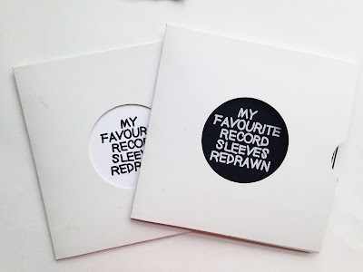
This was going to be my final print test but there was an issues with the version of indesgn it needed to be print off on, i had to go down to drop in to print this which was very busy and therefore i didn't have time to change the text after the version of indesign didn't have the font i used saved. This messed up the layout on all the pages as it changed the size and length of the text lines even thought indesign used the most similar text it could, therefore will go down to drop in again but change the text to Helvetica as this was suggest in my feedback from my last book and is also available on all the college computers, this was an issues i didn't expect as it didn't happen after my first print the font was fine as it was installed on that computer but not this one, but from now on i will have to save the fonts i used to the folder with my packaged document, i will make sure this doesn't happen again.
changes since last print
-cover colour
-spelling mistake
-page alinement
-page order
cover compared
cover colour
After reading feedback from my other book print and asking people about the colour of the cover black seemed to be the most popular, this is as it grab the attention of the audience straight away and add drama to a simple cover that makes it more noticeable. It stand out better again the sleeve cover which is white, this simple change make the book look a lot more professional and also fitted with the colour of binding better as the binding now fits in with the cover rather than standing out which made it look less professional as in professional books the binding is not a feature of the design just a function way to lee the pages together. Feedback from this colour change was very positive as people agreed that it looks better in the case but also outside as a plain white book cover seems to be lost against over busy cove designs even thought it fits with the minimal style.
This is the page with the worse effect from the font change, the for here overlaps into the drowning of the cover, this was very annoying as i didn't expect this to happen but i am booking another printing slot where i can re print the books with the layout fixed and a typeface that is available on all computers in print. The type change effected the subheading on all the pages and made them aline at a different point to the other text, this was a style i experimented with when look at my layout but decided was to overly complicated for a simple design, i still agree with this and this means i defiantly ned to get the book reprinted.
This font doesn't work with the imagery as the imagery is squared where as the font is more curved and soft due to the thinner letterforms and thinner weight, for the reprint i will look at Helvetica light. The font doesn't work with the style of imagery or the theme of the book even though its a san serif similar font the small difference with this typeface and the on i picked have a huge effect on the layout, feel and design of the book therefore i feel its vital to get it reprinted to be the best quality it can.
after i changed the front cover of the book to black i had to change the order of the pages inside to make it follow the pattern of one black page on white, when setting this up i have messed up the pages as it confused when i tried to change it. I tried to paginate the pages myself so they would fit in order but this back fired and caused these pages to be next to each other, two back and two white, rather than being next to each other in opposite mix, for the next book i will investigate how this happened and fix it. I will let indesign paginate the pages its self rather than trying to do it so that all the pages face a opposite colour that is a contesting design.
The pages have been worked out in pairs so that the busy covers are next to the simple cover so that the double page spreads are too over powering to look at then really simple on the next page, it will give the book a scene of balance over all so it fits better and is easier on the audience but as i messed up the pagination in this book this doesn't work out and the pages are not in the order i want therefore this will be sorted for the next print
reprint changes -
-uses a typeface on all the print computers
-layout it out so the text is all alined along on line
-uses a less curved text, seem more feminine than neutral which doesn't fit with the layout or the design ideas as it is too thick it distracts from the images rather than highlight them.
-use a text with a higher x height as the low case lettering doesn't fit with the titles as it too different, it seem to soft and small for this design (Helvetica)
-let indesign do the pagination, sort out the page order


No comments:
Post a Comment