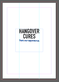
As the final outcome for this brief will be a helpful, calming, lighthearted, eye to read guide to first hand hangover cure for out years personal experiences and how we deal with them to help fresher deal with hangover symptoms need the cover of the book need to reflect this theme. The book need to seem personal, helpful but only apple to this target audience by using modern graphic design styles and current trend in graphical style that appeal to the audeince whilst using design thats easy to read and doesn't have overly power colour scheme due to the effect of hangover being the audience is sensitive to light and will struggle to focus on small text.
features
-modern
-easy to read
-direct
-personal twist
-helpful/positive
-calming
-smoothing
-slightly medical but overly serious
The mixture of text style com from the research into guide covers, some had very serious informative design where as others have more personal advice style design this book is based around a mixture of both as it partly practical advice but mixed with funny more personal quote too. The mixture of the text styles reflect this, it shows it serious but with a lighthearted funny twist, the text has been hand drawn by me to give it a more directly related feel to me personally, this also ova me more control over the letter formation as it was intent to be decrotive but not very complicated to read or feminine therefore i created the text to fit this purpose.
Since a idea and colour scheme has be thought of for this final outcome now,the cover must be influenced by these, reflect calmness, health, help but personal and light hearted too. Its the first part of the book the audience will notice and need to grab their attention but also reflect them themes of the book whilst giving a simple explanation into the book. These are the ideas for the cover then the developments, the cover has been kept very simple to reflect medical and peace. The cover is based around the illustration of a speech bubble, this style of bold colour illustration was seen in the poser research, the bubble is used to represent the idea that all the book is based around quotes. The book is all quote from our year therefore the cover uses this symbol as a way of expressing speech, the audience will be associated with as it international recognised. This idea came from wanting to keep the designs simply obvious and direct, not use any unneeded detail but when a very simple cover was mock up it missed the personal, light hearted touch that the hand drawn imperfect speech bubble adds. this style of illustration is quirky as it related to less serious matter. A serious medical book wouldn't use this style of hand drawn text or illustration as it not accurate to real life imagery but this balances out the serious nature of the din font used on the cover, its added as a decrotive but simple touch to relate to the topic but also add a more lighthearted less serious feel to the cover.
quote bubble over lapping to show how they information gather had similar reasoning behind the idea but is still very different, also the bubble com from different sizes of the page to reflect the conversation i had with the subjects to find the data needs.
This idea of colour was used to reflect feminine and masculine but the pink has overly powerful romantic association therefore not fit for the theme of this book.
-


No comments:
Post a Comment