Inside Pages
Book Page Research
Development
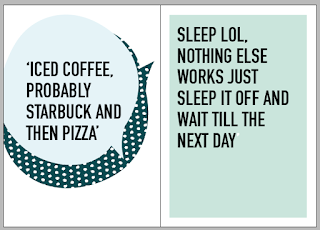
For the inside pages of the book it was vital to follow the same house style as the front and content pages, this is the style that defined the book will keep the audience interested thought the book. The colour scheme used, dot pattern, hand drawn text, din text and the illustration speech bubble need to all be applied tot eh pages to create a professional looking but but not a book that is overly busy, the pages use a grid system to aline the different text placements and to makes sure that even thought the design on each page is different there is a basic pattern the pages follow.
The text on the pages was developed a lot before the final style which fitted with that cover was picked, this is as the aim was to separate the cover, content page and back pages from the quotes as its a different content, to make it obvious with pages the quote where on so the audeince could quickly find the need information when hungover. This was changed over again but it was clear that any other text style made the book too design heavy on the viewer, it make it to complicated not as calm therefore the same text style was applied for the page inside but to separate the needed text the quote where made bigger, this also allowed the audience to read them easier if they are hungover
The text on the pages was developed a lot before the final style which fitted with that cover was picked, this is as the aim was to separate the cover, content page and back pages from the quotes as its a different content, to make it obvious with pages the quote where on so the audeince could quickly find the need information when hungover. This was changed over again but it was clear that any other text style made the book too design heavy on the viewer, it make it to complicated not as calm therefore the same text style was applied for the page inside but to separate the needed text the quote where made bigger, this also allowed the audience to read them easier if they are hungover
to formal, the bubble doesnt fit with the text
too much handwritten text in this style was overpowering and hard to read
too feminie
too serious
doesn't fit with the text on the trout cover which is din therefore not consistent house style.
even in capitals the text is too unreadable for this style of book
made bigger for the quote so the inside pages stand out from the cover and back pages, makes quotes easier to read for this setting
colour scheme used on cover and other pages applied to the inside
AIM FOR THE PAGES
-design heavy pages balance out with white space on next page-balance out long quote with shorter ones on the facing pages
-make the quote the focus
-use conisient style
-need to be easily readable
-balance dots with white space
-balance colours on pages with green and blue
-simple design for large amount of text
-use grids to line up text


No comments:
Post a Comment