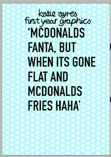
Since the theme of this book i personal, helpful design and the research conducted included it hand drawn text is being added to each page as a subhead, caption to the quote so that it add a more natural hand produced feel. Hand-render text is softer for the audience against the strong Dim bold text which is very digital due to its perfect terminals, organised letter forms and structure, this contrast will dawn attention to the subheadings as they will stand out completely different highlight the imperfection in the font compare to the perfectly design style of din. Using broth style of text balances out the designs, it look professional due to the dim but friend due to the hand render text as this style is mostly assoiacted with more personal brands or products, usually hand made products which differ form the german railway signs that din is associated with. The contrast in the history of the types means that the book seems serious but then edited, it has a personal twits on a serious issues which is a theme aimed for. If all the type was hand rendered it would be too heavy on the reader, hand render text is more detailed and too over power due to the differences with the audiences brain picks out, the reader wouldn't know where to look first with doesn't fit with the concept of calming/easily read. Din is associated with a standard for traffic signs, street signs, house numbers and license plates. Over the next decades the typeface also found use on various household goods and products, making it synonymous with German design but also perfect organised posters, serious informative design that has purpose, because this typeface is associated with instructions this fit for the quote. The typeface make the design seem as rule to follow as its association with this history which works for the purpose of this book to direct people how to deal with hangovers.
Development
first of all the type is drawn over myria 20pt, each subhead is done like this so that all the type follows a basic structure even with the personal difference, this will make the letter form the same way fitting the text together as the same subheading rather than a separate part of information each time. it give the pages a similar yet different style which rifts with the theme of the pages but add a more personal unique, style.
Handwritten text has meaning, this is shown by the font as its curved form and slightly different letter shapes reflect natural free yet calming typeface. There are no harsh lines to reflect serious nature in this form which help its seem more causal and friendly, the text is done in style of a hand written note, quick and not detailed this is as the book need to seem like a guide book or a help book created by student for student, it needs to be relict that the quotes are taken quickly and form the target audience via the note taking style.
changed to balck to fit with other text on the page
experiment over the other the to make sure the size was correct, this is to make sure that all the text in the book is the same size.
applied to the page in the grid system, all the text is added in the grid system used


No comments:
Post a Comment