The client has not given these, showing they're not overly proud of these adverts now or showing how they do no want to miss lead as they don't fit with the current branding. This showed the need for the branding to be followed by this outcome.
Although not given these adverts also follow similar rules to the adverts analysled earlier. This reinforced the brands interests in campaign built around clear simple ideas as again these can be easily summarised and explain in 1 sentence.
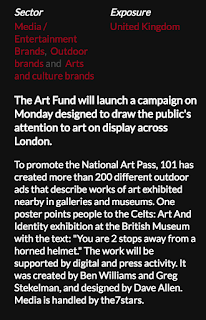
https://www.campaignlive.co.uk/the-work/sector/media-entertainment-brands/arts-and-culture-brands/5848
'show the audience how far away they are from famous art work'
https://www.campaignlive.co.uk/article/art-fund-never-far-art-101/1366527
'show the contrast being the thought process of the art work and the useful nature of the art pass'
common features -
simple idea
clear type
simple layout
focus on art work not museums
sticks to brand (old branding)
include art work titles/famous references
different features-
old branding used
duller colour scheme


No comments:
Post a Comment