Cover Research
KISS = keep it simple stupid
concept 3 - Using the official logo of the festival as the audience will be able to relate/associate this with the festival, screenprint the correct logo onto the cover so it can automatically relate due to brand association. This is also the text used at all the important/main part of the festival eg the stages/bar/entrances therefore using this text style will relate that this book is an important part of the festival guides/information. ISSUE- As this book hasn't be created as an official guide or as serious book, this design style will not relate to the over all tone of the voice. It will give the book a more serious nature with the design style/content has tried to aim away from, to create a more humorous lighthearted book therefore using the official branding will not be suitable. Also the official colour scheme was decided against as it clashes too much with the calm, simple design style as the colour are unappealing to the eye for a design point of view.
mock up -
tests
concept 1 - a cover that mimics the inside page design and style but simply, not an over powering decorative cover as this will distract from the busy design inside but appeal to the audience on personal style level. Created an a handwriting style they can relate to, imperfect relating to the style they would personal produce. A cover that keep with the inside contents tone of voice, casual, imperfect and expressive as it has been created without deep thought but as quickly scribed note as this is style the audience would use when writing list/notes for themselves relating to the festival.
illustration and text covers
experiments -
simple text covers
MOCK UPS -


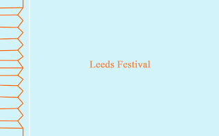
These mock ups are done using digital created typography, the experiments consist of different forms(a shorter version) of the word festival to fest. This slang term has been used as is as most of the people who've been o festival will call it 'Leeds Fest' over leeds festival therefore this targets this audience but this isn't done by every goer. These cover experiments use the shorted version as well as full type but as this book target an audience that might by this book as a gift for someone who has been this has been decided against for the final outcome as this audience might not recognised the shorted version/ understand it. USE FESTIVAL NOT FEST. Also as this text will be screen printed it has been created digitally then it can be printed out with the correct thickness so its subtle for this media as well as seeming more professional due to the straight, non messy text. An issues with this digital text is that been done in the style of handdrawn text but has smoothed out the mistakes to make it seem more precise but this give a more harsh line to the letterforms, its seems to perfect to be hand created. The text is suppose to imitate writing at the festival, as well as a concept for the cover being that the title reflects medias and style that would be seen if it was wrote at the festival using the material available but this digitally created clean text doesn't fit with this idea. After creating this text digitally using illustrator that doesn't fir the aim of the cover more manual type experiments will be create by hand to see if these experiments work better to portray the intent tone of voice for the cover text. These style don't reflect the research as the text is too clean, the lines are too straight and therefore not level of personal touch to it, text in this style in the research is the opposite therefore hand drawn scanned in text might be used. HAND DRAWN TEXT WORKS BETTER FULLY HANDDRAWN.
hand drawn text experiments -
As these were being produced it was explained that to expose a screen for screenprinting the imagery doesn't need to be digital printed, it can be drawn in full black then exposed using the primary imagery. Using the non scan versions of the typography will allow the personal mistakes and imperfections to be more obvious which works well for this concept of the book cover. CAN EXPOSE TH SCEEN WITH HAND DRAWN BLACK TYPE.
tests-
experiments -
more detailed typography
concept 2 - contrast the book inside, work with the serious nature of the book structural pages as a serious book to balance out the heavy inside hand created/expressional design.This also fits with some of the more serious cover designs seen in the intent shop where the publication will be distributed. This could be letter pressed or screenprinted.
serious/ digital type covers -
mock ups -
From feedback on the simple front cover mock up it was made clear that overall the target audience as well as peers had the opinion that the cover more suited for this brief was the handwritten, messy manual style text. Even thought it was stated that this cover type style was more suited the current design didn't appeal to the audience as much, this is as they felt it looked too digitally created and they if it needed to be more imperfect if it was to represent text created at a festival.
The cover will be printed via screenprint, this media can allow handdrawn images and txt to be exposed to a screen then re copied this method is being used for the cover as it can be used on the cover material but also as this method could be used in mass production of the book as once the screen is created its very easy, cheap and fast to recreated the same text over and over again. As the screen can be exposed using handdrawn text this style of type feels more apporiate to the brief due to feedback as well as fit with the concept of creating a cover that seem as if it was wrote at the festival and fits with the lighthearted tone of voice of the book


