Photo Album Style Design
needs to include
-6x4 photos
-text
-all photos are landscape
photo sizes
research-
For these deign ideas the style is based off research above into how a scrap book is layout and created, the concept is to create a scrapbook style book with advice and information, quote ect from the festival as the corresponding cop which is add elements the audience can find humous or relate too. The images reflect the festival but the copy give it sell about content.
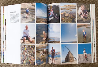
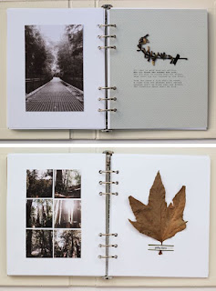
Scrapbook style design will work best for the imagery as the images are disposable camera photos taken in mess ungrided style, using them in more modern minimalist design will juxpostion the imagery highlighting the issues with the style rather than matching to work with the images. Researching this style to see how most scrapbook allow for space, imagery and text along with how they get across a more personal manual approach to design. Most the imagery found showed thats crap book have pages where the images can be removed, this links back to feedback received in a crit were a peer suggested that the images should be made removed so they can be added to walls or look at as individual images. A benefit of analog photography is thats associated more with having physical printed of the images rather than digital files, it a moment captured and unchanged, therefore having physical version of the images the audience can remove and engage which will link to these ideologies of the appreciation of analog photographic media. Having the images removable also links to the idea of relating back via the images, the audience of young adult will associate this medium with scrapbook/photo album from their childhood as the 1990's was a decade before digital imagery so that will remise more with this media.
The design of the book will be created so its reflect the memory of the festivals style/atmosphere better as it will use the original dispoable imagery although this has caused issue with the designing the layout of the images on the page. An issues with this photographic media is that when made bigger or smaller the quality of the images reduced even more, which may make the book look cheap or badly produced. Designing the book to mock photo album/scrapbook design style with the images and handwritten copy around it will be done as this will link more to the imagery rather than focusing on the quality it will enhance the beauty of the media and celebrate the technique used as well as this style work better with the style of imagery by not making the issues with quality more obvious as a minimal modern design commonly used in photo books would.
The images will photo paper printed to get them as accurate as possible to the original quality photo, but the original images cannot be used if the book is being reproduced or in this project incase there is any issues the original images will be ruined then. The image will then be added to the matt thick stock pages via glue or via thin decorative tape in the corners in the form of an organized layout based on the research into photo style albums/scrapbooks layout (above)The matt stock will be used will allow the contrast between the shiny, glossy photo imagery and the background stock to be enhanced via the harsh change in textures, highlighting the benefits of the chosen media. Also the thick matt stock will a degree of professionalism to the book, help it seem more commercial rather than just as a cheap festival guide, this stock is also the most durable so it fits with the idea of creating a book that will last years and be able to survive a festival.
Layout 1
Landscape book with the binding down the size of the spine
landscape book, which the binding down the left spine, allow the audience to flick thought with ease, whilst also allow the photos to fit on the pages in the correct orientation without having to be edited or changed. This landscape format fits better with the image format as it allowed the images to be added but without extra large amount of white space.
The size of this idea come from the next size up of dispoable photo sizes, 7x5. This size will allow for the photo to be added in the original size but also so there is space around the image for text but also to allow the page to be stuck in via tape, the tape will allow the audience to remove the image and replace it whilst added a very manual, scrapbooky, personal effect to the pages as this style is more commonly used in photo album or to stick photos on wall ect.
 |
| 7x5 size |
this is the page 7x5, which the image size added, a boarder of 0.5 is added to give the image a break from the page, the boarder will be printed on photo paper, it mimics style taken from Polaroid imagery linking to a currently popular photographic style.
Black line represent tape
No room for text on 7x5 size page so text on the back of the removable image or on the facing page??
experiments with transclear GFSMITH stock in this layout -
Transclear is a stock produced by GFSMITH paper merchant, it a plastic-style specialized stock they produced to be based of a stronger more flexible tracing paper, this will work for the concept for making the book durable as it a thicker stronger stock than tracing paper. It also allows text to be drawn on the back, this was
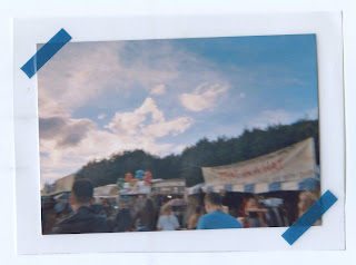 |
| Front, stuck on top of the paper |
 |
| text wrote on the back of the photo, seen thought the transclear stock |
 |
| 8x8 |
Back line represent tape
room for text on this 8x8 book size
image placement change on different pages but on the same grid, text fits around the image
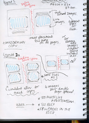
Layout 2
LANDSCAPE VERSION
scrapbook / photo album -
mock ups
transclear paper tests-
 |
| Front, stuck on top of the paper |
 |
| text wrote on the back of the photo, seen thought the transclear stock |
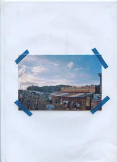 |
| Front, stuck on top of the paper |
 |
| text wrote on the back of the photo, seen thought the transclear stock |
ISSUES








No comments:
Post a Comment