The hardback covers for this book where created before the book size change and use a mount of the aimed book-rum which there isn't much of so the covers where still used to test the rest of the elements of the mock up. Even thought this was the wrong size book cover the size felt better to hold than the smaller mock up 2, its easier to use and open therefore this experiment highlighted that the final book needs to be size taken from between both of the book sizes (7x5, 17.75x10.6) , so its big enough to hold and use but not so big that like this book theres too much space between the top of the pages and the top of the cover. SIZE = BETWEEN BOTH MOCK UP SIZES
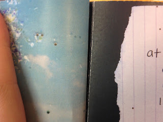
The inside cover colour was also tested here, the first cover uses a shiny textured light blue stock from GFSmith, this is as the orange shiny stock tested before was too thin to stick down without bubbling. Even when in this sample it was added to harder white card before being attached the paper still bubbled due to the low GSM, if this book was being mass produced GFSMith would be contacted and asked if they could create the stock thicker but for this project that not possible. The blue shiny paper still links to colour scheme of the book whilst being decorative but in no busy way, this is the pages doesn't distract too much from the inside pages. The blue stock is 300 gsm therefore did not bubble which make to more suitable for this cover than the orange stock as it give a more professional, well create production style. An issue with this specialist stock is that only one side is decorative but does allow for the audience attention to be drawn to the dedication page on the same spread. ORANGE DOESN'T WORK EVEN ON WHITE CARD, BUT BLUE DOESN'T BUBBLE
 |
| gold paper experiment with card under |
correct elements -
book cloth colour
string colour
blue inside page
blue page should included at the start rather than just the dedication straight away
stock for inside the cover
incorrect elements-
size
back inside cover stock
cut of some of the images
binding design
binding holes
back cover not creased
page stock
image colour
feedback
MOCK UP 2
After the first proper mock up, this book was done on the spare blue stock, this was as screen print will need to be tested on the correct stock therefore this need to be saves as there only a small amount left. This book was done at the size 17.75 cm x 10.6 cm to test the size, this is the same size as the page size but after feedback as well as personal opinion along with research feedback, its been conclude as it states above that this size is too small for the final due to the way its makes it hard to open/handle, the other size book is easier but this would mean changing the size of the pages which goes against the concept of reflecting the photographic style. The final book size will be slightly bigger than this size, the pages will be the same size, but with boarder around the cover size. MORE EXPERIMENTAL SIZE WORK NEEDED
The binding design for this book was largely simpler that the design on the pervious book, this deisgn represents the shape of tents at the festival but its less detailed as to draw attention to the cover design rather than the pattern design. This design was easier to perfect whereas the last design was easier
correct elements-
binding design
binding holes
back cover creased as well as front
string colour
inside page size
image colour (slightly)
incorrect elements-
cover size
messy binding
marks on the cover
page stock
cover stock, both colour and thickness
IMAGES NOT THE CORRECT PRINT COLOURS, EXPERIMENT WITH DIGITIAL PRINT


No comments:
Post a Comment